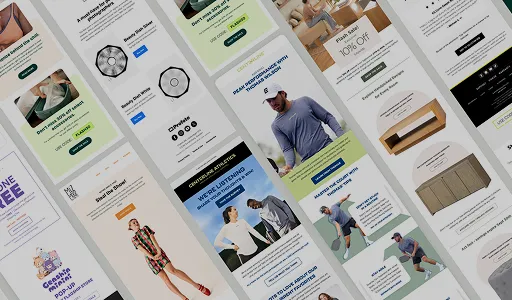

As an email marketing agency working across ecommerce, healthcare and B2B accounts, we open a lot of client campaigns on a phone before we open them anywhere else. That’s usually where the problems show up first, and it’s usually where brands notice them last. A button that’s perfectly clickable on a 27-inch monitor turns into a mis-tap magnet on a 6-inch screen. A two-column layout that looks intentional on desktop stacks itself into a mess. Most brands are still designing for the screen they’re reviewing on, not the screen their subscriber is actually holding.
This guide walks through what mobile optimization actually means for an email campaign, where it breaks most often, how we build for it in Klaviyo, and where most brands leave revenue on the table before they even realize mobile is the reason.
Quick Overview
A mobile-optimized email is one that renders in a single column, loads fast on a mobile network, and gives the subscriber a CTA they can tap accurately with a thumb, not a mouse pointer. Most ecommerce email opens now happen on mobile, so this isn’t a nice-to-have layer of polish, it’s the default screen size that should be dictating every design decision. Single-column layouts, 16px body text, 44px tap targets, compressed images and dark-mode-safe colors are the non-negotiables. Campaigns, flows, and win-backs each behave differently on mobile and need different priorities. Testing on a real device before every send catches what a desktop preview simply can’t.
What “Mobile Optimized” Actually Means for an Email Campaign?
A mobile-optimized email isn’t just an email that “looks fine” when you shrink the preview window. It’s an email built around three things happening correctly, in order: the layout renders as intended without the email client re-stacking it in a way you didn’t design, the page loads fast enough on a mobile connection that images aren’t still spinning by the time the subscriber decides to bail, and the CTA is easy enough to tap that intent actually converts into a click.
Miss any one of those three, and it doesn’t matter how strong the offer or the subject line was. The subscriber never gets far enough to see it.
Why Mobile Optimization Is a Revenue Problem, Not a Design Problem
Treating mobile rendering as a cosmetic detail is how brands end up quietly losing revenue per recipient without ever tracing it back to the actual cause.
Mobile Attention Windows Are Shorter
Subscribers on mobile scroll faster and decide faster. Reading three paragraphs before reaching an offer might work in an email client on a wide desktop screen, but on mobile that same email is three or four scrolls before the point ever lands, and most subscribers won’t get there. The offer, the value, and the CTA all need to be visible within a scroll or two.
Tap Targets Aren’t the Same as Click Targets
A cursor can land precisely on a small button. A thumb can’t. A CTA sized for a mouse click regularly gets missed, mis-tapped, or ignored on a touchscreen, and that gap between “looked interested” and “actually clicked” is exactly where mobile campaigns lose their edge over desktop.
Unoptimized Images Cost You the Whole Email
Large image files stall on mobile networks, and several mobile email clients block images by default until the subscriber approves them. When that happens without alt text in place, the subscriber is staring at blank space where your hero image and product shot should be, with zero context for what the email is actually about.
Dark Mode Isn’t an Edge Case Anymore
A meaningful share of mobile subscribers have dark mode enabled as their default, not something they toggle on for one email. Emails built only for a white background can end up with invisible white text, logos with transparent backgrounds that disappear into a dark canvas, or color combinations that were never tested against a flipped palette. This gets skipped constantly because it doesn’t show up in a standard desktop preview, and it’s one of the fastest ways to make a campaign look broken to a subscriber who did nothing wrong on their end.
What Actually Breaks on Mobile Email Campaigns?
| What Breaks | Why It Happens | The Cost |
| Multi-column layouts collapse out of order | Mobile clients stack columns automatically, but not always in the sequence you designed | Subscribers lose the intended reading order and disengage before the CTA |
| CTA buttons are too small to tap | Desktop-sized buttons under 44px are hard to hit accurately with a thumb | Click rate drops even when the offer is genuinely relevant |
| Images load slowly or don’t display | Large, uncompressed files time out on mobile networks; some clients block images by default | Product visuals and context disappear, and trust drops with them |
| Font sizes are too small to read | Body text under 14px forces zooming, which most subscribers won’t bother doing | The email gets closed instead of read |
| Subject line and preheader get cut off | Mobile clients display far fewer characters than desktop | The hook never fully lands before the subscriber has already decided |
| Links sit too close together | Footer links, nav menus, and multiple CTAs placed near each other are easy to mis-tap | Accidental clicks, frustrated subscribers, and lower trust in the next send |
| Dark mode breaks color and logo visibility | Emails coded only for a light background weren’t tested against inverted colors | Text disappears, logos vanish, and the email looks broken through no fault of the offer |
Key Elements Every Mobile-Optimized Email Needs
| Element | Why It Matters |
| Single-column layout | Renders consistently across every client and screen size without relying on how well a given inbox handles column-stacking |
| 16px minimum body text | Readable without zooming, which is the difference between a scan and a skip |
| 44px minimum tap targets | Matches the accepted mobile usability standard from Apple and Google, so buttons get hit on the first try |
| One primary CTA | Multiple buttons competing for a thumb on a small screen split attention and lower click-through on all of them |
| Compressed, alt-tagged images | Loads fast on mobile data and still communicates the offer even if the client blocks the image itself |
| Dark-mode-safe design | Colors, logos, and text stay legible whether the subscriber’s default is light or dark |
| Subject line under 40 characters | Fits fully within what mobile clients display before truncating |
How to Build a Mobile-Optimized Campaign in Klaviyo?
Klaviyo’s editor defaults to responsive design, which handles a lot of the structural lift automatically. What still needs deliberate decisions from whoever’s building the email:
Build in a Single Column
Stick to full-width content blocks as your default structure. Multi-column sections aren’t off-limits entirely, they’re genuinely useful for product grids where the visual pairing is intentional, but they need extra testing and tend to be the first thing that breaks on older or less common mobile clients.
Set Font Sizes for a Thumb-Length Screen, Not a Monitor
Body text should sit at 16px, not the 14px floor that technically renders but forces a slight squint. Headings need at least 22px to keep visual hierarchy intact on a small screen, and CTA button text should be no smaller than 16px, with enough padding around it that the tappable area itself hits 44px.
Design CTAs for Thumbs
One primary CTA per email, sized to at least 44x44px with 12–15px of padding on every side. Avoid using a text link as your main CTA on mobile: a full-width button is dramatically easier to hit accurately than a linked word sitting inside a paragraph.
Compress Every Image Before It Goes In
Run every image through a compressor like TinyPNG or Squoosh before uploading, aiming under 200KB where you can without visibly losing quality. Set explicit width and height on each image so the layout doesn’t jump around while it loads, and never skip alt text. When an email client blocks the image by default, alt text is the only thing telling the subscriber what they’re missing and why it’s worth turning images on.
Design for Dark Mode From the Start, Not as an Afterthought
Use a logo file with a transparent background that holds up against both light and dark canvases, or build in a light-background container behind it so it doesn’t disappear. Avoid pure white text on a background that assumes a white canvas, since some clients invert backgrounds but not text colors, and that mismatch is what actually causes the “unreadable” version subscribers report.
Write Subject Lines and Preheaders for a Phone Screen
Keep the core message inside the first 40 characters, since most mobile clients cut off well before that point. Treat the preheader as a genuine second subject line that adds new context or urgency, not a repeat of what the subject line already said. Skip “Re:” or “Fwd:” prefixes and heavy emoji use in the subject line itself; both render inconsistently across mobile clients and can look like spoofing rather than a real send.
How Mobile Behavior Differs Across Campaigns and Flows
Mobile subscribers don’t engage with every email type the same way, and the priorities shift depending on where the email sits in the customer journey.
| Email Type | Mobile Behavior Pattern | What to Prioritize |
| Promotional campaigns | Subscribers scan fast and decide within seconds whether the offer is worth a second look, often between other tasks | Offer above the fold; subject line and first visible block need to communicate value immediately |
| Abandoned cart flows | Higher intent since the subscriber already showed purchase interest, so they’ll read more carefully if the timing is right | Product image, price, and CTA all visible without scrolling; remove every unnecessary step to purchase |
| Welcome series | New subscribers forming a first impression of the brand fast, often faster than they would on desktop | Brand clarity, one obvious next step, a fast-loading hero image, no walls of text |
| Win-back flows | Low-intent, often disengaged subscribers checking email out of habit rather than interest | One sentence, one offer, one CTA; brevity does more work here than design polish |
Segmenting by Device and Engagement
This is the part most mobile optimization guides skip entirely, and it’s where the gains compound. Mobile rendering fixes are table stakes; segmenting around device behavior is what actually moves revenue per recipient.
- Send-time testing by device. Mobile opens tend to cluster around commute times, lunch breaks, and evening scroll windows, which rarely line up with when desktop opens peak. Testing send times against device-level engagement data, rather than a single blanket send time, surfaces patterns that a generic “9am works best” rule misses.
- Engagement-based resend logic. A subscriber who consistently opens on mobile and never clicks may be running into a rendering or tap-target issue specific to their client, not genuine disinterest. Segmenting mobile-only non-clickers separately from desktop non-clickers helps isolate whether the problem is the offer or the device experience.
- Device-aware A/B testing. Running subject line or CTA tests without splitting by device blends two very different attention spans into one result. A shorter, punchier variant might be winning almost entirely on mobile while getting outperformed on desktop, and averaging the two hides that.
How to Test Whether Your Email Actually Works on Mobile?
Testing before a send isn’t optional. Desktop previews inside Klaviyo, useful as they are, don’t fully represent how an email renders across the range of mobile clients and operating systems actually in use.
- Start with Klaviyo’s built-in mobile preview. It catches layout, font sizing, and button spacing issues before you go any further.
- Send a test to a real phone. Every time, no exceptions. Check it inside your actual inbox app, not just a preview pane.
- Run high-stakes sends through Litmus or Email on Acid. These tools render across 90+ clients and devices at once, catching issues that a single phone test can’t surface.
- Check it in dark mode specifically. Toggle your device’s dark mode on and re-check the send. This is the single most commonly skipped test, and it’s the one most likely to make an otherwise solid email look broken.
What to actually look for in that test: does the layout hold as a single column without unexpected gaps, is the CTA visible within a short scroll, do images load at the correct size without shifting the layout, is body text readable without zooming, and are tap targets spaced far enough apart that an accidental tap doesn’t land on the wrong link.
Mobile Email Mistakes We See Most Often
- Designing in desktop preview and calling it done. The desktop version of the editor is not a substitute for a real device test, no matter how close the preview claims to be.
- Stacking multiple CTAs on a small screen. Every additional button dilutes the odds that any single one gets tapped.
- Skipping alt text. Once images are blocked, an email with no alt text is just blank space and a logo.
- Ignoring dark mode entirely. An email that looks polished in light mode and unreadable in dark mode is still a broken email to the subscriber who opened it that way.
- Treating every email type the same. A win-back email built with the same length and structure as a welcome email ignores that the two audiences have completely different attention spans.
- Testing once and never again. Managing email campaigns mobile-first isn’t a one-time setup. Klaviyo updates, email clients update, and a template that rendered cleanly six months ago can quietly start breaking without anyone noticing until the metrics dip.
FAQs
1. What makes an email mobile optimized?
An email that renders correctly on any screen, loads fast on a mobile network, and makes the CTA easy to tap. In practice, that means a single-column layout, 16px minimum body text, 44px minimum tap targets, compressed and alt-tagged images, dark-mode-safe design, and a subject line that fits within the first 40 characters.
2. What font size should I use for mobile email?
16px for body text and at least 22px for headings. Technically 14px will render, but it pushes subscribers to zoom in, and most won’t bother.
3. How do I test if my email looks good on mobile?
Start with Klaviyo’s mobile preview toggle, then send a test to an actual phone before scheduling. For higher-stakes sends, tools like Litmus or Email on Acid render across dozens of clients and devices at once, and always check the send in dark mode specifically
4. Why don’t my email images show up on mobile?
Usually because the file size is too large for the connection, or the subscriber’s email client blocks images by default. Compress images under roughly 200KB where possible, and always include alt text so the subscriber understands the content even before images load.
5. How long should a subject line be for mobile?
Keep the core message inside the first 40 characters, since most mobile clients cut off around 30 to 40 characters. Pair it with a preheader that adds new information rather than repeating the subject line.
6. Does mobile optimization matter differently for flows versus campaigns?
Yes. Promotional campaigns need the offer visible immediately since attention is short. Abandoned cart flows can carry slightly more detail since intent is already high. Welcome emails need to be brand-clear and light on text. Win-back emails work best kept to one sentence and one CTA, since the subscriber is already disengaged.
7. Should I design for dark mode separately from light mode?
Yes. Use logos with transparent backgrounds that hold up on both, avoid text and background color combinations that only work in one mode, and check both versions before sending rather than assuming the light-mode design will translate cleanly.