
Table of Contents
To be effective they need to be well designed, which is why we’ve put together this extensive guide showing you 40 great email pop up examples.
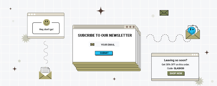
What Is An Email Popup?
An email popup is a form that pops up to ask a website visitor to enter their email address and other information such as their name, gender, age, location, etc. The form can pop up as soon as the customer visits your site or be timed to pop up at a predetermined time after they land on your website.
Do Email Pop-ups Work?
One might be unsure if pop-up email forms effectively grow a subscriber base. But surprisingly, they do quite a good job. Conventional thinking may persuade you that users will not submit their email addresses after seeing a box that interrupts their website experience. But, in reality, email popups are one of the most effective ways to grow an email list.
Using them correctly can be a compelling way to engage with customers and generate leads. In fact, a study revealed some fascinating insights concerning popup form conversion rates – the average conversion rate of all the popup forms included in the study was 3.09%. However, the top 10% of all popup forms tested converted at a rate of more than 9%.
Top 8 Types Of Email Pop Ups You Can Use Today
Let’s understand the various types of email popups you can deploy for your website.
1. Welcome Email Popups
These are half or full-screen pop-ups that slide above the page content. They are triggered when a visitor visits your website for the first time. It’s an excellent way to welcome visitors and introduce them to your products/services. Welcome popups bring the offer front and center. Hence, you can consider them, especially if the offer is highly relevant and important to your strategy. Otherwise, it may be too intrusive as it hijacks the user’s attention.
Examples of Welcome Email Popups:
- Newsletter Signup Popups
- Free Shipping Popups
- Discounts and Coupon Code Popups
- Social Media Follow Popups
2. Overlay Modals
These center-screen pop-ups show on top of page content, which is as close to the typical pop-up as you can get. However, unlike the welcome mat, overlays do not prevent the rest of the information from being displayed, but the user must click out of the pop-up to continue. While some users find overlay modals invasive, they can result in high conversion rates if the offer is appealing.
Examples of Overlay Modals include:
- Exit Intent Popups
- Time-on-Page Popups
- Scroll Trigger Popups
3. On-Click Pop-Ups
On-click pop-ups are a type of overlay modal that appears with a form when a user hits a call-to-action button or another page element. They’re ideal when an in-line form would clog the page, yet you want to reduce friction to a specific offer. Again, the UX is usually straightforward, lowering the conversion route friction.
Examples of On-Click Pop-Ups include:
- Contact Form Popups
- Subscription Popups
- Welcome Back Popups
- Downloadable Content Popups.
4. Gamified Coupons
Gamified coupons are another type of overlay modal that allows you to play a game for a discount or prize in exchange for the users’ information. They are great for fun ecommerce store branding and frequently take the form of a prize wheel or scratch-off ticket (since the coupon can then be applied at checkout).
Examples of Gamified Coupons include:
- Spin-to-Win Popups
- Scratch-Off Tickets
- Instant Win Popups
- Trivia Popups
5. Top Banners
These little banners, sometimes known as sticky bars, appear as a bar at the very top of the page, asking the visitor to take action on something. They have a more persistent conversion element than other forms of pop-ups and are best utilized for broad offers like newsletter subscriptions, coupons, or even general announcements.
Examples of Top Banners include:
- Newsletters
- Free Shipping Announcements
- Discounts and Coupons
- Product Announcements
6. Slide-In Boxes
Slide-ins are little boxes that appear from the page’s side or bottom, comparable to an overlay modal but with less intrusive behavior. These are ideal for displaying deals as the user scrolls through the page’s content. They can also be used for recent blog posts or other content elements.
Examples of Slide-in Boxes include:
- Product Offers
- New Product Launches
- Recent Blog Posts
- Promotional Content
7. Full-Screen Takeover Popups
These are the most intrusive of all email popup types, as they block out the entire page and require users to take action before they can proceed. They can be used to display special offers or geo-targeted messages but should be used sparingly not to alienate visitors.
Examples of Full-Screen Takeovers include:
- Geo-Targeted Offers
- Time-Sensitive Specials
- Contests and Giveaways
8. Embedded Forms
Embedded forms are a less intrusive email popup option, as they appear within the page’s content. They can be used to pre-fill information, update customer information, or capture user data. Embedded forms are ideal for reducing friction on conversion routes requiring more user information.
Examples of Embedded Forms include:
- Email Subscription Forms
- Contact Information Forms
- Shipping Address Forms
No matter which type of email popup you choose to deploy on your website, ensure it matches your brand and the context of your website. Every email
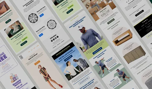
40 Email Pop up Examples
Many variables go into creating effective popup forms, which we’re going to show you in the examples below. Hopefully, one or more of these email pop up examples will inspire you to create a highly effective email popup for your own website.
1. The Iconic
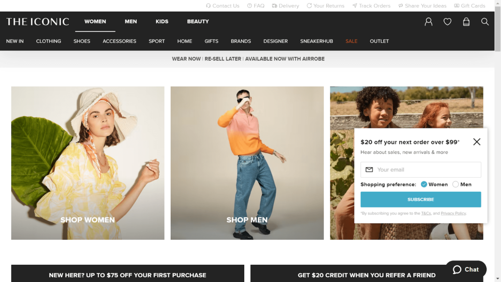
The Iconic is a large clothing e-commerce site based in Australia. When you visit their website, an email popup immediately shows up on the right-hand side of the screen. It’s an unobtrusive popup that offers the customer an immediate benefit of signing up to their email list in the form of a 20% discount. They also ask the website visitor to enter their content preference based on their gender. This is a good way to learn the subscriber’s gender so you’re able to send targeted and relevant content to them.
2. Bean Box
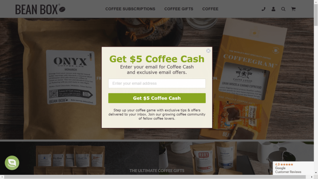
Bean Box is a coffee subscription service. Their email signup pop up form offers new subscribers a free $5 voucher to spend on coffee if they sign up, instead of a percentage discount. This email pop up form is well designed and makes it easy for the website visitor to understand the benefits of signing up. Bean Bag also mentions in the text in the form that subscribing makes the subscriber part of the “community,” which makes them feel as though they’re part of a like-minded group rather than just a subscriber to a website.
3. Big Tree Farms
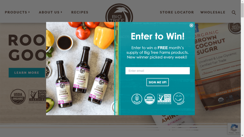
Big Tree Farms uses the chance to win a prize to entice potential customers to subscribe. For new brands, this can be a much more cost-effective way to get new email signups than having to offer discounts, which can eat into their margins. What we also love about their popup form is that they emphasize the benefits of their products (certified non-GMO, USDA organic, etc.) to customers who are highly likely to care about that information.
4. Sunglasses Hut
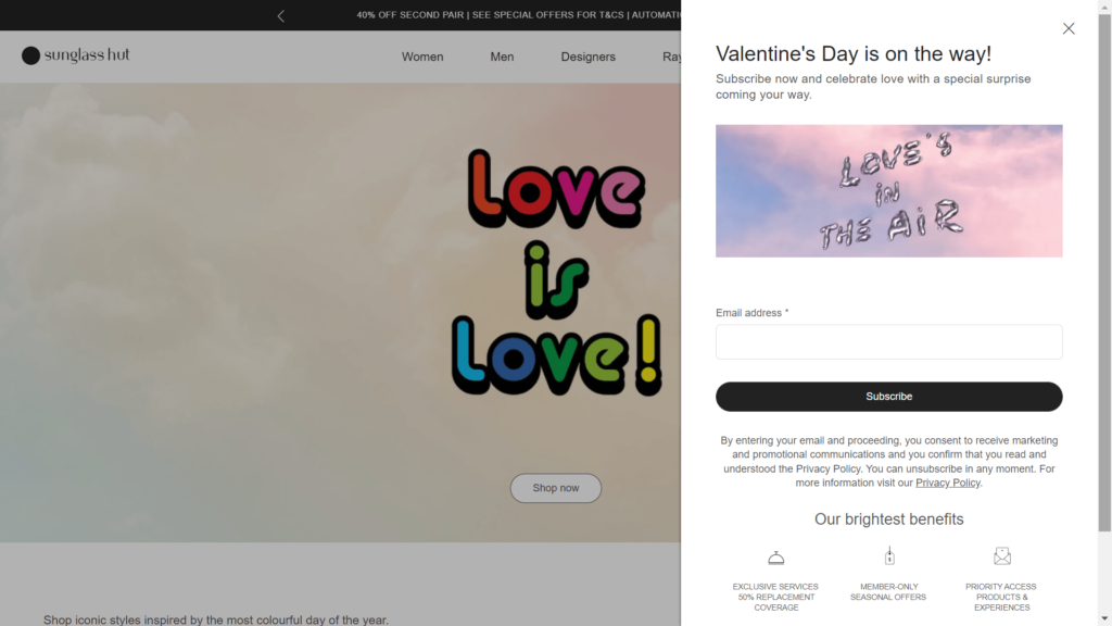
Sunglasses Hut, as the name suggests, sells sunglasses. Their email signup popup form appears on the right-hand side of their web page and can be closed by website visitors if they don’t want to subscribe. What we like about this email pop up example is how the company has used an upcoming event (in this case Valentine’s Day) to entice potential customers to subscribe. It’s a very simple form that highlights the benefits of joining their email list.
5. Chubbies
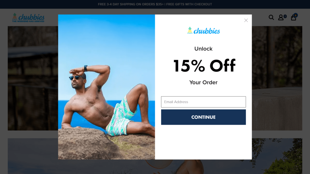
Clothing retailer Chubbies keeps their email popup super simple. When a customer lands on their website, the email popup appears and offers them a 15% discount to use on their order. Given that customers are likely to be visiting the website intending to make a purchase, or at least thinking about it, offering a discount encourages the customer to make a purchase. This is a great example of a simple, well-designed email popup that offers a clear benefit to the website visitor.
6. FashionNova
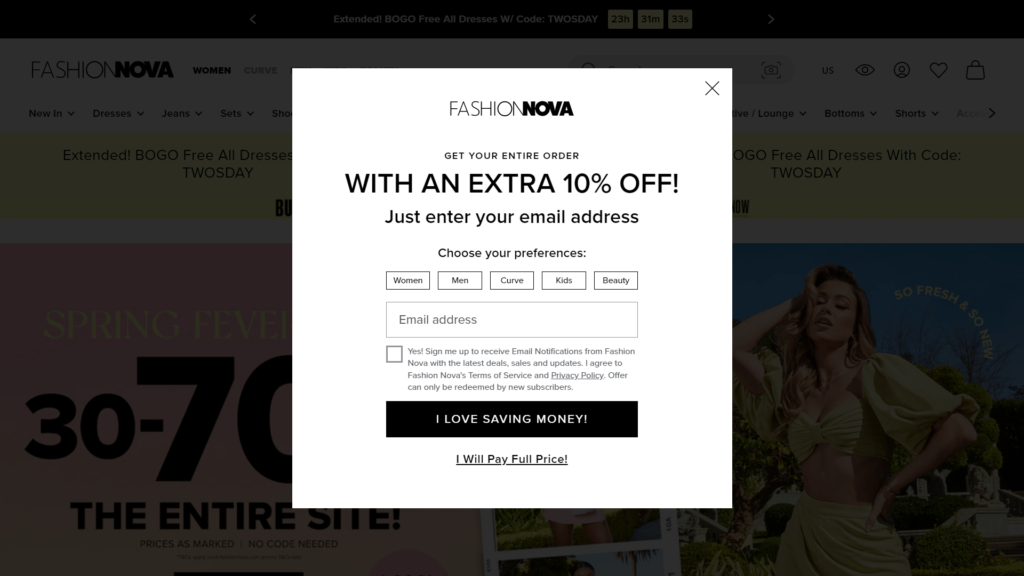
The email popup form on FashionNova appears as soon as a customer lands on the homepage. Subscribers are asked to provide an email address, choose which content they’re interested in, and permit the company to send them emails by ticking a box. In return for subscribing, the customer is offered a 10% discount to apply to their order. This is a good email pop up example of emphasizing a simple benefit in exchange for subscribing, which tends to work best. We also love how they have labelled their button “I love saving money” instead of using “enter” or “subscribe”.
7. Bensons for Beds
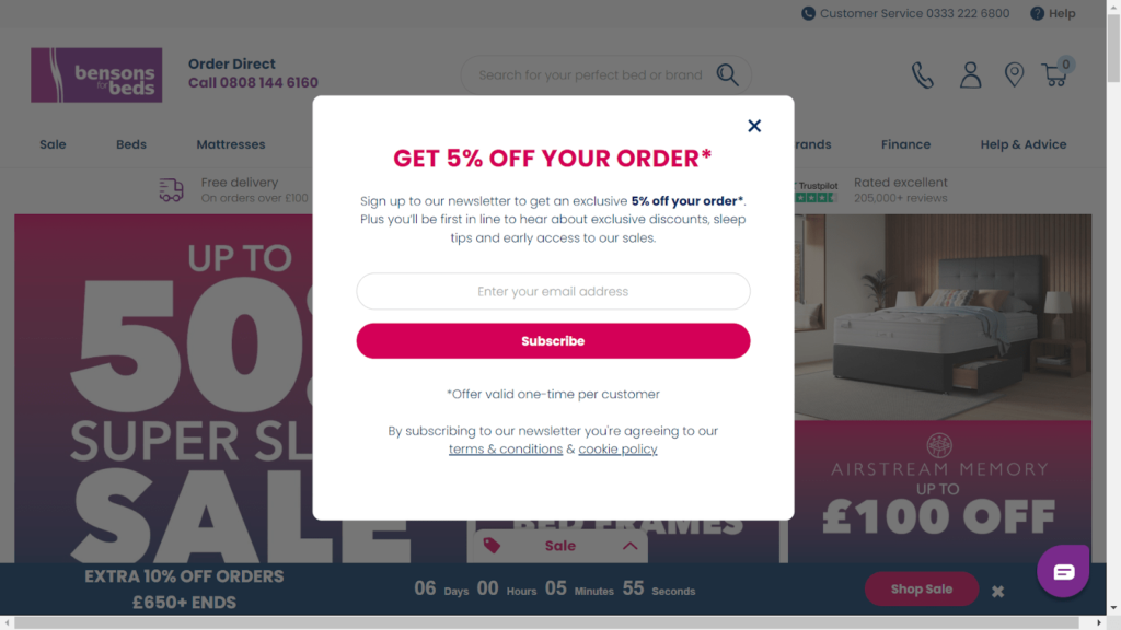
The Bensons for Beds website has an email popup that’s displayed after about 30 seconds from when the customer lands on the homepage. This allows the customer to have a glance at the website to be sure they’re in the right place before requesting they sign up for their email newsletter. The company offers subscribers a 5% discount on their order if they sign up, which is a little on the light side. But for high-price products like beds, this could be enough to entice customers to subscribe.
8. Manscaped
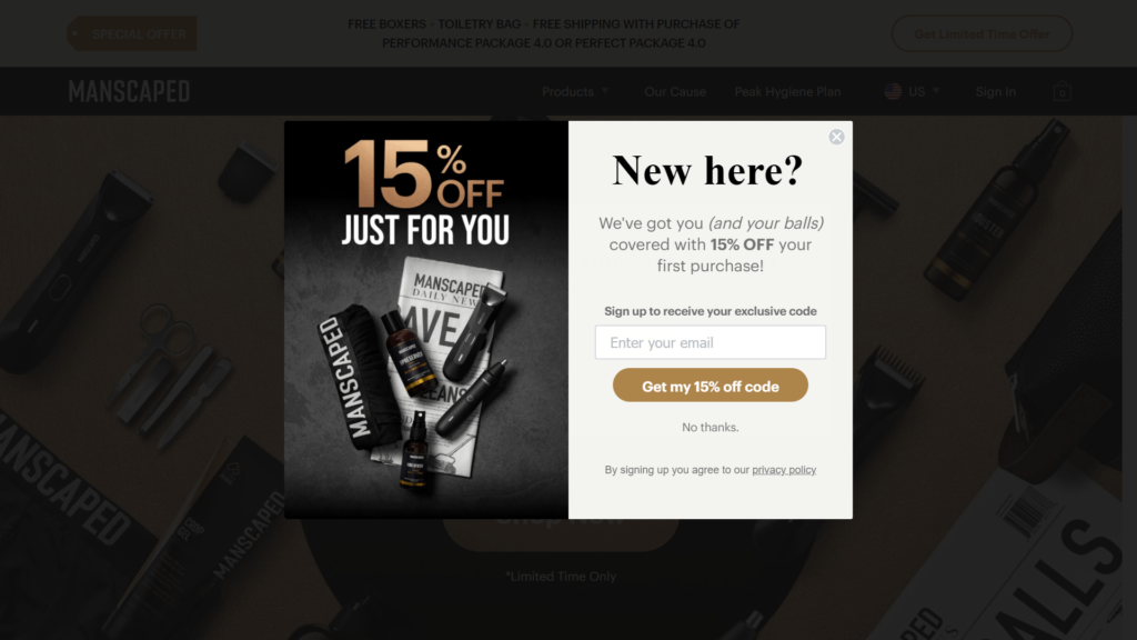
The email popup on Manscaped.com showcases their brand by having the main title “15% discount just for you” set above a photo of their products. The text uses humour to make the website visitor feel at ease while at the same time explaining the benefits of subscribing. This popup form appears in the centre of the page, with the background blackened out so the form is front and centre. This makes the potential subscribers focus on the form as they’re not distracted by images in the background.
9. The Kombucha Shop
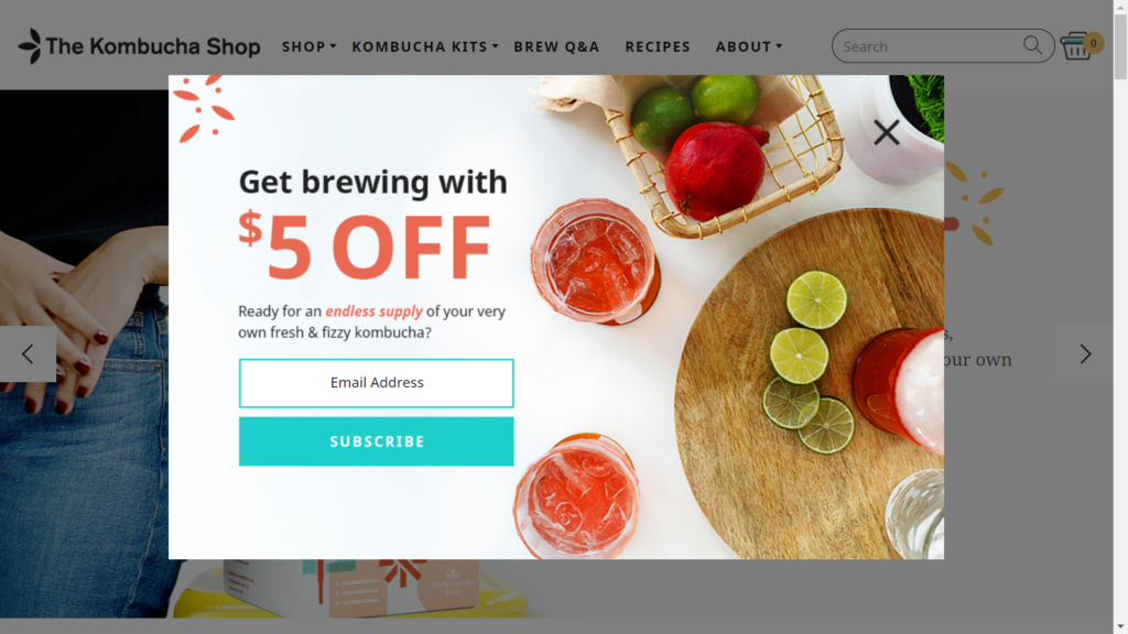
The Kombucha Shop email popup is another example of a slick and simple form that only requests an email address from the website visitor and in exchange gives them a $5 discount off their next order. By using bright and beautiful images of their product within the form, the company also highlights their products and brand, which helps reinforce to the customer why they should sign up.
10. MNML
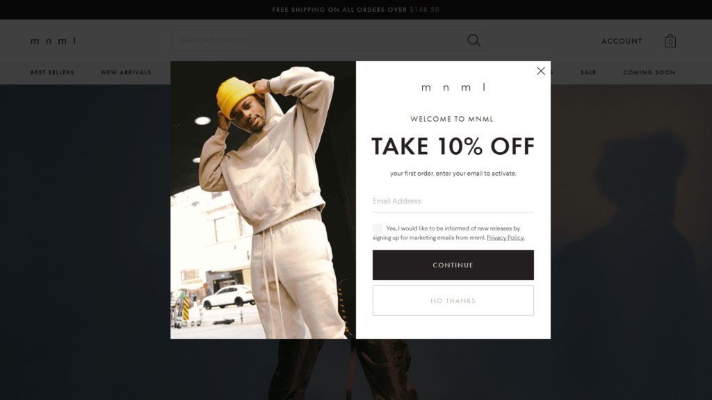
MNML is a hip fashion brand for men. This email popup form is super simple and appears in the centre of the website to ensure the visitor is focused on it. The company offers a 10% discount to entice people to subscribe, which is known to boost subscriber numbers. We like how the form is branded using the same colours and fonts as the rest of the website, which results in a slick design that isn’t distracting.
11. Bodega
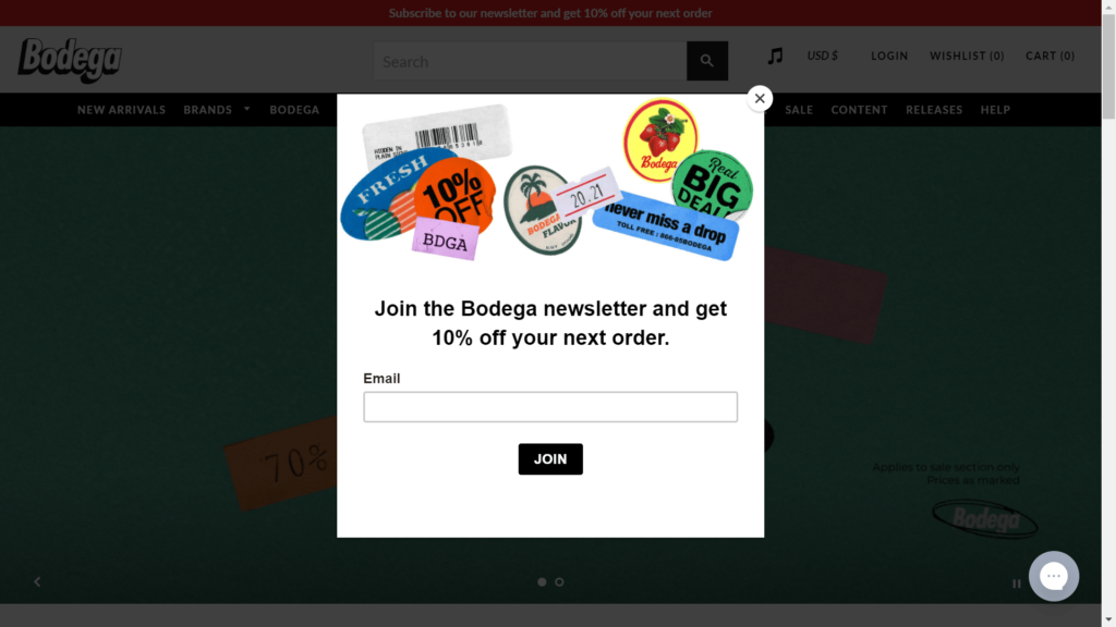
Bodega has a super-simple email popup form that displays their products at the top and then explains why the customer should subscribe (to get their newsletter and a 10% discount off their next order). We like how this form is kept simple and doesn’t distract the website visitor – signing up is the main focus.
12. Rachael Hartley Nutrition
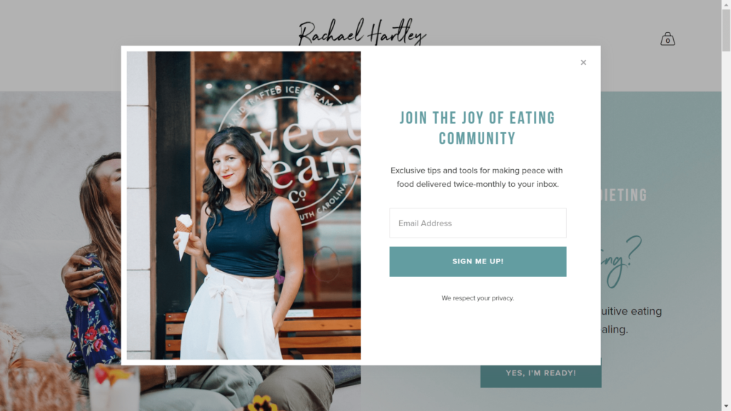
Rachael Hartley Nutrition is a lifestyle website that combines content with e-commerce functionality. This email newsletter popup example emphasizes joining a community with membership giving website visitors the benefit of access to exclusive content. Using the term “community” makes the subscriber feel part of a group more so than just being a subscriber to a company’s email newsletter.
13. Ridge Wallet
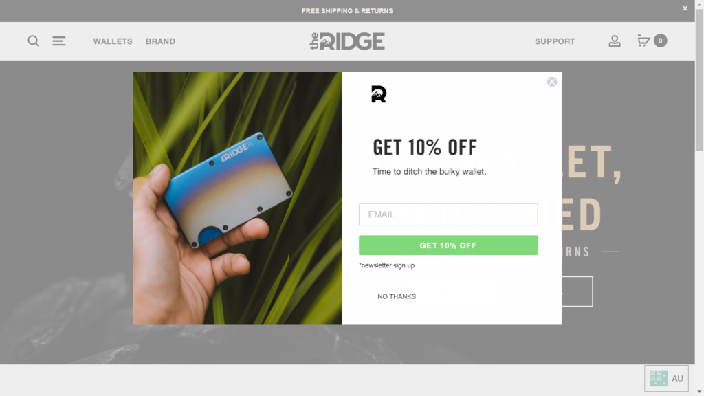
RidgeWallet keeps it simple. The title in the popup lets the reader know the benefit of signing up (a 10% discount) and the text underneath the title (“Time to ditch the bulky wallet”) reminds the website visitor of the benefit of their product. This helps reinforce why they should subscribe as they’re most likely on the website because they’re interested in buying the product.
14. Bulletproof
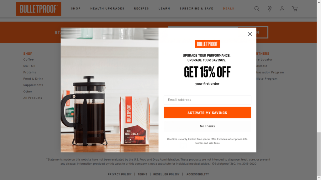
Bulletproof sells a range of health supplements. When you visit their website, this email popup form is displayed after about 30 seconds. It offers the visitor a 15% discount on their first order in exchange for subscribing. We like how the form is branded in the same colours and fonts as the rest of the website, and the use of “Activate my savings” for the button reinforces the benefit of subscribing.
15. Black Tailor
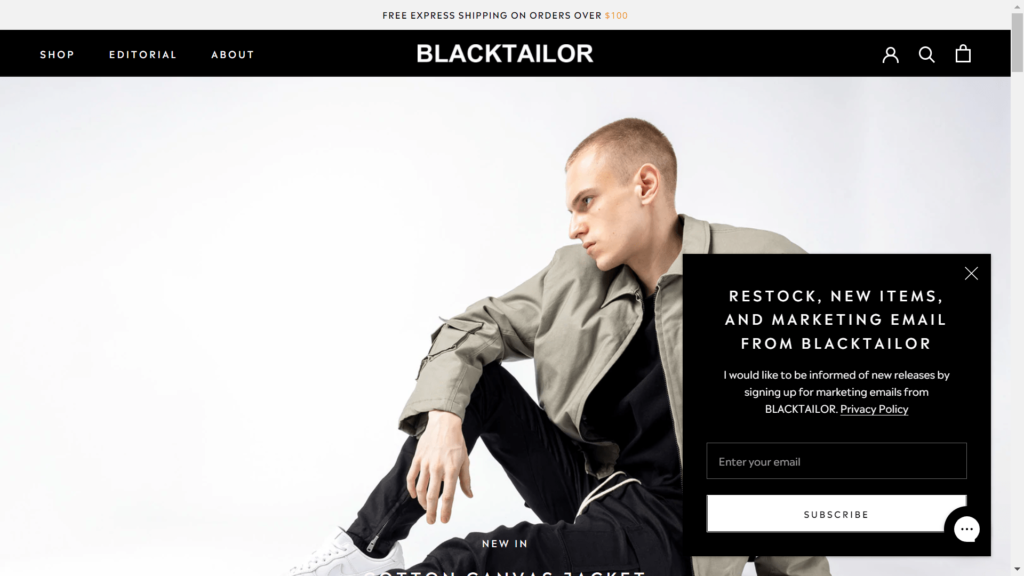
The email popup on Black Tailor appears on the lower right-hand side of the web page, which makes it unobtrusive so the visitor can continue browsing the website without having to close the form first. We like how the text at the top of the form clearly states the benefits of signing up and the color scheme of the form is in line with the website as a whole so it looks professional.
16. FanJoy
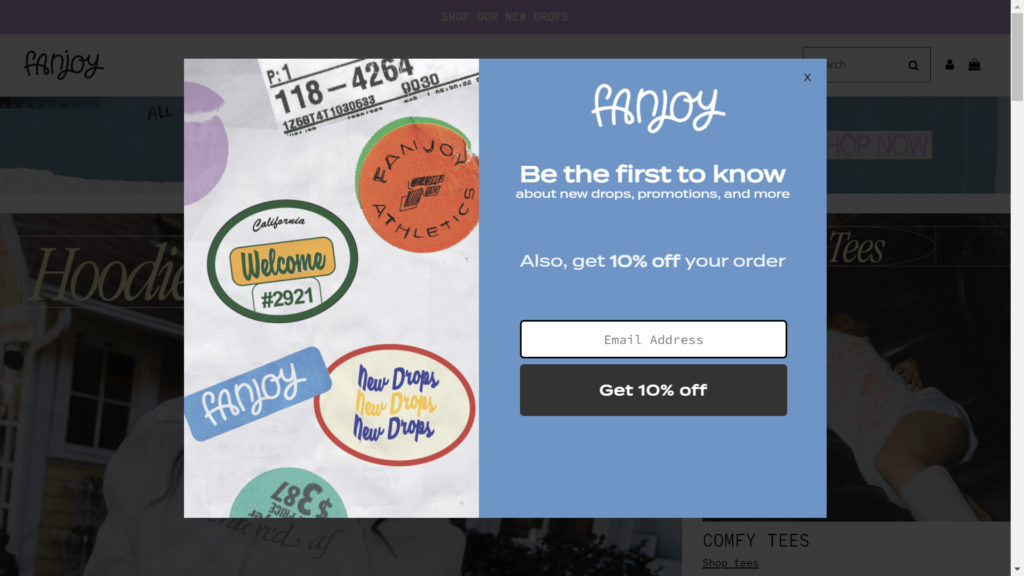
The email popup on Fanjoy states all of the benefits of signing up to their email list, from receiving information about new products and promotions to offering a 10% discount. After reading all of the benefits, the website visitor is going to be more motivated to subscribe. We also love that the signup button reinforces the discount by being named “Get 10% off”.
17. Haven
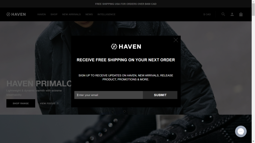
Instead of offering discounts, Haven offers subscribers free shipping as a reward for subscribing. In addition to the offer, they make clear the benefits of subscribing, such as receiving alerts when they stock new products and learning about promotions.
18. Heatonist
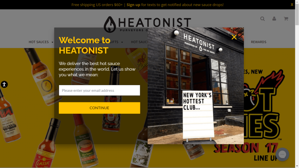
The email popup you’re presented with on Heatonist is a great newsletter popup example of a well-designed form that appears in the centre of the website as soon as a potential customer lands on the homepage. By showing the sign with “New York’s hottest club” on the left-hand side of the form, they’re reinforcing to subscribers that they’re joining a club/community and not just an email list.
19. UnTuckIt
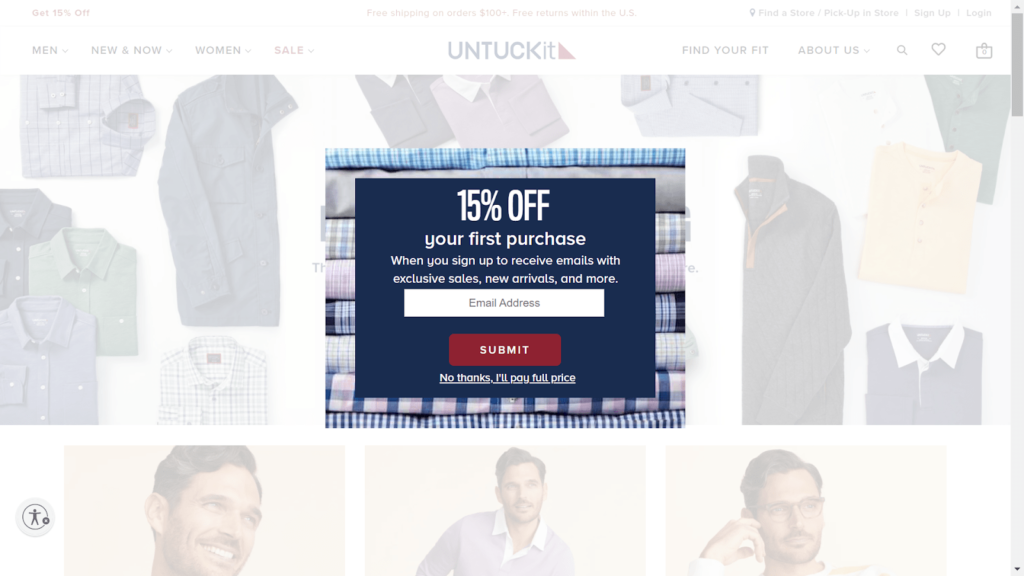
The UnTuckIt example above is another email sign-up pop-up form that uses discounts to entice subscribers to enter their email addresses. It’s a super simple form that keeps the process of subscribing easy. We like the use of “No thanks, I’ll pay full price” as the text for customers to click if they decline to subscribe as it reinforces the benefit of subscribing.
20. Lack of Color
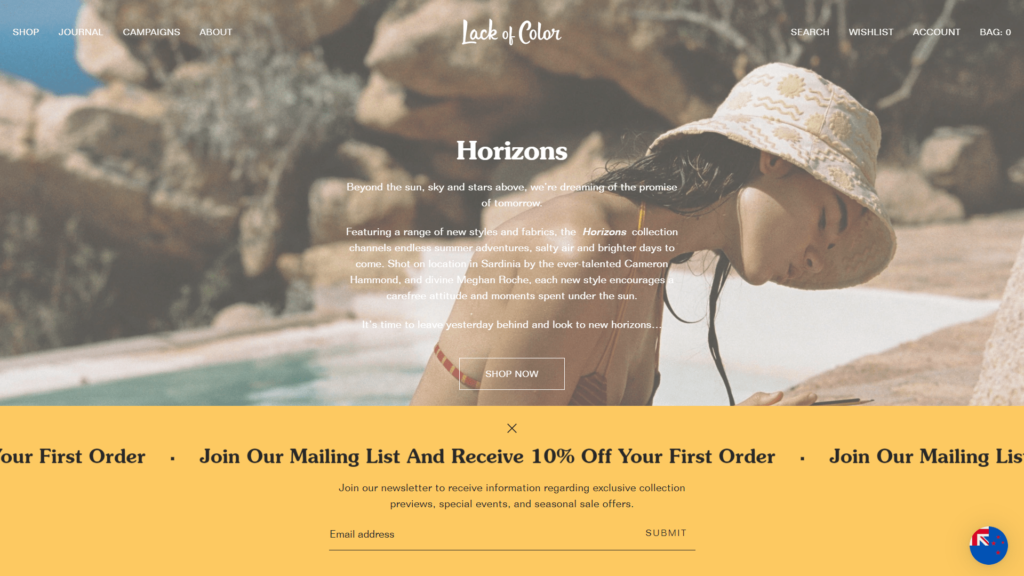
Lack of Color takes a different approach to the usual middle of the page popup form, instead of showing customers a popup at the bottom of the page, which can be closed if they’re not interested. The company offers a discount to subscribe and they keep the form very simple.
21. Monto
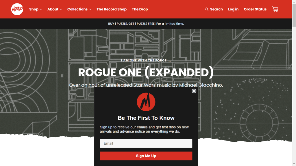
Monto doesn’t offer potential subscribers any discounts to sign up to their email list. Instead, they entice the subscriber by offering first access to new products and upcoming events. This makes the subscriber feel special by having access that others don’t have.
22. King Ice
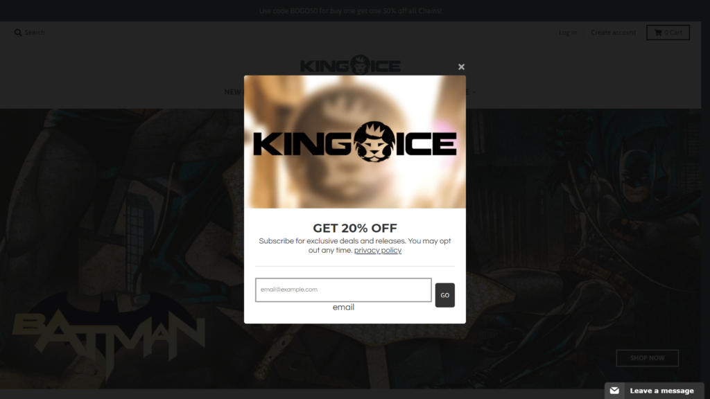
King Ice offers new subscribers a large 20% discount to subscribe to their email list. We like the simplicity of their popup form and how they state that subscribers can “opt out anytime” on it. This tells potential subscribers that if they don’t like the emails they receive from the company they’ll be able to easily unsubscribe at any time.
23. Super Natural Kitchen
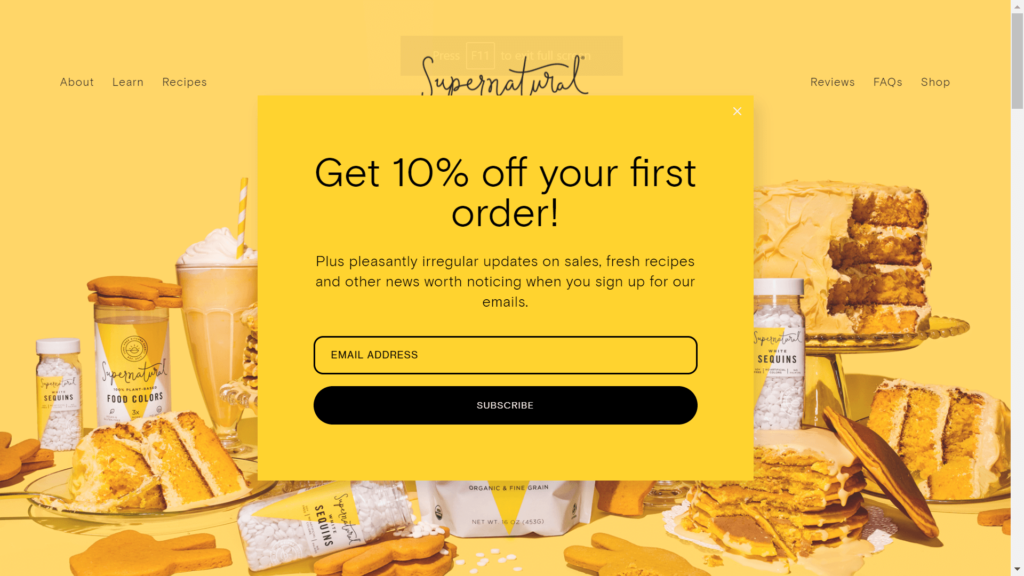
Supernatural Kitchen produces a range of food products. Not only do customers get a 10% discount for signing up, but they’re also promised exclusive access to recipes. This is a good example of using relevant content for branding (in this case food) as an enticement to subscribe. We like that the popup doesn’t block out the whole website so the visitor can still see the products in the background.
24. UpNature
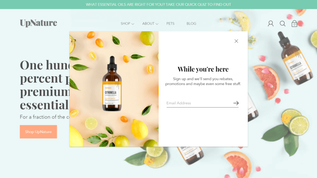
Essential oils e-commerce site UpNature offers potential subscribers the chance to win free stuff as opposed to being offered discounts. The company also offers the subscriber the ability to receive news of new promotions. We like how this email pop up form clearly states the benefits of signing up and that it has a minimalist layout.
25. Sous Chef
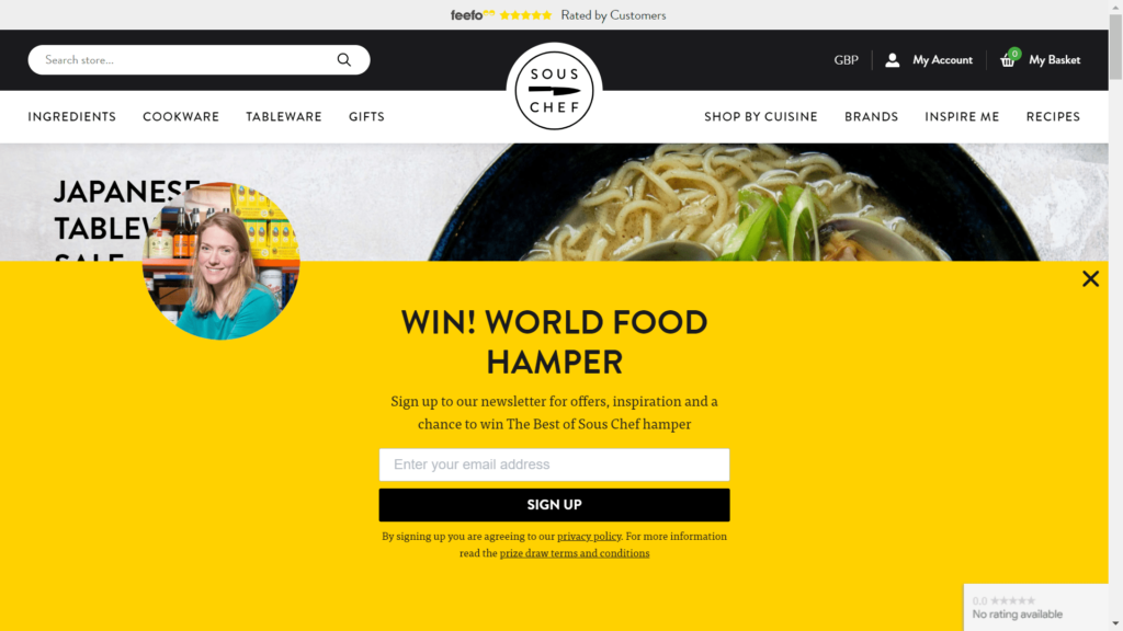
Sous Chef is a UK-based website that combines content with an e-commerce shop that sells cookware and other kitchen utensils. In their email signup pop up form, they offer all new subscribers a chance to win a prize (a food hamper), which for smaller retailers can be a less expensive alternative to offering all new subscribers a discount.
26. Tsubi Soup
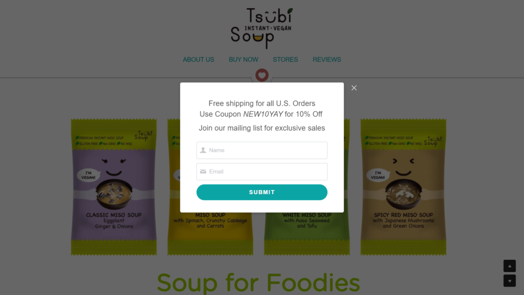
Tsubi Soup offers a range of vegan soups that are sold online in the USA. In their email popup form, they give the subscriber a deal code to use without making them subscribe first. This builds trust with the subscribers and makes them more likely to subscribe to get future deals.
27. Cap Beauty
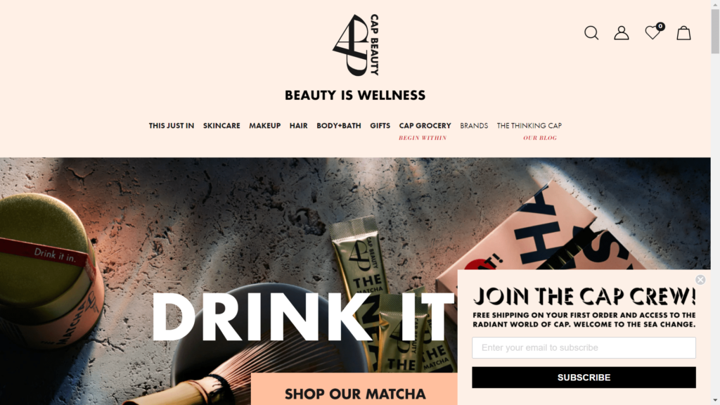
The email popup on Cap Beauty’s website is another example of an unobtrusive popup form that appears in the lower right-hand corner of the web page as soon as a visitor lands on their homepage. If website visitors aren’t interested, they can easily close the form and get on with browsing the website.
28. Natori
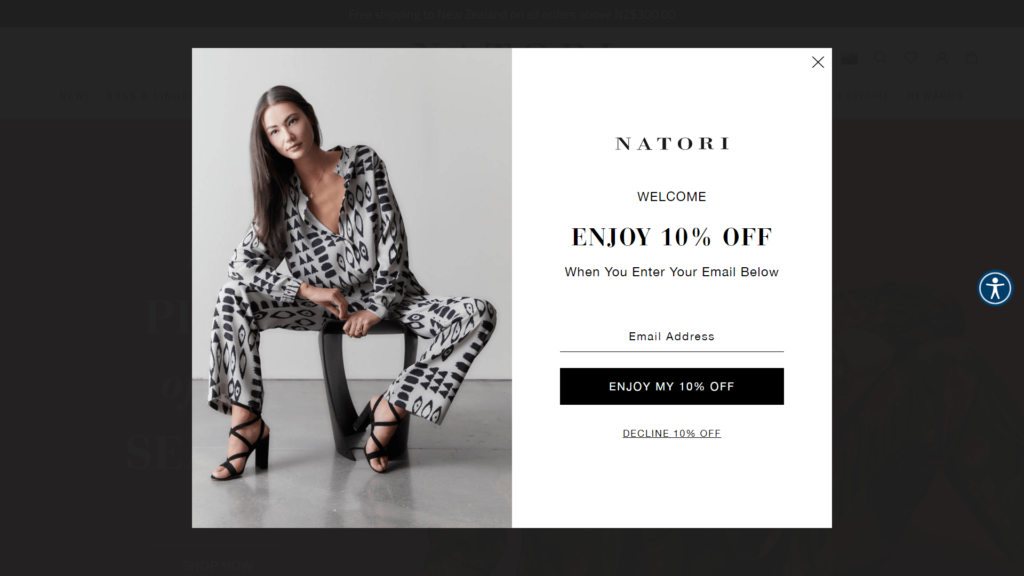
The popup on Natori.com is another excellent example of a simple yet powerful email popup form. They clearly state the benefit of subscribing (10% discount) and reinforce this by using “Enjoy my 10% off” on the subscribe button. Underneath the button, it says “Decline 10% off,” which makes the website visitor think twice about closing the popup without subscribing.
29. Tommie Copper
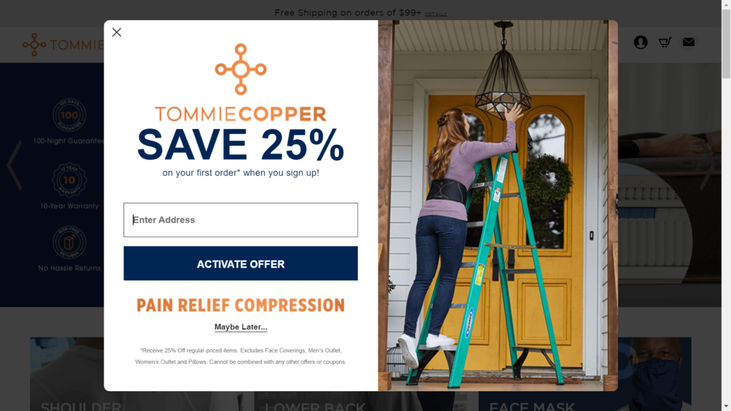
Health and performance clothing retailer Tommie Copper offers email subscribers 25% off their first order. We like the simplicity of this email popup form and how it clearly states the benefit to the subscriber of subscribing. The use of “Activate offer” as the button text is a great way to reinforce to the customer that they are receiving a benefit by signing up.
30. Body Bliss
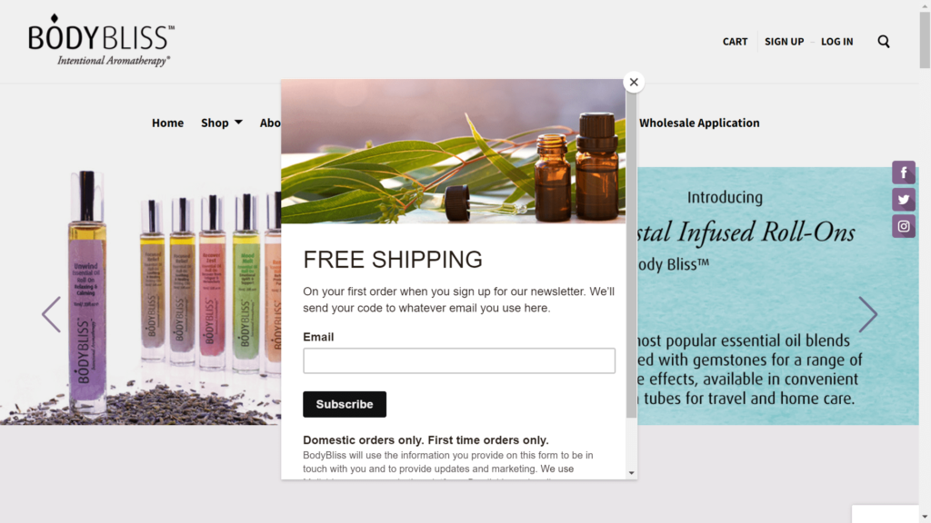
Body Bliss focuses on promoting free shipping in their popup form as opposed to offering big discounts or the chance to win a prize. This form is another example of a simple, straight-to-the-point popup form that clearly states the benefits of subscribing.
31. Black Diamond Equipment
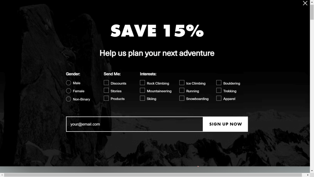
Black Diamond Equipment has decided to get more in-depth information from website visitors. They ask for the visitors’ gender, content preferences, and even ask the visitor to select some of their interests related to the types of products the company sells. This means the company receives more detailed information about each subscriber so they can better target their prospects.
32. Burrow
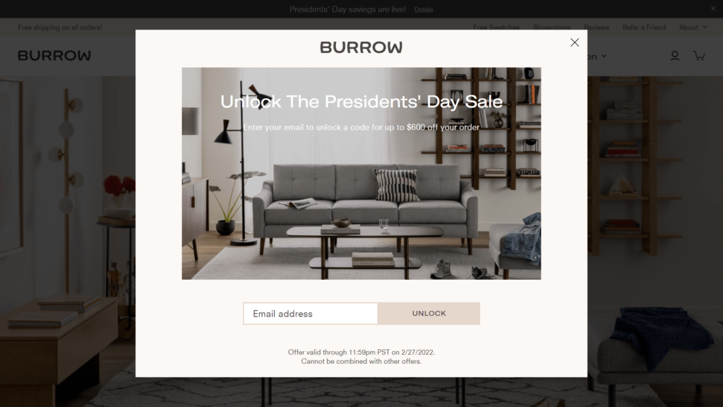
Burrow uses a promotion around a specific event (the President’s Day holiday in the USA) to entice website visitors to sign up for their email newsletter. The time-limited offer creates a sense of urgency for the potential customer to sign up.
33. Revelry
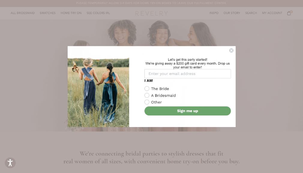
Revelry is an e-commerce store for brides to find the perfect wedding dress and dresses for bridesmaids. What we like about this popup form is the way they can capture the intention of the website visitor, whether they be a bride, bridesmaid, or other. This means they can send out more targeted email communications.
34. Sugarboo & Co.
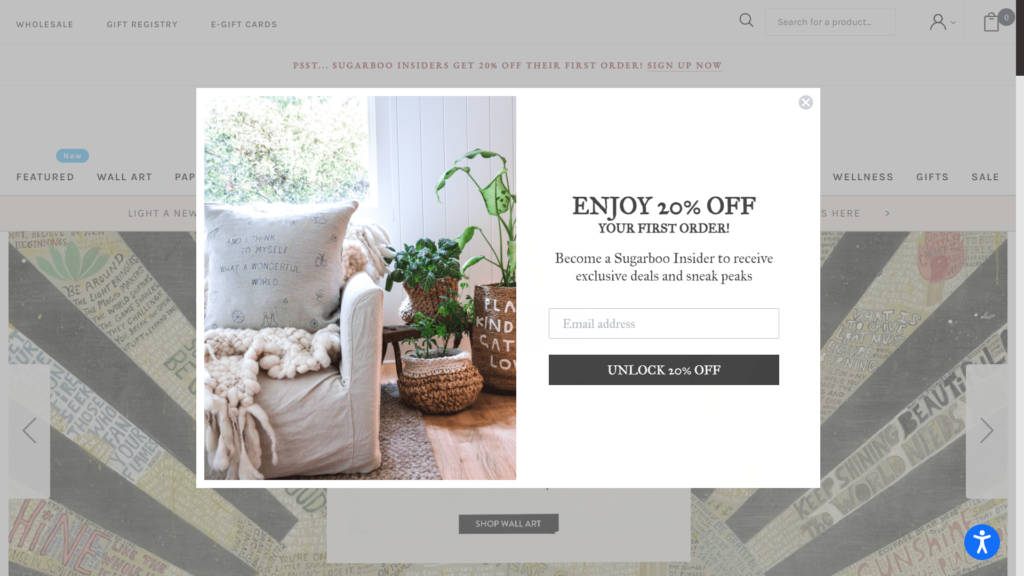
Sugarboo & Co. offer subscribers access to special deals as well as “sneak peaks” at new products. This provides clear benefits for the website visitor to sign up. We love the use of “Unlock 20% off” as the button text to reinforce to customers the main benefit of subscribing.
35. Molton Brown
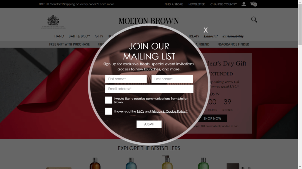
Molton Brown asks subscribers for their full name, their email address, and for them to agree to receive emails by ticking a box. Depending on what products you sell, it can sometimes make more sense to get more information from the subscriber upfront even if it risks fewer customers signing up.
36. Anchor & Crew
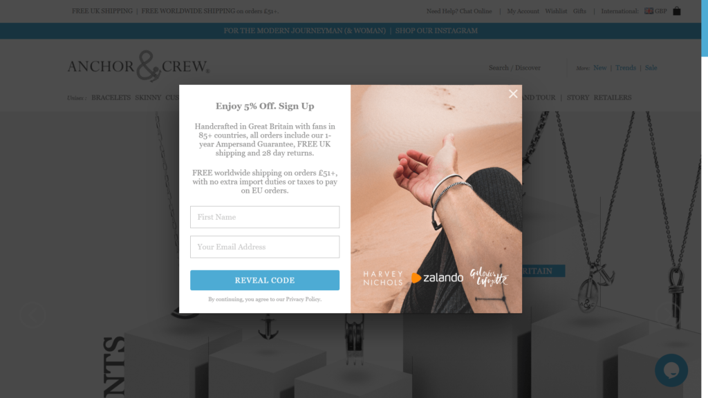
The email popup on the Anchor & Crew website clearly lets the potential customer know the benefits of subscribing (5% discount) and also takes advantage of having the attention of the customer to highlight some important information about their brand.
37. Autograph Foliages
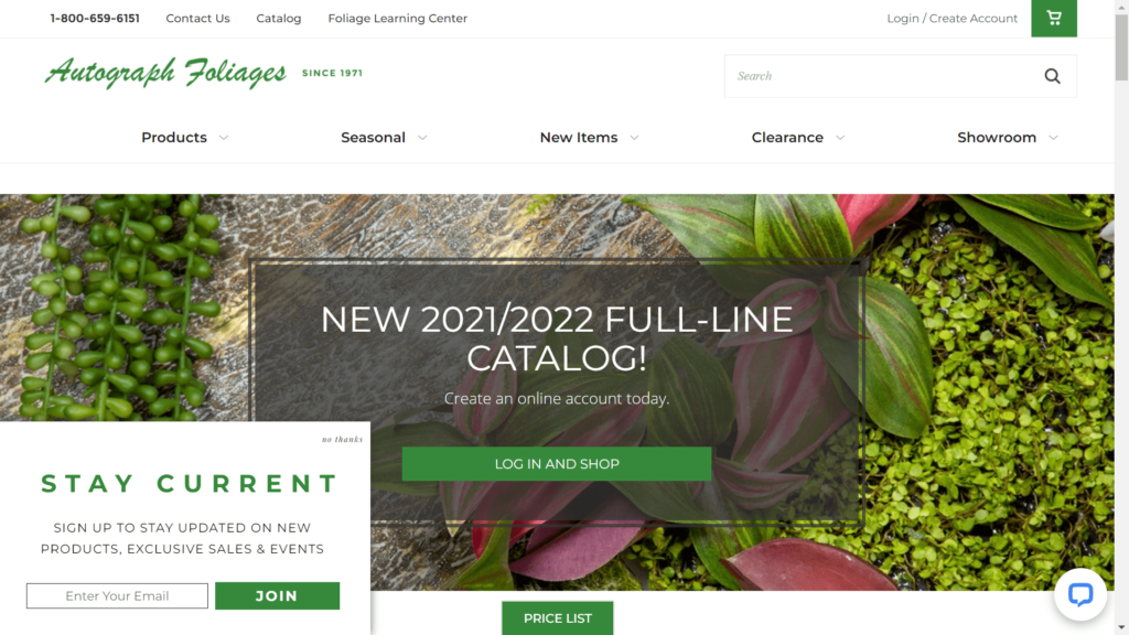
Autograph Foliages’ popup is another email pop up example of a simple and noninvasive form. It clearly states the benefits of signing up (staying informed about new products, sales, and events) and gives visitors the option to politely decline the invitation with a “No thanks” button. Having a less aggressive approach when attempting to capture subscribers might not be the best approach for all e-commerce stores, but it works quite well for the types of specialty products that Autograph Foliages offers.
38. Gubi
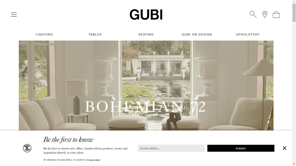
The email popup on Gubi’s website appears at the bottom of the webpage as soon as website visitors land on their homepage. Instead of offering discounts and freebies, the company emphasizes access to exclusive offers and content to entice the subscriber to join. It’s a great example of a simple and sleek form that isn’t intrusive.
39. US Mattress
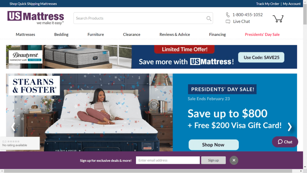
The email popup form on US Mattress’s webpage is perhaps the simplest on our list. But sometimes simple works best so we thought we’d include this one. When you visit their website, this form appears on the bottom of the webpage within 60 seconds. It offers subscribers the ability to receive exclusive deals in exchange for subscribing.
40. Goldbelly
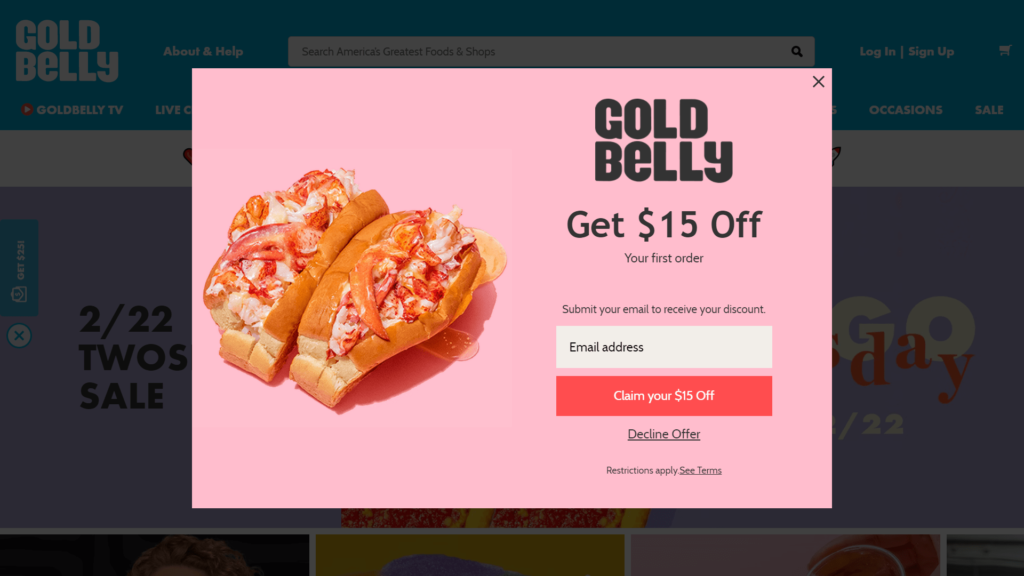
Goldbelly is a marketplace for chef-made meal kits. What we like about this email popup is the simplicity and how it offers a clear benefit in the form of a $15 voucher in exchange for the website visitor’s email address. The use of “Claim your $15 off” as the button text is a great way to reinforce the benefit that the subscriber is receiving if they sign up.
Email Pop-up Best Practices
To get the most out of your email pop-up forms, there are certain best practices that you should adhere to:
1. Nail Your Targeting and Segmentation
Timing is one of the critical components when planning pop-up messages. Presenting the popup message at least 10 seconds after a website visitor has opened your company’s webpage is ideal. Then you can design different pop-ups for different points in a visitor’s journey. Consider timing a pop-up for:
- Visitors who are just browsing through the site
- Visitors who are about to leave the site
- Visitors who travel to a specific page of the website
- Visitors who are scrolling to a particular place on a webpage.
Segmenting pop-ups to make them more relevant is also essential. Visitors from specific regions or sources should be targeted with messaging that matches their beliefs, situational understandings, and desires. To boost customer retention and growth, your company can generate different email pop-ups for new and returning visitors. If your brand is unsure how to time pop-ups or identify audience segmentation, you can run A/B testing to find the most effective messaging for diverse client groups.
2. Pay Emphasis To The Words/Copy You Choose
Copy exists for the sole purpose of creating impact. Therefore, the message should always be concise and have a clear call to action. For example, suppose a visitor intends to leave your company’s website. In that case, a pop-up informing them of the products they left in their cart and a free shipping offer may entice them to stay and complete their purchase. Each pop-up should be built to eliminate the many concerns visitors may encounter while engaging with your product or service.
The benefit that a website visitor can get should be the first thing they read on the pop-up. Such as:
- Encourage them to join the club by leveraging an opportunity to be included in an exclusive community.
- Create a sense of urgency in the reader to follow the instructions on the pop-up.
- Establish a sense of trust with the reader. Many successful marketing campaigns, for example, use humor to promote a sense of community and shared values.
- Emphasize the significant benefits users will receive from subscribing to your company’s emails and look for calls to action that go beyond “submit.” A pop-up may, for example, ask the reader to click a button that says “count me in” or “claim my surprise.” This will entice the user to engage in the said action.
3. Use Compelling Visuals
An illustration immediately immerses users in the theme, sets the tone, and aids in conveying the essence of the text. A proper image will influence the conversion rate by increasing the number of content views and email clicks. A strategically chosen picture can capture a viewer’s attention, reinforce membership benefits, and convince a potential subscriber that their contact information is secure.
Pop-ups can prove visually successful when:
- Displayed with photos of team members to foster a sense of human connection or photos of the product to persuade the visitor to buy them
- Using logos of other subscribing firms could act as social proof to convince potential subscribers to take action.
- Incorporating the company’s color theme and overall design in the pop-up to create brand recognition.
- Using GIFs or animations to create a sense of excitement and encourage conversions.
4. Make Incentives Irresistible
“An incentive is a bullet, a key: an often-tiny object with astonishing power to change a situation.” -Steven Levitt
Everyone’s drawn towards rewards. Incentive emails are the collection of emails you intend to send whenever you offer a new product or promotion. These emails will contain enticing incentives and special offers such as discount codes, coupons, or free delivery in the email pop-up. This will facilitate in generating more email leads.
By conveying the offer in the email popup on your website, you can encourage visitors to share their email addresses in exchange for a reward. This way, an incentive will be created to motivate them to see what you have in store for them.
Some of the most popular sorts of incentive email popups to create excitement among recipients are:
- Festive/ seasonal discounts: Offer festive discounts, such as Black Friday or Christmas promotions, to drive sales and spike engagement.
- Loyalty program: Encourage customers to sign up for loyalty programs or reward them with points whenever they purchase a product or service.
- Exclusive discounts: Offer exclusive deals to customers who subscribe to your email list, for example, 10% off for the first order.
- Flash sales: Create a sense of urgency among customers and encourage them to purchase the offering quickly by providing limited-time flash sales.
- Free trials: Give customers the opportunity to experience a product or service before they commit to it. This helps in building trust and loyalty.
- Promo Code with offers: Promo codes can help you get more attention from potential customers and give them an irresistible chance to try out your product.
- Inspiration for Referrals: Encourage customers to refer their friends and family for a discount or reward.
- Buy one, get one free: Offer customers the opportunity to purchase two items for the price of one. This increases sales and encourages them to explore more.
- Free subscription for a limited time: Give customers access to a free subscription for a limited time to entice them to sign up.
These email popups can be used to welcome new visitors to your website Alternatively, you can encourage existing customers who have just abandoned their cart without purchasing to return.
5. Leverage Exit Intent Strategically
Did you know that 95% of visitors who leave your site will never return?
Using an email popup triggered by exit intent, you can convert an additional 2-4% of visitors into email subscribers and, eventually, customers. Exit intent does not always trap visitors. They can still close the popup and leave without disclosing any information. It just allows you to have one last interaction with the visitor before they go.
And more often than not, visitors might linger just enough to respond to the offer when they see a popup while leaving the site. Exit intent is a powerful component that has been shown to be effective in retrieving abandoned users.
For instance, Fastrack regained 53% of abandoned visitors and increased sales using exit-intent marketing. Also, consider Medstar Media, which reported a 500% increase in conversion rates after implementing lightbox popups triggered right before users left the site.
The bottom line is that if you’re not using exit-intent popups, you’re missing out on retaining potential clients.
Some tips to perfect your exit-intent email popups:
- Use a relevant headline: Your headline is essential to the popup. It must be interesting enough to stop the user in their tracks and persuade them to take action.
- Concise content: Keep the text on your popup short, sweet, and to the point. Users tend to lose interest quickly, so don’t drag it out.
- Time it right: Timing is everything. Place your popup at the right moment, when visitors are about to leave your website and not even a second before.
- Device compatibility: Optimize your popups for all devices. Make sure they look good and work well on mobile, tablet, and desktop.
- Calls-to-action: Use clear calls-to-action to guide visitors to the next step. Make them simple and easy to understand.
6. Enable Pop-ups With Dedicated Landing Pages
Fullscreen email popups provide you with many options and space to show off a fantastic design that will truly impress your visitors. A wonderful approach to accomplish this is to convert a full-screen email popup into a landing page.
A landing page is designed to focus on a single, extremely focused call to action. It’s a great lead generation technique because visitors aren’t distracted by anything on a typical home page; they’re just encouraged to enter their information in exchange for your offer.
When visitors click on the CTA in the popup, they are directed to a full-screen landing page. The landing page provides additional information and encourages visitors to sign up, buy, or download your offering.
This strategy generally involves a soft secondary CTA (on the popup) that leads to a hard CTA (on the landing page). For example, if you have a free ebook offer, the popup might say: “Learn More,” whereas the landing page could contain a stronger message such as: “Download Now.”
This lets visitors learn more about your offer before making their final decision. It also reduces friction, as the visitor does not have to fill out a form twice.
7. Fish For Visitor Feedback
A popup-based survey can be a great way to obtain valuable information from your visitors. This is especially true if you use a survey that appears only when the user has already spent some time on your website.
Survey popups are effective because they allow visitors to provide feedback without interrupting their experience. You can also use survey popups to ask visitors what kind of content they would like to see on your site and what other topics they are interested in.
Typical benefits of popup-based website surveys include:
- Learn how the visitors interact with your site.
- Determine potential issues that are impeding conversions, leads, and sales.
- Obtain immediate feedback from visitors on your website design and content.
- Improve customer service by addressing issues quickly.
- Get an insight into visitor sentiment towards your brand, products, and services.
- Interacting with visitors before they leave your site can help you reduce site or cart abandonment and enhance conversions.
- Divide your visitors into groups for future digital marketing campaigns.
- Expand your email lists by pairing the popup form with an incentive.
8. Diligently Test Your Popups
Testing or having a run-through is essential before putting anything out for the customers. It is wise to test basic elements such as layouts, button colors, and form design. Additionally, testing a popup’s timing is crucial to help you plan better.
Drip experimented with increasing the conversation rate for their blog’s email popup. Here, the original popup (the control) had a time-based trigger, meaning it showed seven seconds after a user visited a blog post. The experimental popup, however, had a scroll-based trigger, meaning it showed after a reader scrolled 35 percent down the page.
The result was surprising. The experimental, scroll-based popup outperformed the control by 62 percent. Of course, the popup was the same, but the timing made a huge difference.
In sum, always test your popups’ timing. You might be surprised by what you learn about your visitors’ behavior and how they interact with your website.
9. Tailor For Mobile Experiences
Many marketers avoid installing popups on mobile due to the fear of violating Google’s interstitials rules. But it’s not mobile popups themselves that are the issue. Instead, it’s how they’re employed.
The trick is to design a mobile-specific email popup. This includes the following:
- Limiting input fields: Mobile users have a hard time typing in emails. So, limit the number of fields to avoid fatigued thumbs.
- Using a top bar: Instead of a full-screen popup, you can use a mobile-friendly top bar. This will allow users to scroll down the page without interruption.
- Triggering based on scrolling: Popups triggered by a time delay (e.g., seven seconds) can be disruptive on mobile. Instead, use scroll-based triggers to avoid annoying visitors with an unexpected popup.
- Optimizing size: Popup buttons and other elements should be big enough for a finger-tip click. This makes them easier to use on mobile devices.
- Removing graphics: While a graphical popup might look great on desktop, it can slow down the page load time on mobile. It is better to use simple text and fewer graphics where possible.
- Create an engaging teaser: Keep the popup teaser short and sweet. The goal is to capture attention and get visitors interested in your offer without overwhelming them with information.
- Keep popups brief and to the point: Keep the number of words in your mobile popup to the minimum to avoid confusing visitors. Popup copy should be concise, consistent, and easy to understand.
- Use solid colors: To make your popup stand out, use a solid color that stands out from the rest of the page. This will help draw visitors’ attention and make your popup more noticeable.
- Eliminate background pictures: Background visuals on a smaller screen can quickly become overwhelming, making it difficult to read the popup’s text. Therefore, it is best to avoid using background images altogether and opt for solid colors.
With these tips, you can create a mobile-friendly email popup that doesn’t interfere with the user experience and is more likely to convert.
10. Deploy Conversion-centric Copy
Popups aren’t as effective as you’d like them to be if the copy isn’t written well. The most crucial copy elements in an email popup are:
Headline: The popup’s headline serves one purpose – to capture your visitors’ interest and persuade them to continue reading. Write an attention-grabbing headline, including an offer to which the visitors cannot say no.
Body Text: The body copy of your popup should motivate visitors to sign up. They must understand what is in it for them. Keep it short and tell visitors what they get in exchange for their email address. Nobody has time to read an entire novel about how fantastic your newsletter is. You can use specific incentives such as discounts, competitions, and freebies or just highlight the advantages of your newsletter.
Copy for a Call-to-Action: Your call-to-action copy is most likely the most crucial part of your popup. It’s your last chance to persuade visitors that signing up is the right thing to do. However, avoid writing “sign up.” Nobody signs up just to receive emails. Instead, they join because they value the information in the emails. Whether exclusive offers, inspiration, or freebies, convey this value in your CTA and let visitors know what to expect when they click the button. For example, to encourage visitors to sign up for a competition, try – “I want to win”- button, instead of the sign-up button.
11. Smartly Leverage Success Pop-ups
A success popup appears when a visitor completes the requested action on the main popup.
To continue generating visitors, add a success popup after your email popups. For example, thank the visitors and inform them that they have successfully subscribed to your email list. You may even place another call to action alongside the success notification to continue driving traffic to your website.
Examples of successful pop-up copy could be:
- “Thank you for signing up! Keep an eye on your inbox for updates and exclusive offers.”
- “You are now subscribed to our mailing list. Enjoy exclusive discounts and secrets!”
- “Congrats! You are now part of our exclusive community. Get ready for upcoming surprises!”
Your success popup should be simple and not require any extra effort from the visitors. Just provide them with a brief message that expresses your gratitude and encourages them to continue engaging with your website.
12. Segregate Pop-ups For New and Existing Visitors
Segment new and recurring visitors and design various popup campaigns for each. Why? Because it will annoy a visitor who has already subscribed to your email list via your signup popup.
Furthermore, you can use popups to present more personalized offers to new and returning users to boost your conversion rates.
For instance, you can create a special welcome offer for new visitors and present tailored discounts on specific products to returning visitors who already know your brand. This will help you to better engage with your visitors and create a personal connection.
13. Consider Less Aggressive Popup Types
It is always better to use email popups that are more subtle. The reason is simple – aggressive popups can be intrusive, which makes them counter-productive.
Instead of fullscreen popups or those that open immediately on page load, try using scroll popups. They are more subtle and appear only when the user scrolls to a certain point on the page.
Popups that use animation or slide in from the side are also less intrusive and can result in higher conversion rates.
In addition, you can try experimenting with Sidebars or Bottom bars. Sometimes, these popup types offer similar results with a lower risk of annoying visitors.
14. Use Teasers To Build Interest
The teaser is a little bar at the bottom of the screen that appears when your popup has not yet been triggered or after it has been dismissed. It’s a powerful tool for piquing visitors’ interest and drawing them to your offer while browsing your site.
You can use a teaser to ask visitors questions, highlight an offer, or suggest something humorous. Make sure your teaser is simple yet engaging.
For example, “Psst! Have you heard about our new product?” or “Hey there! Check out our exclusive offers!” These teasers create a subtle yet effective way to draw people’s attention and invite them to click the popup.
The popup must only appear on mobile when visitors click the teaser to deliver a smooth and user-friendly experience. This will help you build trust and ensure visitors don’t feel overwhelmed when visiting your site.
15. Keep Input Fields To the Minimum
The temptation to include several input fields in our popups frequently arises from our desire to learn about our audience as much as possible. However, having additional input fields minimizes the possibility of conversions. Often, an email address is all required to obtain value from a visitor. You have a direct line of connection if you have their email address.
Another, better way is to collect information with multistep popups. Here’s how they work.
In the initial stage, ask for the visitor’s name and/or email address. Then, in the following step, improve their lead profile by inquiring about their gender, interests, age, and other details.
What works best here is that even if visitors abandon the first step, you will still have their email address and any information they provided in the first step.
At the end of the day, remember to be mindful of how many input fields you ask your visitors to fill out. Too many fields will dramatically reduce the conversion rate.
Keep it simple. Ask for only the necessary information, and you will see higher conversion rates!
16. Use Trigger CTAs
Trigger CTAs are an incredibly effective way to engage visitors with your content. They help direct them to the right page and encourage them to take action.
Here, ‘trigger’ equates to the CTAs being clear in design and singular. Moreover, ‘action’ means adding a sense of urgency that encourages visitors to click on the CTA.
For instance, if you’re running a promotion asking your visitors to purchase before the end of the day, you can use this as a trigger CTA making it easier for them to decide on the spot.
Trigger CTAs can also be used in your popup design. For example, a message like “Before you leave, take advantage of our special offer!” can make visitors act on the popup immediately.
Try out different trigger CTAs, experiment with them, and see which ones work best for your site. This way, you can keep visitors engaged and push them down your conversion funnel.
By following these best practices, you can create an effective popup campaign that will help keep your website visitors engaged and help increase conversions. Next, try experimenting with different layouts, colors, and forms to find out what resonates best with your audience. Good luck!
For a deeper dive into the strategies behind effective signup forms and list-building optimization, explore Chapter 2 of our Introduction to Email Marketing Course — Building Your Email List the Right Way. It covers how to fine-tune popup timing, minimize form friction, and apply data-driven techniques to grow a healthy, engaged subscriber base.
The bottom line
Email popup forms are a great way to collect the email addresses of current and prospective customers so you can start communicating with them directly with news, offers, and more. To get the best signup rate, you usually need a well-designed form that highlights the benefit of subscribing to customers although as you saw above, there are some exceptions to this rule. Hopefully, these 40 email pop up examples has given you some inspiration for how you’ll display your company’s popup email form!