

Every email you send has a specific purpose. Is that purpose obvious to your recipients? Whether your email’s purpose is to drive an eBook download or a specific product purchase, the question remains:
How do you get recipients take your desired action?
While there are many factors—like the subject line, copy and design–which help to drive engagement, the call-to-action (or CTA) is the most important factor for prompting action.
CTAs provide clear direction as to what the subscriber needs to do next—and is ultimately a key driver in the success of your email campaign.
Maximize Your CTA
Three components play key roles in your CTA’s effectiveness: copy, design, and placement.
CTA COPY
With the advent of tablets, smartphones, and touchscreens, the concept of “click here” as CTA copy is somewhat antiquated. It also doesn’t provide value or direction in terms of usability. So, how should you approach the copy portion of your CTAs. Here are some ideas:
- Make sure the CTA states exactly what the recipient will get by clicking.
- Use strong action verbs in your CTA.
- Be specific and focus on benefits.
- Create a sense of urgency.
- Use numbers (when applicable) to denote discounts. (e.g. “Save 20% Now”).
- Be concise—5 words of less is ideal.
- Add first-person elements.
Suppose you have an eBook to offer to your email recipient. Good CTA copy might be:

CTA DESIGN
A well-designed CTA, irrespective of where it is placed in the email, succeeds in standing out. Let’s see what design options you might consider:
1. Button Type
Bulletproof buttons:
“Bulletproof” buttons are built with code instead of images. Using code means these buttons display in all email clients—even with images off.
Animated buttons:
Adding movement to your CTA (with animation via CSS) can draw the eye.
2. Shape
Rectangular buttons are common and effective. You can test using rounded corners on your rectangles to add some shape and depth.
3. Size
When it comes to CTA size, it can be as large as you want, provided it’s nicely balance with other elements in your email template. You should also consider a mobile-first design not just for your CTA but your template as whole—as more than 50% of opens and clicks are coming via mobile devices these days.
For mobile, Apple uses and recommends CTAs that are 44x44px. You should test your sizes to help find your ideal. (Longer may work better or worse for you.)
4. Color
CTA color can have a major impact on clicks and conversions. Vibrant colors that contrast with your template’s background can make your CTA more noticeable.
Ultimately, you’re likely to choose a color from your brand style guide. If you’re unsure, and it’s a good fit for your brand, try Blue. The chart below shows how effective blue can be in terms of driving clicks.
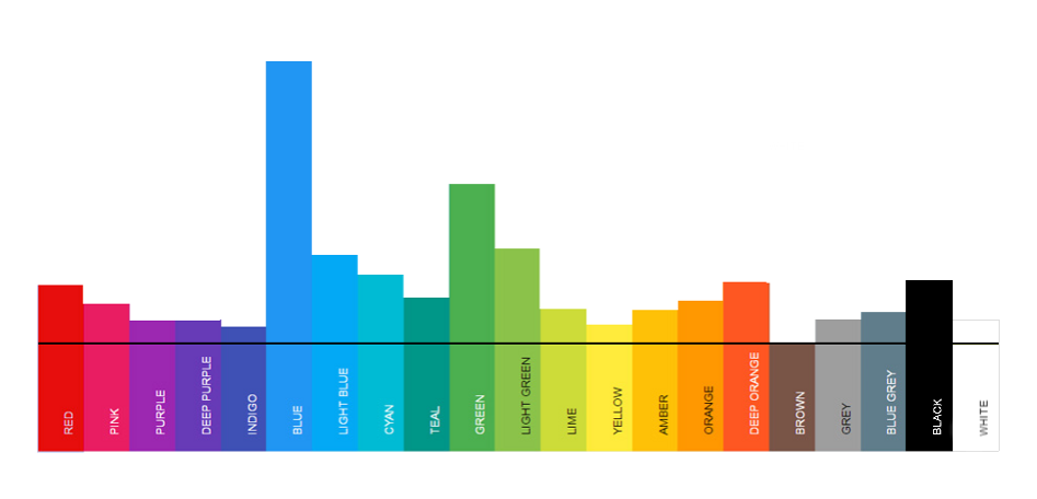
Source: Really Good Emails
5. Font
Legibility, strength, and color play a major role in how a font can drive CTA effectiveness. Essentially, is your CTA text readable?
For fonts, you also need to be sure that if you’re using code/text for the CTA copy that the font you choose is compatible across email clients—or a suitable, “web/email-safe” backup option is selected as well.
6. White space
White space around your CTA plays an important role in grabbing the recipient’s attention, as it creates a visual break. White space especially works well for those who open your emails on mobile devices as this provides enough clear area for the recipient to click on it with their fingertip.
CTA PLACEMENT
Don’t make your CTA hard to find. In terms of placement, that means putting the CTA “high enough” (some may say “above the fold”) in the email that recipients don’t miss it.
Good CTA placement helps your email to be scannable and maintain focus on your main purpose. Whether that means right at the top or in the middle of your template depends on how you test placements and how your subscribers ultimately engage.
You may find that for simple CTAs (like a product offer), placing the button high up makes perfect sense. You may find that for a more complicated offer, you’ll need some space for explanation before putting in the CTA. That’s a decision for which you’ll have to test and find out what works best for you.
Final Thoughts
All these tips above are important to consider, but there’s one critical factor I left out: Proper linking. If your CTA doesn’t link to a good, correct, relevant, working landing page, it doesn’t matter how good your CTA is. Make sure *where* you’re taking your clickers matches up.
What other best practices are you using with your CTAs? Share them in the comments below.