


In today’s mobile-centric world, where smartphones have become an extension of our lives, businesses must adapt their marketing strategies to cater to the ever-growing mobile audience. One crucial aspect that demands attention is ensuring mobile friendly emails.
With 81% of consumers accessing their emails on smartphones and tablets, delivering an optimal experience across all devices is paramount to capturing attention and driving engagement. More than 73% of fast-scaling companies are creating mobile-first email campaigns to increase their open rates.
So, to help you cover all bases while crafting enthralling mobile email campaigns, we have created this extensive blog that covers all aspects and nuances of mobile friendly emails.
Designing Mobile Friendly Emails
Here is a definitive guide to help you craft enthralling mobile-friendly email templates.
Use Short Subject Lines.
Mobile users are more likely to scan subject lines, so ensure yours is short and to the point. A good rule of thumb is to keep your subject lines to 50 characters or less. Use clear and concise language that will grab the reader’s attention.
Avoid using all caps, exclamation points, or mentioning spammy words, as these can trigger spam filters.
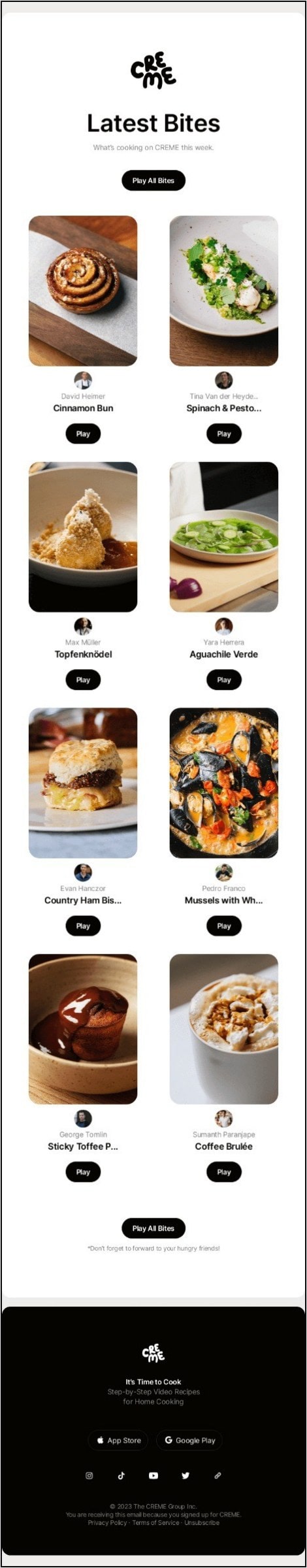
CREME keeps its subject line crisp without using any filler words.
“New Bites on CREME” is enough to convey to the audience that there new cooking videos on their platform.
Beyond the straightforward subject line, the overall aesthetics of the emails are quite grounded and leverages the use of white space to enhance the content. Coming to the email copy, there is next to none. They start including thumbnails from their latest video uploads along with personalized CTA buttons for each of them.
The colourful content images and the black “Play” are sure to attract a decent number of clicks.
Keep The Designs Simple.
Avoid using too many images or graphics, as these can make your emails slow to load on mobile devices. In addition, it can visually overstimulate the customers, making them spend less time on your emails. Both these factors combined can decrease the overall engagement and click-through rates.
The single-column layout makes your emails easier to read on small screens. This layout also promotes vertical scrolling, which is in line with recent content featured on phones.
Additionally, limit the vertical scroll. Unlike other social media apps, subscribers do not generally doom scroll their emails to keep themselves entertained. Try to deliver the message and include a CTA button above the first email fold or within the email’s first page.
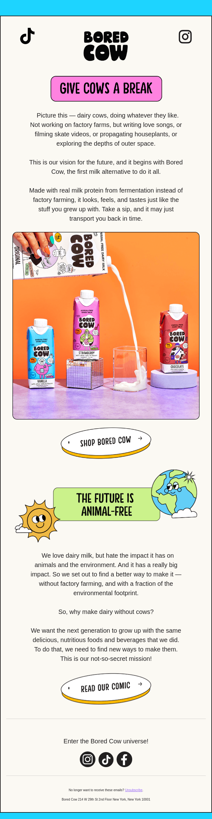
Bored Cow keeps its design philosophy simple while still maintaining the vibrancy of their emails. The title is neon pink and goes well with the black text. The email copy is engaging, and, finally, the funky product image binds the whole mobile-friendly email together.
Add Visuals
Coming to visuals can help to break up text and make your emails more engaging. However, make sure the visuals are optimized for mobile devices.
Furthermore, avoid using stock photos. Get a professional photoshoot done for your products and include these images in the promotional emails. Similarly, if you are inserting graphics, ensure that they adhere to your brand’s image and colour palette. Some email marketers also use the brand’s voice and fonts to drive-in consistency.
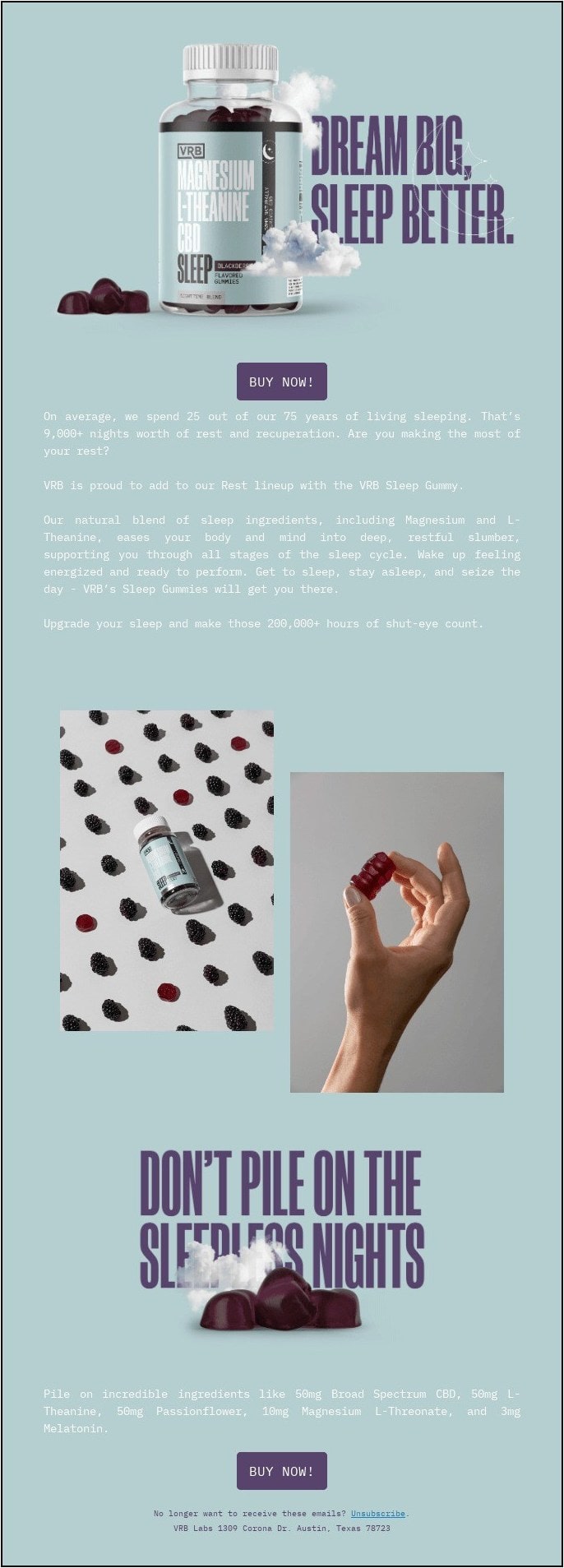
VRB promotes its newly launched sleeping gummies with an enthralling visual. The sleeping pills bottle is surrounded by dreamy clouds to represent a good night’s sleep. The visual is immediately followed by a CTA button.
Optimize Your CTAs
Like your email copy, the CTA buttons should be clear and concise. Proper placement of the CTA button helps you drive click rates and also increases the chance of readers converting to actual paid customers. In a nutshell, the CTA button removes friction by redirecting the customer directly to the designated pages.
Do not decrease the CTA button size, as it will make it inconvenient for the user to click on them. In addition, place multiple CTAs to give more opportunities for your subscribers to convert.
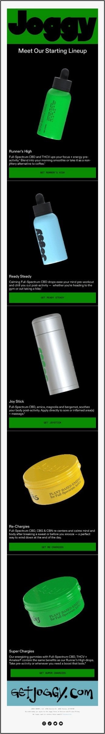
‘Buy Now’, ‘Shop Now’, and ‘Learn more’ CTA buttons have become dull and archaic. Joggy leads by example by using different and more action-oriented CTA phrases for each of its buttons. It uses personalized CTA buttons using its product names to make them unique.
It also helps that their dark green color contrasts well with its pitch black background color.
Use Responsive Templates
Creating mobile friendly emails can be a pain. You need to consider different smartphone models and email clients, and it can be costly and time-consuming to hire developers and designers to do this for you.
A better way is to use responsive email templates. These templates are already optimized for mobile screens, so you can be confident that your emails will look good on any device. Email marketing platforms, like Mailchimp, HubSpot, and many others, offer hundreds of pre-optimized email templates to make it easier for budding email marketers.
Here are some of the benefits of using responsive email templates:
- They save you time and money.
- They ensure that your emails look good on all devices.
- They make it easy to create visually appealing emails.
- They give you more control over the design of your emails.
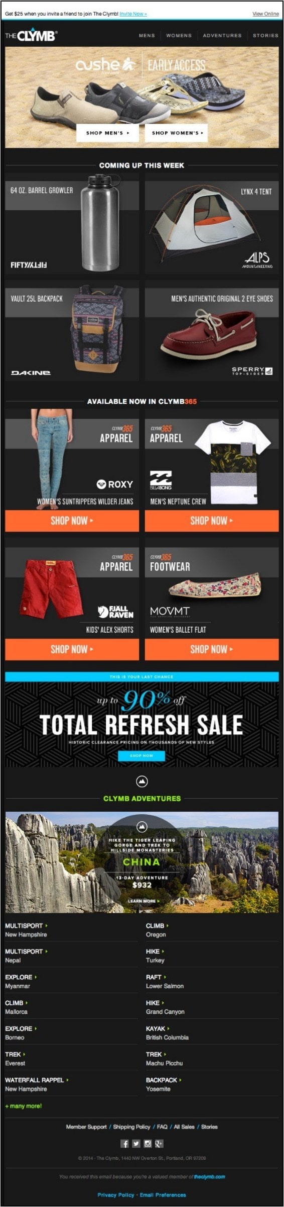
Clymb’s responsive email template slightly changes its layout when viewed on different devices. It makes the email look appealing irrespective of the device you view it on. It also follows all the best practices, like professional product images, colorful CTA buttons, and offering incentives to make its emails stand out.
Use Whitespace Wisely
Adding visuals and catchy text is a great way to grab your recipient’s attention, but it’s also important to let your email breathe. Leaving some blank space between texts and images will help your emails look cleaner and more organized.
This is especially important on mobile devices, where screens are smaller and people have less time to read.
White space can also be used to emphasize important information. For example, you can use white space to separate your call to action button from the rest of the text, making it stand out and more likely to be clicked. However, it’s important not to overdo it. Too much white space can make your emails look empty and uninviting.
The key is to find a balance between using white space to make your emails look clean and organized and using enough text and images to convey your message. With a little practice, you’ll be able to create emails that are both visually appealing and informative.
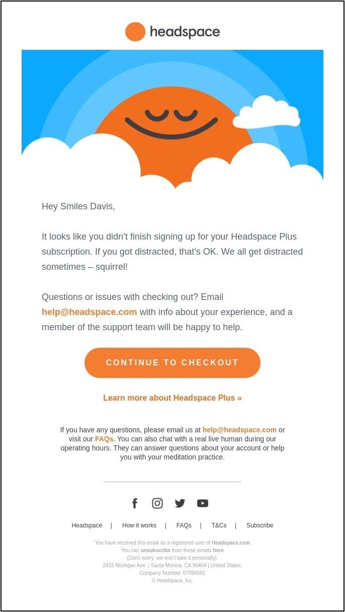
Headspace makes good use of whitespace to highlight its hero image. In fact, the clouds in the visual subtly blend in with the background to give an immersive experience to the readers.
Test And Optimize Your Emails
A/B testing is a great way to see which mobile-friendly email design works best for your audience. You can test different things, such as the placement of your call to action button, the length of your email, or the subject line.
For example, you could create two versions of an email, one with the call to action button below the header and the other with the call to action button above the footer. Then, you could send each version of the email to a different group of people and see which one gets more clicks.
Apart from the CTA button, you can test the email length, hero image, tone of your copy, and even your subject line.
The results of your A/B test will tell you which design is more effective. You can then use this information to improve your email marketing campaigns and get better results.
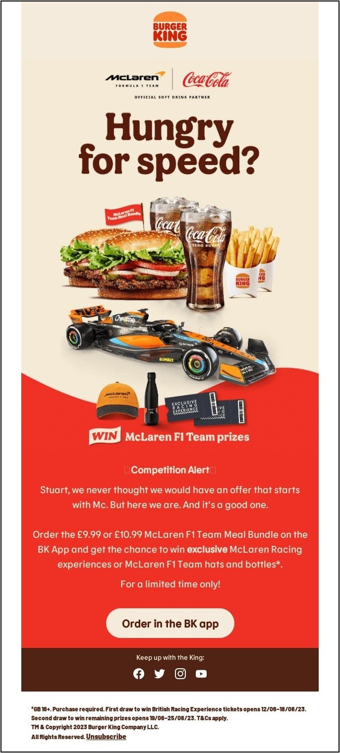
Burger King’s complex collaboration visual must have required extensive A/B tests to ensure all the sponsors get equal visibility without compromising their own brand images. As a result of the ingenious email marketing campaign, they were able to promote their brand along with McLaren F1 Team and Coca-Cola.
Best Practices For Mobile Friendly Emails
To extract the best performance from your email campaigns, ensure your mobile-friendly templates follow the best practices mentioned below.
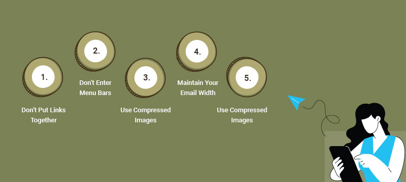
Don’t Put Links Together.
When two words are right on top of each other, it can be difficult to tell which word is the link and which word is not. This can lead to accidental clicks and can also make your email look unprofessional.
To avoid these problems, it’s best to separate stacked links with other text, images, or whitespace. This will make your links easier to click and read, and it will also make your email look more professional.
Don’t Enter Menu Bars.
Tiny menus and navigation bars are frustrating to use on mobile devices. Fingers are not precision instruments, so it can be difficult to tap on small links or buttons. This can lead to accidental clicks and frustration.
It is better to avoid menus and navigation bars in emails altogether. Emails are not websites, so you don’t need a traditional menu or navigation bar. Instead, stick to the basic building blocks of the web: links and images.
Links and images are easy to tap on, and they are more likely to be noticed by your recipients. They also make your emails look more professional and less cluttered.
Use Compressed Images
Smaller images load faster and use less bandwidth. This is important for mobile users, who often have slow connections.
There are a few ways to reduce the size of your images. One way is to use responsive coding techniques. This means that your images will load at a different size depending on the device they are being viewed on.
For example, on a mobile device, your images will load at a smaller size than on a desktop computer.
Maintain Your Email Width.
While most modern mobile devices can handle responsive email designs, there are still some that cannot. This is why it’s important to set a width for your email templates.
A width of 600 pixels or less will ensure that your emails will look good on all devices, including those with small screens. You can set the width in the table tag of your email template, or you can use the CSS width property.
By following this simple tip, you can make sure that your emails are always displayed correctly, no matter what device they are being viewed on.
Use A Large Font Size.
Small font sizes can make your email difficult to read, especially on a small screen. This is because the text will be too small, and people will have to squint to read it. As a result, they may just delete your email instead of trying to read it.
A font size of 13 or 14 pixels is a good compromise for both desktop and mobile devices. It is large enough to be easily readable on a small screen, but it is not so large that it takes up too much space.
If you want to make your email even more readable, you can go even larger than 13 or 14 pixels. A font size of 16 or 18 pixels is also a good option.
Conclusion
As you can see, mobile-friendly email template production is a crucial aspect of any marketing campaign. It can be especially challenging for a brand that is new to email marketing. However, fret not, as you can always reach out to experienced email marketing agencies, like InboxArmy, who offers email design services.
