
Table of Contents
What Is An Exit Intent Popup?
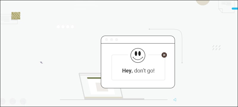
Exit Intent Popups appear on the visitor’s screen when they are leaving the site. It could be in the form of an offer that entices them to stay for a bit longer. The message and design of the popup can be tailored to what kind of user on the page – whether it’s a visitor who has added products to their shopping cart or simply someone who hasn’t registered with you yet.
And guess what? Studies show that pages with exit intent popups outperform pages without them regarding conversion rate!
That’s why it pays off (literally) to display one of these last-minute offers before your visitors leave your website – there’s always a chance that you’ll persuade them enough to stay or get some contact info to reach out afterward.
All this and more make Exit-intent popups a boon for your email campaign management efforts as more email captures directly translate to more engagement opportunities with prospective buyers.
How Does Exit Intent Actually Work?

Visitors are the lifeblood of any website. So you work hard to attract them and ensure they stay on your page. After all, you don’t want potential customers to slip through your fingers without a chance of converting them into paying ones!
Monitoring visitor behavior is vital in this endeavor. Fortunately, technology has made things a lot easier with exit intent tactics that help you predict when people are about to leave your website.
Exit intent technologies track the movements of a user’s mouse cursor on the page. If the cursor moves away from the active area (the content window), a popup shows up immediately with an offer or message encouraging them to take action.
The static area, meanwhile, includes all other browser add-ons, not part of the loaded web page, such as the toolbar and search bar.
In short, capitalizing on exit intent behavior means maximizing every opportunity to turn visitors into subscribers, leads, or paying customers – something all businesses must strive for!
Do Exit Intent Popups Work?
Exit intent popups have become popular among businesses to retain customers and keep them from leaving their websites. But how effective are they really? In this section, we’ll explore the pros of using them and provide you the tips on how to make the most out of them.
- More email opt-ins: Exit intent popups that request an email address can persuade 4% to 7% of your site visitors to join your list. For every 100 site visitors, this could result in two additional email addresses!
- Improved conversion rates: The average conversion rate is 3.09%, but the best popups can have conversion rates ranging from 10% to 60% if properly optimized.
- Popup optimization: If you collect emails in a sidebar, consider switching to an exit intent popup to see a 1,375% increase in list growth. (Read more about email popups here)
- Better ROI: Exit intent is a powerful tool for growing your email list and increasing conversion rates. This means it can boost your digital marketing ROI.
When To Use Exit Intent Popups?

Exit intent popups are a powerful tool that can be used to capture potential customers and keep them from leaving your website. But when should you use them? In this section, we’ll discuss the situations wherein these popups are most effective and walk you through the tips on when to deploy them.
On product pages: On product pages, use an exit intent popup to offer a coupon code or other incentive. This will give visitors one final chance to take advantage of your offer before they leave, helping you capture more potential customers.
Cart pages: To reduce cart abandonment, consider creating an exit intent popup that makes a last-minute offer or asks people to save their shopping list.
This can encourage customers to complete their purchases and provide you with the information you need to follow up with them in the future.
Landing pages: If your landing page message isn’t resonating with some users, use an exit intent popup to give them one last chance to take advantage of your offer. This incentivizes the user to stay and, potentially, convert.
Home page: If you’ve noticed many people leaving your home page before clicking through to other pages, consider adding an exit intent popup with an offer or additional information that might help keep them on the page.
Important Note: Use exit intent popups only when people have not yet taken action. A popup that appears at an inconvenient time can be annoying and impersonal to your audience. Other unique tips to keep in mind when using them includes:
- Price/availability notifications: Offering alerts is a great way to get people involved with your brand when prices or availability change frequently (flights, properties, job positions, etc.).
- Optimized offers: People may be more willing to give their email address for a special offer that lasts a week rather than being forced to buy now.
- Clear call to action: Make sure your popup has a clear and concise call to action that informs the user what they need to do without overwhelming them with too much information.
- Test and adjust: Always test different offers, copy, and designs to see which works best for your audience.
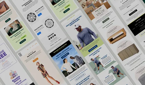
40 Exit Intent Popup Examples For Your Website
To help you out further, here is a list of 40 Exit Intent Popup Examples we found. Let’s check them out:
1. NeilPatel
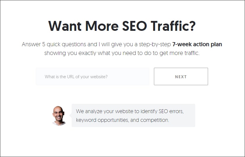
This example clearly states the value of responding to the question set. The minimalist design enhances the CTA. While explicitly listing the outcome of the exit popup, Neil Patel also positions himself as a leader in the domain.
2. DesignForMankind
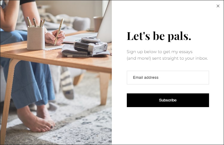
Design For Mankind’s informal tone sets the stage for a friendly engagement with the website visitor. In addition, the simple, straightforward CTA increases the possibilities for a positive response and collection of critical information.
3. RookieMoms
RookieMom’s relatable visual and the personalization encourage visitors to subscribe. The popup text clearly spells what you’ll get when you subscribe. The well-formatted fields indicate the action required.
4. BrightBazaar
The warm, positive vibes of BrightBazaar’s popup are impossible to miss. The different color fonts draw attention to the important messages while imparting a smooth look to the layout.
The image resonates with the brand’s message, and the enticing benefit encourages customers to respond to the CTA.
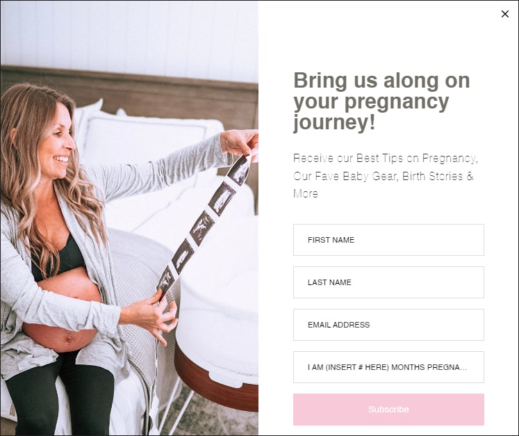
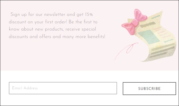
5. LoveSweatFitness
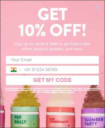
This form from LoveSweatFitness combines aesthetically appealing visuals with a catchy discount offer to attract subscribers. Implementing a simple form that briefly outlines the other benefits helps to drive the point home and entice visitors to sign up.
6. OurFoodStories
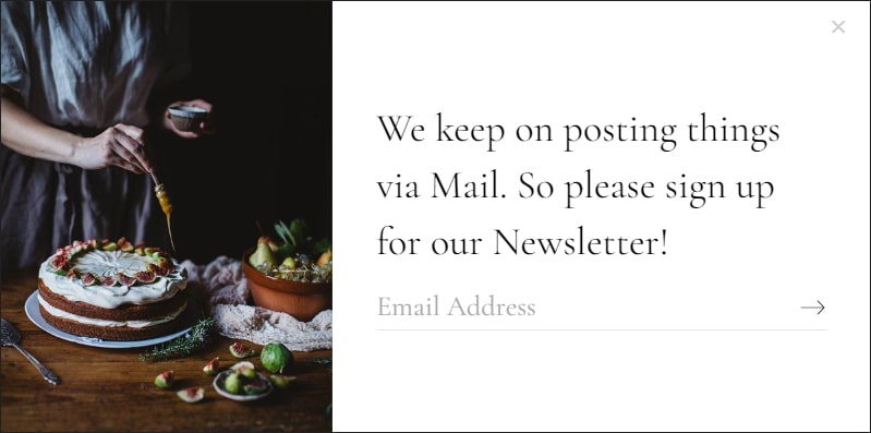
This example from OurFoodStories did a great job of reminding customers about the newsletter before they leave the website. The stark visuals balanced with simple text command the attention of website visitors.
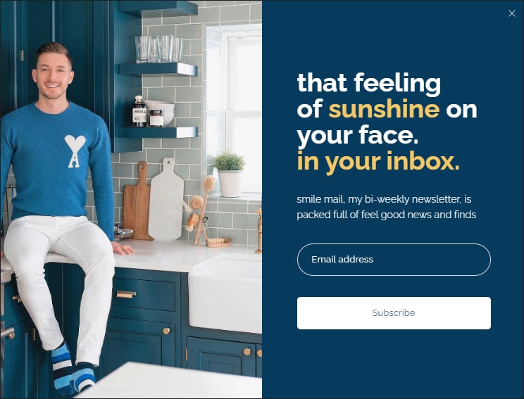
7. GoingZeroWaste
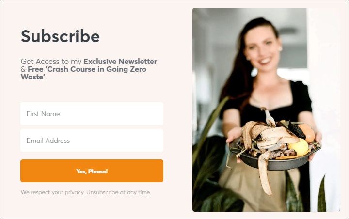
The personal tone of the GoingZeroWaste owner showcases a friendly, helpful attitude to help guide users on a specific journey.
The subtle color schemes, the close-up of a relatable item, and the smiling face draw in the users, making this popup one that won’t be swiped away quickly Read more about email personalization here.
8. CollectiveGen
This example from CollectiveGen incentivizes visitors to stay on the website with a headline that is straight to the point. It gives audiences quick insights into how it will help create a positive experience. The soothing background, the calming image, and the right call to action make it easy for visitors to act.
9. Addicted2Diy
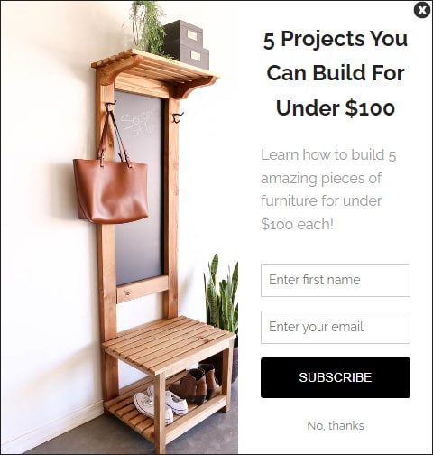
This popup from Addicted2Diy captures the attention of price-conscious shoppers. The well-structured message positioned in a reader-friendly font is hard to miss. In addition, the image of simple, elegant furniture visuals aligns with the DIY enthusiast in people, making them more likely to subscribe.
10. SmartPassiveIncome
This direct, no-frills message from SmartPassiveIncome informs the reader about the unique benefits of subscribing to the newsletter. The absence of visuals helps the reader focus on the message, and sharp fonts make it easier to read and act on.
11. BloggingWizard
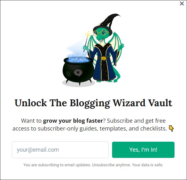
The graphics in the popup from blogging wizard create a light-hearted but contextual atmosphere. The simple header and short description further entice users to take action.
The opt-in form is placed in a prominent position and only requires an email address, allowing users to quickly sign. At the same time, the CTA button, including the phrase “Yes, I’m In!” emphasizes the urgency of signing up.
12. ContentMarketingInstitute
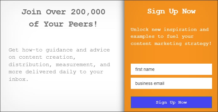
This pop from content marketing institute is straight to the point. The left column headline establishes the service’s popularity, and the sub-text encourages users to subscribe by listing the key benefits.
The opt-in form in the right column, set in a bright, vivid color is easily read and teases with the power of the unknown, inspiring action.
13. KlientBoost
The design from Klient Boost includes a graphical representation of the message. At the same time, by outright addressing a specific need, this popup combines both visual and textual elements to get maximum impact.
The sharp fonts, clutter-free aesthetics, and straightforward CTA all help to draw in the user.
14. General Assembly
This popup from general assembly is an excellent example of collating various data in a simple, non-obtrusive, and user-friendly way. The left column comprises both main headlines and a very efficiently designed opt-in form set on a white background.
The relatable visual takes up lesser space but compliments the overall design aptly.
15. Instapage
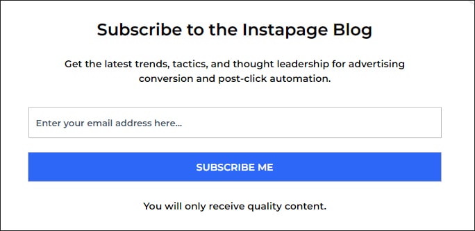
The simplicity of this instapage popup works to its advantage with a clear headline, description, and call-to-action button. In addition, the well-proportioned fonts and opt-in forms clearly indicate that signing up is quick and easy.
16. Zendesk
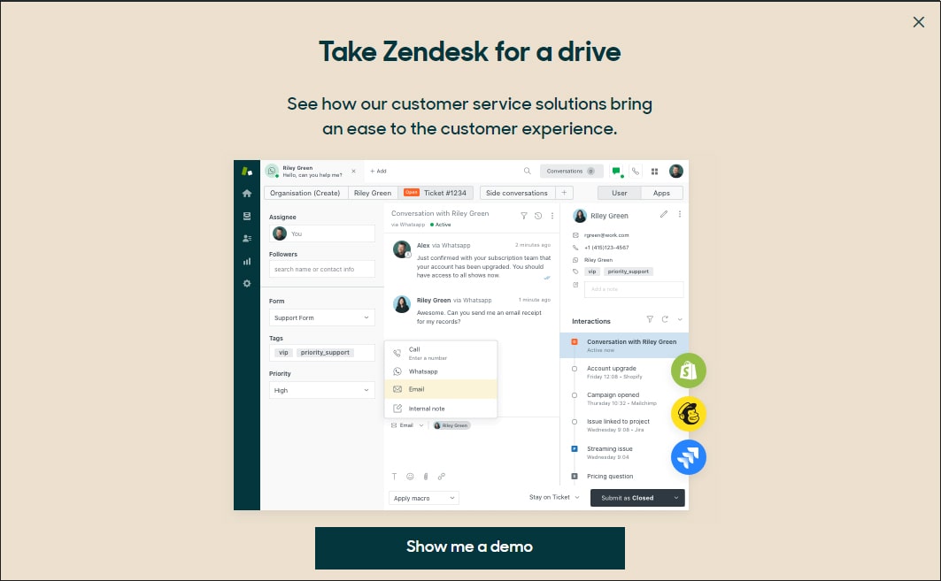
The bold statement of this popup from zendesk is hard to ignore. It confidently invites people to explore the features and benefits of Zendesk’s customer service solutions and the problems it solves.
The image contains a snapshot of the Zendesk dashboard, thus enabling users to compare it to their current use. In addition, the demo button is clearly visible, so the interested visitor won’t have to search for it.
17. CoSchedule
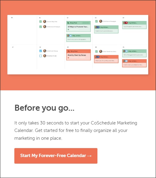
This popup from CoSchedule appeals to visitors who don’t abode well without wasting time. The copy is terse but succinctly outlines the product benefits for visitors to decide on their actions.
The product snapshot highlights the features at a glance. The CTA at the bottom is set in the same background color as the snapshot, establishing a seamless transition.
18. Milleduex
This Milledueex makes it clear that it values its site visitors and offers exclusive deals for subscribers. The muted pastel palette and typeface make it easy to read and understand the offer.
The opt-in feature in the white space captures the user’s attention before they click away from the page.
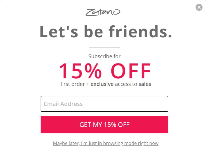
19. Zutano
The informal, chatty tone of this friendly popup from Zutano, its cheerful font, and its clever use of color to highlight critical messages capture visitors’ attention without being overly intrusive.
For example, the phrase ‘Get my 15% off’ emphasizes the importance and urgency of taking action.
20. PushLiving
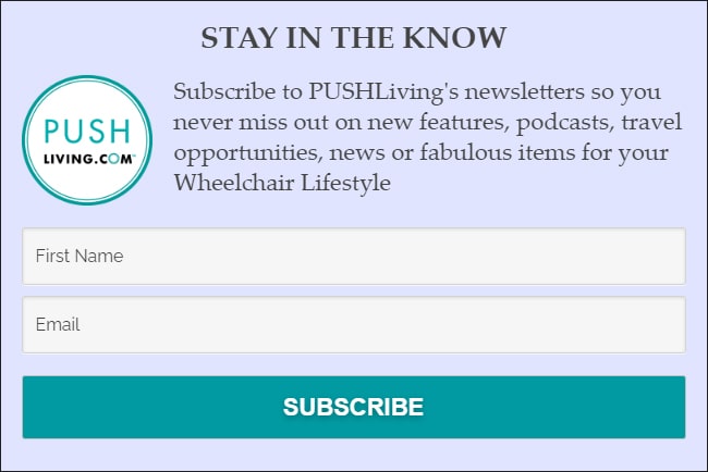
This popup from Push Living text indicates who this newsletter caters to and what benefits subscribers receive in a reader-friendly layout. The big and bold subscribe button ensures that the desired action is evident.
21. ConvertFlow
This popup from convertflow set on a black background with text in white, is an effective way to grab attention. The different font sizes in the copy help convey the message.
The image of the product and blurbs containing the names of brands showcase the expertise and verify the authenticity of the content. The CTA in blue stands out in stark contrast to the overall color scheme and is big enough to be noticed.
22. WestElm
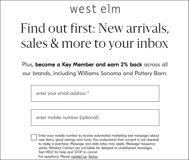
This pop-up from WestElm is a perfect example of how eye-catching, reader-friendly fonts have set the tone for a personalized yet informative message that entices users to opt-in.
This pop-up emphasizes the importance of a well-crafted message and how simplicity can be the greatest asset when creating an effective signup form.
23. OneQuince
The unique initiative from One Quince targeting friends is clearly brought out in the text and the visuals. The soft tones and well-defined color contrasts add a touch of professionalism to the popup, while the clear call-to-action is irresistible.
24. Artesano
Pop-ups don’t get any simpler than this. This example from Artesano proves that even the most basic pop-up design can be effective with crisp, clearly defined opt-in forms and CTAs.
It is a good fit for any eCommerce store looking for pop-ups that can be easily optimized for all devices and have zero hassles about compatibility issues.
25. Ecovacs
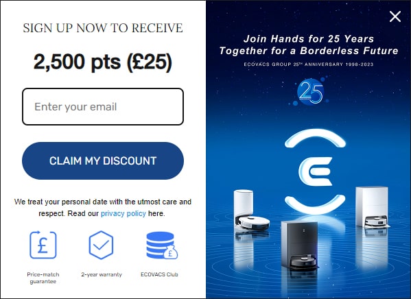
Where points translate to real cash rewards and discounts, such exit intents are an excellent way to encourage customers to stay on your website and avail of the special offer.
This pop-up from ecovacs counter-balances the text, using product visuals in their natural context to engage customers and influence the desired action. The clear CTA with a deep blue button helps customers quickly identify the reward and motivates them to experience the brand.
26. FathersFactory
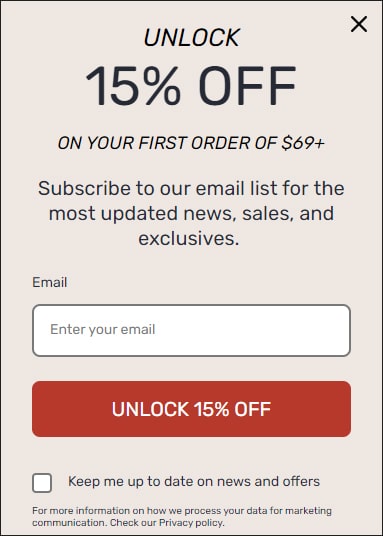
Unlock 15% off on your first order of 69$ and subscribe to the email list. The image from fathers factory’s popular range of wooden tops, alongside the generous – discount offer.
The earthy tones give it a homely feel while enhancing the visibility of the CTA and opt-in features.
27. Bakell
This unique pop-up from bakell is the perfect way to engage customers. It adds excitement to the website experience and is also a great way to offer discounts. The minimalist design ensures good visibility of the key elements, including the CTA and opt-ins.
28. Death Wish Coffee
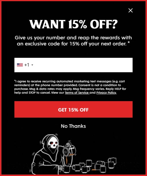
This sassy example from death with coffe does not offer a discount. Rather they ask if you’d be interested in one. Also, they ask for your contact number to send you a code, making it more about your needs than signing on as a subscriber.
The bold copy and image reflect the brand’s quirky personality, which its target audiences will identify with.
29. StyleRunner
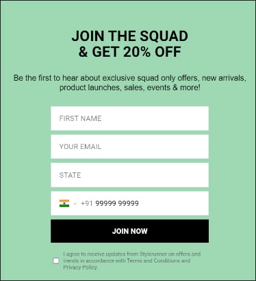
This simple, elegant pop-up from style runner sends out a message in warm and inviting language, conveying a feeling of exclusivity for those who sign up. The incentive is highlighted in bold font, while the opt-in forms fit in with the overall design.
30. Marie Claire
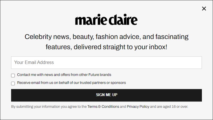
With a significant presence in fashion and beauty, the main focus of Marie Claire’s exit pop-up on its logo and subscription form, and the monochromatic color palette give it an elegant look.
The text and CTA stand out against the background, making it easy to read and understand.
31. KCHLaser
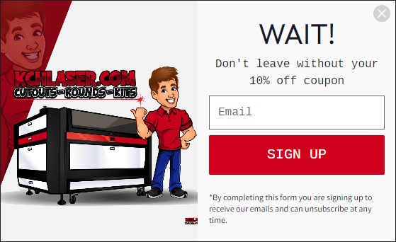
This exit pop-up from KCH Laser engages the site visitor by persuading them not to leave until they’ve grabbed their discount.
This personal appeal to the visitor to take advantage of the deal creates a strong connection with customers. The visual of the smiling mascot appears to be watching over the visitor and further solidifies this connection.
32. HighGroveGardens
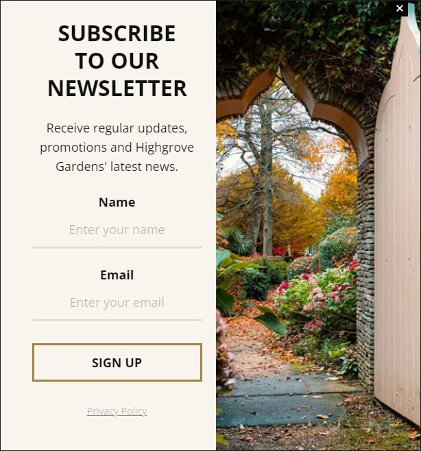
This pop-up from High grove gardens enables visitors to subscribe to the content they want to see. The content focuses on customer experiences that significantly impacts leads, even when they don’t plan to make an immediate purchase but may return in the future or promote the brand experience among peers.
The elegant visuals and CTA in a gold-bordered box background enhance the look and feel of the message.
33. Roa Hiking

This pop-up from Roa Hiking navigates the fine line between persuasive and luring by offering a 10% discount to everyone who joins their newsletter. The masked models in the image add mystery and glamour while giving it a more sophisticated feel.
The simplicity of the design and prominent fonts help keep visitors focused on the offer.
34. Vintage Threads

The Vintage thread’s friendly welcome tone and the use of emojis make for a delightful first impression.
The brand moves away from the classic “Please subscribe” message in favor of a more creative one that ties in with asking customers what they want and offering a potential solution. Even without graphics or other visuals, the message’s engagement quotient is relatively high.
35. Wishpond
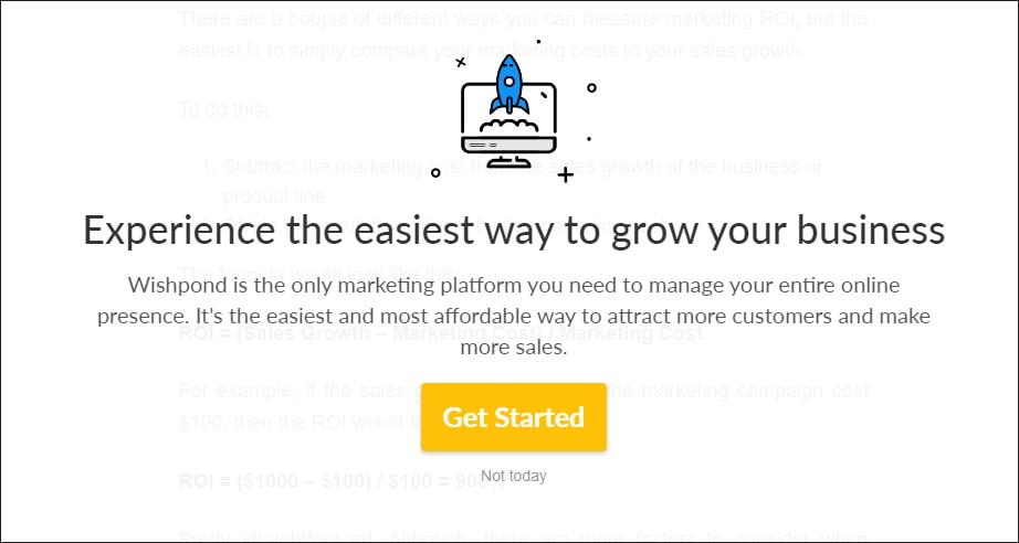
This powerful headline of this pop-up from wishpond shows that the company has positioned itself as an industry leader.
The copy’s benefit-oriented language conveys why the reader should act now, and the invitation to experience the product encourages readers to take the next step and learn more.
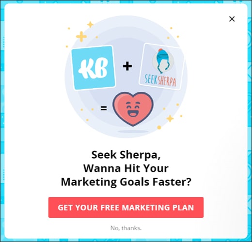
36. KB Authority
This example of KB Authority begins by creating a sense of urgency and rewards customers for acting fast! With the use of high-contrast colors and bold fonts emphasizing the discount volume on the next purchase, the visitor’s attention is quickly and easily grabbed.
The no-fuss message is easy to read and understand, while the prominent CTA button encourages visitors to act now and take advantage of the discounted offer.
37. Queen City Plumbing
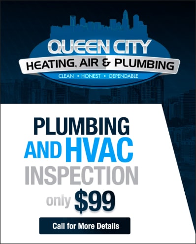
This example of Queen City Plumbing stands out because of the distinctive layout encompassing the logo and the offer in perfect balance. The information is kept simple and to the point.
It also shows customers exactly how much they’ll pay for a job that costs much more. Pricing information is often more valuable than any offer, motivating customers to take action.
38. Wattel and York
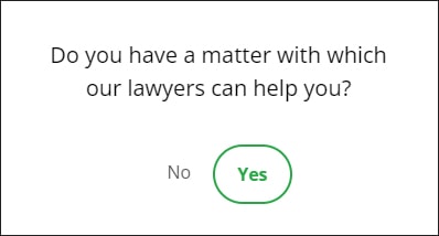
This pop-up from wattel and York greets visitors with a question about their legal needs. It has a personal touch, shows empathy and interest, and encourages users to take the first step in seeking legal help.
The sobriety of the pop-up’s design helps visitors to remain focused on the question and have a meaningful experience.
39. W Promote
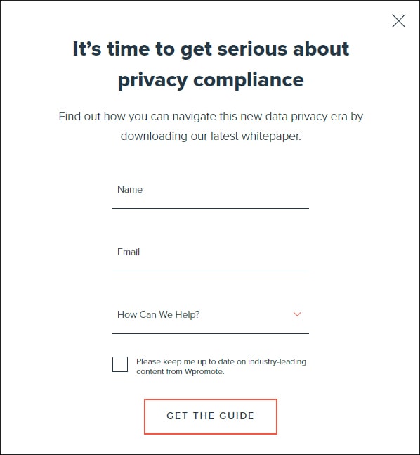
The headline of W Promote deviates from the general feel-good messages. Instead, it engages with customers by directly addressing a critical issue and offering a solution.
The opt-in form collects contact details and has a drop-down list containing pre-filled options for where help is needed. The B&W color palette, a clear CTA button, and personalized tone create a sense of urgency that’s hard to ignore.
40. Lego
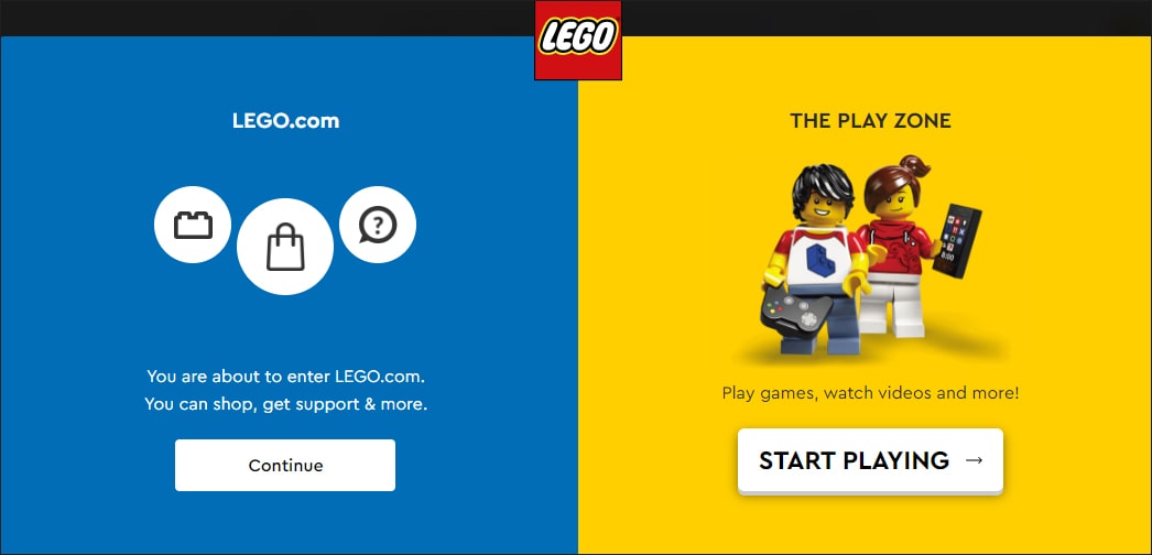
Bright, vivid colors in the pop-up exemplify the classic Lego brand and the kind of world their toys evoke. The directions are well-organized, simple, and to the point.
The cheerful blue portion caters to ecommerce and customer support, while the playful imagery in the yellow portion is the play zone, thus creating a perfect balance between the two.
Which Design Practices Work Best for Mobile Pop-ups?

Mobile pop-ups are a powerful tool for businesses to grab customers’ attention and increase engagement. Let’s explore some of the most effective design practices that can be used to create engaging mobile pop-ups and maximize your chance of success.
1. Always Follow The Rules
Ensure your mobile popups follow the rules – after all, no one likes an unexpected surprise! Doing so allows users to keep enjoying the main content of their landing page. In addition, it ensures they won’t be surprised by a cookie disclaimer, location selector, or age verification pop-up that they weren’t expecting. Those measures help keep them safe and secure while browsing your website.
2. Experiment With Different Pop-up Types For Mobile
Some of the most popular pop-up types used on mobile include:
Floating pop-ups: These appear as a simple bar at the top or bottom of the page and are great for promoting discounts, offers, free shipping, or other perks.
Slidebox pop-ups: These appear in the corner of the screen, larger than floating pop-ups but with enough space for the main content to be visible.
Featured pop-ups: These pop-ups appear above the main content in the middle of the screen. Although not full-screen pop-ups, they should appear after the user has expressed interest by leaving the landing page.
3. Account For GDPR Compliance
Designing pop-ups for mobile screens does not have to be complicated – just ensure you stay in line with GDPR regulations! Keep things simple and direct so visitors understand what information you’re collecting and why.
Also, make sure that opting out is an option – ask users to consent explicitly rather than automatically opting in by having them act. That way, you can keep your visitors happy while keeping GDPR compliant.
4. Avoid Being Overbearing
When it comes to mobile pop-ups, the key is moderation. You can go with something like a featured pop-up, half-page pop-up, or even a full page if need be – but the key is timing.
Don’t overwhelm your visitors with an aggressive pop-up as soon as they land on your page; instead, let them explore the content before you display your messages. That way, you’ll have better success in achieving your goals!
5. Crisp And Clear CTAs
A crisp and clear CTA for mobile pop-ups can make all the difference! Speak to your audience directly by using second-person pronouns and make your call-to-action stand out with more approachable and conversational verbs.
Create a sense of urgency by adding time-sensitive phrasing to make it harder for visitors to dismiss.
6. Limit Image Or Video Usage
If you want to make sure everyone can access your mobile pop-up, it’s best to keep images and videos to a minimum! Keep it simple and reduce file sizes by keeping any images you use below 100kb.
Ensure the image works harmoniously with the rest of the page, and avoid making it too crowded or distracting. This way, your mobile pop-up will be accessible to all users – even those who don’t have unlimited data!
7. Customize Pop-ups With Behavioral Targeting
Showing personalized pop-ups to visitors is a great way to increase engagement! Studies have found that 72% of consumers are more likely to interact with tailored messages.
It’s easy to customize and target pop-ups based on the behaviors of each individual visitor – such as when they’ve navigated to a specific page or category, spent an X amount of time on it or scrolled down 50%.
Additionally, craft clear messages as visitors prepare to exit your website. This will ensure they receive the most relevant content possible!
8. Keep Form Fields To A Minimum
When it comes to pop-up forms, keep them concise and easy to fill out. Too many fields can lead to visitors feeling overwhelmed or frustrated.
Sticking to the basics is a good rule of thumb – ask for only the absolutely necessary information and make all fields mandatory (or optional).
Additionally, ensure the font size is big enough to read easily on a mobile device. That way, customers won’t be discouraged from filling out the form!
9. Test Your Pop-ups Before Launching
Want to know what kind of design practices work best for mobile pop-ups? Testing is the answer! Give A/B testing a try – explore different pop-up positionings like floating, featured, or slide box and measure which one gets the most conversions.
Then refine your efforts by testing the design and content of the winning type of pop-up. This way, you can ensure your pop-ups are constantly optimized for the best results!
10. Measure And Analyze The Results
Once you’ve launched your mobile pop-ups, it’s time to measure and analyze the results. Use analytics tools to track visitor engagement, click-through, and conversion rates.
This will help you determine what’s working and what’s not so that you can make adjustments where necessary – ensuring that your mobile pop-ups are always helping to reach your goals!
Which Exit-Intent Triggers Work Best For Mobile?

While tracking user behaviors and triggering appropriate pop-up responses on desktops is easier, it can be a bit more challenging on mobile.
To determine which type of triggers work best for your mobile audience, you can conduct A/B testing on different types of exit-intent triggers, such as follows:
Back button pressing: On mobile devices, pressing back until you reach the previous page is one way to quit a website. So, on mobile devices, the appropriate JavaScript code can be used in conjunction with “Back” button hits to cause a popup to appear when a user is ready to leave.
Percentage-based scroll: When a visitor scrolls down a page significantly – typically past 55% – an enticing popup will appear, offering something that can’t be refused! This trigger works best for mobile devices, where additional content can easily draw the user’s attention.
Time-based scroll: This allows you to decide when it is the ideal time to display widgets on your page after a visitor has been around for a certain amount of time. Whether it be 5, 30, or 60 seconds, popups can be tailored to appear at just the right moment for maximum engagement.
Idle timeout: This feature will display popups only when a visitor has been inactive for the time that you pre-define, ensuring they are not disturbed while browsing your website. With this method, you can maximize visitor engagement on any mobile device.
How to Use Exit Intent Popups Without Putting Your SEO at Risk?

Pop-ups can be a great way to engage with website visitors, but they also carry the risk of negatively impacting your SEO. Fortunately, there are ways to use pop-ups without risking your search engine ranking. By understanding how search engines view pop-up windows and implementing best practices, you can ensure your mobile pop-ups don’t hurt your SEO. Here are some best practices to follow:
1. Optimize The Timing of Your Pop-ups
Google has made its stance on pop-ups that appear immediately very clear. This is affirmed in the “intrusive interstitials” article and Search Quality Raters’ criteria, further emphasizing its importance.
Here are a few ways you can make sure your pop-ups are optimized and won’t harm your search rankings:
- Add a delay before showing the pop-up window. This gives visitors enough time to absorb the content on the page before they’re interrupted by an offer or other message.
- Use the second page viewed during a session to display your pop-up window. This prevents visitors from being bombarded with offers shortly after they land on your site.
- Set up a scroll condition where the pop-up is only triggered after the visitor has scrolled halfway down the page.
- Take advantage of exit intent technology and show promotion as people are about to leave your web pages without taking any action.
2. Optimize Accurately For Mobile
Optimizing your website for mobile is essential to ensure that your pop-ups don’t put your SEO ranking at risk. Google provides general guidance on what is acceptable, so you must strictly adhere to their criteria for invasive interstitials.
This involves using smaller pop-ups that take up no more than 20-30% of the screen space.
According to Google’s guidelines, modals should be easy to close. This is especially crucial on mobile devices, where clicking an element is more complicated than on desktops.
The Honeywell study suggests a button size of 42-72 pixels on a mobile device. In addition, testing the closing X is highly recommended to ensure it isn’t too close to the edges of the screen and isn’t hard to tap.
3. Optimize Properly For Speed
Optimizing properly for speed is a great way to ensure your pop-up does not adversely affect your website’s SEO. Using services such as Pingdom Tools and Google Page Speed Insights, you can quickly assess a pop-up’s effect on how fast your website loads.
With these tools, you can determine how long it takes for them to load and identify any elements that may be causing performance slowdowns. In addition, categorizing resources by load time in Pingdom can help you easily locate and address any problem areas.
Once you’ve located the issue, there are usually a few simple techniques to speed up loading:
- Use a script or pop-up program that has been performance optimized.
- Use a service like CompressJPG to compress any images you plan to use.
- Whenever feasible, replace images with HTML. HTML is frequently simpler.
4. Put Yourself In Your Visitors’ Shoes
When it comes to pop-ups, Google cares about User Experience. Taking a visitor’s perspective on the matter is key. So what value does your pop-up offer to those visiting your website? Ask yourself these questions to ensure you’re heading in the right direction:
- Will my pop-up impede visitors from navigating my site, like when they’re reading one of my articles?
- What important information does my pop-up present that could benefit visitors (e.g., urgent updates, exclusive offers, discount codes)?
- How easy is it for visitors to understand and read the message presented in my pop-up? Is it brief and concise?
Important points to keep in mind:
- Include a unique deal that wouldn’t be available anywhere else.
- The popup message must be concise and easy to understand.
- Make sure the popup is easy to close.
5. Use Only Non-Intrusive Interstitials
To use pop-ups without putting your SEO at risk, it is vital to use non-intrusive interstitials. These include any window you are legally required to display to censor content or alert users, such as cookie-use notifications and age-verification interstitials.
Other types of pop-ups are permissible, provided they are easy to close. Examples include banner advertising, slide-ins, inlines, and tabs, which should occupy no more than 15% of the screen.
It is recommended that full-screen overlays, welcome mats, and ad modals are avoided if there is any doubt about whether the interstitials may be seen as intrusive. Slide-in boxes and top banners can allow consumers access to the content while minimizing disruption to their experience.
6. Be Aware of “Gray Area” Interstitials
You may not realize it, but certain types of interstitials have the potential to incur a penalty from Google. Language selection pop-ups, for example, can be particularly problematic on international websites.
It’s also important to be mindful of interstitials such as sticky sidebars, related posts, share buttons, live chat boxes, and coupon pop-ups. Although I don’t expect these to affect your SEO ranking negatively, it’s still better to err on the side of caution and keep an eye on how your page performs after adding them.
7. Limit Intrusive Ads To Desktops Only
As a workaround for the interstitial penalty, some websites have opted to show pop-ups only on desktop devices. Many plugins offer targeted features, allowing you to limit their platforms of operation.
With website-building tools like Wix, you can hide obtrusive pop-up windows on all mobile devices. However, remember that these invasive pop-ups could suffer future penalties if they harm UX. It’s better to aim for an optimal user experience on all platforms.
8. Choose Exit Intent Popups Over Timed Pop-ups
When designing pop-ups, try to make them as non-intrusive as possible. For example, instead of displaying a timed pop-up, an exit intent popup would be a better option
This is better as it only appears when the user is about to leave the page, which helps ensure that visitors aren’t annoyed or frustrated by your pop-up. On the other hand, timed pop-ups can interfere with the user’s experience and could even lead to a penalty if not used correctly.
With these tips in mind, you can start using pop-ups to your advantage without risking a penalty from Google. Pop-ups can be a great way to get visitors’ attention, but remember that relevance and user experience are key.
Frequently Asked Questions (FAQs)
1. What Is The Meaning of Exit Intent?
Exit Intent is a technique that can convert visitors before they leave your website. It’s the last chance to capture their attention and get them to complete an action or purchase a product.
When handled properly, it can increase your conversion rates and strengthen your brand value. On the other hand, if not done correctly, it can have an adverse effect and potentially annoy users. Thus, planning and executing your exit intent strategy is important.
2. What Is A Trigger in a Popup?
A pop-up trigger determines when your pop-up with an incredible offer will appear based on the specific action of your visitors. If you want to use your pop-up to its full potential and increase sales for your e-commerce website, it must appear at the right time to the right audience.
According to statistics, the average conversion rate of a pop-up is 3.09%, which is an excellent opportunity to take if you want to take your business to the next level.
3. What Triggers An Exit Intent Popup?
An exit intent popup can be triggered when:
- a user moves their mouse away from your website window, typically towards the close button or the address bar.
- the user clicks on a link to remove them from your website.
- the user attempts to navigate away from your website or close the window.
- the user scrolls to a predefined page length, such as the bottom.
- a particular element on the page comes into view.
4. How Do Pop-ups Affect SEO?
Pop-ups can have an impact on your SEO if not used correctly. Google advises that pop-ups should be easy to close and should not hinder the accessibility of your website’s content.
Otherwise, you could run the risk of receiving a Google penalty, which may also adversely affect your visitors’ experience, which in turn may indirectly affect SEO.
5. What Is The Best Type of Pop-up?
The best pop-up type depends on your individual goals and objectives. However, one of the most popular types is an exit intent popup, as it only appears when a user is about to leave the page. This helps ensure a better user experience and increases the chances of conversion.