In today’s mobile-centric world, where smartphones have become an extension of our lives, businesses must adapt their marketing strategies to cater to the ever-growing mobile audience. One crucial aspect that demands attention is ensuring mobile friendly emails. 

With 81% of consumers accessing their emails on smartphones and tablets, delivering an optimal experience across all devices is paramount to capturing attention and driving engagement. More than 73% of fast-scaling companies are creating mobile-first email campaigns to increase their open rates. 

So, to help you cover all bases while crafting enthralling mobile email campaigns, we have created this extensive blog that covers all aspects and nuances of mobile friendly emails. 

Designing Mobile Friendly Emails

Here is a definitive guide to help you craft enthralling mobile-friendly email templates. 

Use Short Subject Lines.

Creme email

(Source) 

Mobile users are more likely to scan subject lines, so ensure yours is short and to the point. A good rule of thumb is to keep your subject lines to 50 characters or less. Use clear and concise language that will grab the reader’s attention. 

Avoid using all caps, exclamation points, or mentioning spammy words, as these can trigger spam filters.

CREME keeps its subject line crisp without using any filler words. 

“New Bites on CREME” is enough to convey to the audience that there new cooking videos on their platform. 

Beyond the straightforward subject line, the overall aesthetics of the emails are quite grounded and leverages the use of white space to enhance the content. Coming to the email copy, there is next to none. They start including thumbnails from their latest video uploads along with personalized CTA buttons for each of them. 

The colourful content images and the black “Play” are sure to attract a decent number of clicks.

Keep The Designs Simple.

welcome-to-the-bored-cow-universe

(Source) 

Avoid using too many images or graphics, as these can make your emails slow to load on mobile devices. In addition, it can visually overstimulate the customers, making them spend less time on your emails. Both these factors combined can decrease the overall engagement and click-through rates. 

The single-column layout makes your emails easier to read on small screens. This layout also promotes vertical scrolling, which is in line with recent content featured on phones. 

Additionally, limit the vertical scroll. Unlike other social media apps, subscribers do not generally doom scroll their emails to keep themselves entertained. Try to deliver the message and include a CTA button above the first email fold or within the email’s first page. 

Bored Cow keeps its design philosophy simple while still maintaining the vibrancy of their emails. The title is neon pink and goes well with the black text. The email copy is engaging, and, finally, the funky product image binds the whole mobile-friendly email together. 

Add Visuals 

Add visuals in email

(Source) 

Coming to visuals can help to break up text and make your emails more engaging. However, make sure the visuals are optimized for mobile devices. 

Furthermore, avoid using stock photos. Get a professional photoshoot done for your products and include these images in the promotional emails. Similarly, if you are inserting graphics, ensure that they adhere to your brand’s image and colour palette. Some email marketers also use the brand’s voice and fonts to drive-in consistency. 

VRB promotes its newly launched sleeping gummies with an enthralling visual. The sleeping pills bottle is surrounded by dreamy clouds to represent a good night’s sleep. The visual is immediately followed by a CTA button. 

Optimize Your CTAs

Joggy email

(Source) 

Like your email copy, the CTA buttons should be clear and concise. Proper placement of the CTA button helps you drive click rates and also increases the chance of readers converting to actual paid customers. In a nutshell, the CTA button removes friction by redirecting the customer directly to the designated pages.

Do not decrease the CTA button size, as it will make it inconvenient for the user to click on them. In addition, place multiple CTAs to give more opportunities for your subscribers to convert. 

‘Buy Now’, ‘Shop Now’, and ‘Learn more’ CTA buttons have become dull and archaic. Joggy leads by example by using different and more action-oriented CTA phrases for each of its buttons. It uses personalized CTA buttons using its product names to make them unique. 

It also helps that their dark green color contrasts well with its pitch black background color. 

Use Responsive Templates

The Clymb email

(Source) 

Creating mobile friendly emails can be a pain. You need to consider different smartphone models and email clients, and it can be costly and time-consuming to hire developers and designers to do this for you.

A better way is to use responsive email templates. These templates are already optimized for mobile screens, so you can be confident that your emails will look good on any device. Email marketing platforms, like Mailchimp, HubSpot, and many others, offer hundreds of pre-optimized email templates to make it easier for budding email marketers. 

Here are some of the benefits of using responsive email templates:

  • They save you time and money.
  • They ensure that your emails look good on all devices.
  • They make it easy to create visually appealing emails.
  • They give you more control over the design of your emails.

Clymb’s responsive email template slightly changes its layout when viewed on different devices. It makes the email look appealing irrespective of the device you view it on. It also follows all the best practices, like professional product images, colorful CTA buttons, and offering incentives to make its emails stand out. 

Use Whitespace Wisely

Headspace email

(Source)

Adding visuals and catchy text is a great way to grab your recipient’s attention, but it’s also important to let your email breathe. Leaving some blank space between texts and images will help your emails look cleaner and more organized.

This is especially important on mobile devices, where screens are smaller and people have less time to read.

White space can also be used to emphasize important information. For example, you can use white space to separate your call to action button from the rest of the text, making it stand out and more likely to be clicked. However, it’s important not to overdo it. Too much white space can make your emails look empty and uninviting.

The key is to find a balance between using white space to make your emails look clean and organized and using enough text and images to convey your message. With a little practice, you’ll be able to create emails that are both visually appealing and informative.

Headspace makes good use of whitespace to highlight its hero image. In fact, the clouds in the visual subtly blend in with the background to give an immersive experience to the readers. 

Test And Optimize Your Emails 

Burger king email

(Source) 

A/B testing is a great way to see which mobile-friendly email design works best for your audience. You can test different things, such as the placement of your call to action button, the length of your email, or the subject line.

For example, you could create two versions of an email, one with the call to action button below the header and the other with the call to action button above the footer. Then, you could send each version of the email to a different group of people and see which one gets more clicks.

Apart from the CTA button, you can test the email length, hero image, tone of your copy, and even your subject line. 

The results of your A/B test will tell you which design is more effective. You can then use this information to improve your email marketing campaigns and get better results.

Burger King’s complex collaboration visual must have required extensive A/B tests to ensure all the sponsors get equal visibility without compromising their own brand images. As a result of the ingenious email marketing campaign, they were able to promote their brand along with McLaren F1 Team and Coca-Cola. 

Best Practices For Mobile Friendly Emails

Best Practices For Mobile Friendly Emails_Banner

To extract the best performance from your email campaigns, ensure your mobile-friendly templates follow the best practices mentioned below. 

Don’t Put Links Together.

When two words are right on top of each other, it can be difficult to tell which word is the link and which word is not. This can lead to accidental clicks and can also make your email look unprofessional.

To avoid these problems, it’s best to separate stacked links with other text, images, or whitespace. This will make your links easier to click and read, and it will also make your email look more professional.

Don’t Enter Menu Bars.

Tiny menus and navigation bars are frustrating to use on mobile devices. Fingers are not precision instruments, so it can be difficult to tap on small links or buttons. This can lead to accidental clicks and frustration.

It is better to avoid menus and navigation bars in emails altogether. Emails are not websites, so you don’t need a traditional menu or navigation bar. Instead, stick to the basic building blocks of the web: links and images.

Links and images are easy to tap on, and they are more likely to be noticed by your recipients. They also make your emails look more professional and less cluttered.

Use Compressed Images

Smaller images load faster and use less bandwidth. This is important for mobile users, who often have slow connections.

There are a few ways to reduce the size of your images. One way is to use responsive coding techniques. This means that your images will load at a different size depending on the device they are being viewed on.

For example, on a mobile device, your images will load at a smaller size than on a desktop computer.

Maintain Your Email Width.

While most modern mobile devices can handle responsive email designs, there are still some that cannot. This is why it’s important to set a width for your email templates.

A width of 600 pixels or less will ensure that your emails will look good on all devices, including those with small screens. You can set the width in the table tag of your email template, or you can use the CSS width property.

By following this simple tip, you can make sure that your emails are always displayed correctly, no matter what device they are being viewed on.

Use A Large Font Size.

Small font sizes can make your email difficult to read, especially on a small screen. This is because the text will be too small, and people will have to squint to read it. As a result, they may just delete your email instead of trying to read it.

A font size of 13 or 14 pixels is a good compromise for both desktop and mobile devices. It is large enough to be easily readable on a small screen, but it is not so large that it takes up too much space.

If you want to make your email even more readable, you can go even larger than 13 or 14 pixels. A font size of 16 or 18 pixels is also a good option.

Conclusion 

As you can see, mobile-friendly email template production is a crucial aspect of any marketing campaign. It can be especially challenging for a brand that is new to email marketing. However, fret not, as you can always reach out to experienced email marketing agencies, like InboxArmy, who offers email design services.

Where on some days, the design ideas just flow like a medley; there’ll always be times when you struggle to get past that creative block. Fortunately, if you’re looking for email design inspiration, some valuable online resources can come to your rescue.

Whether you’ve run out of ideas, pressed for time, or feel overwhelmed creating emails that work for your target audiences, worry not! This article contains a list of curated email design inspiration galleries and some unique examples to get your creative juices flowing.

Best Places To Find Email Inspiration

InboxArmy:

InboxArmy email inspirations

Our email marketing portfolio contains a vast selection of email design and development work. Whether you’re working on a new campaign or looking for fresh email design inspiration, Our email gallery has a rich variety of eye-catching email templates. You can browse for the latest trends in layouts, colors, and even different business-type and pick up some effective design tricks for your next campaign.

Really Good Emails:

Really good emails inspiration

Really Good Emails comprises thousands of emails you can filter based on category or keywords to meet your email design inspiration needs. The extensive dropdown menu and search engine are user-friendly and help you learn what leading brands and experts are doing with their emails so that you can design your emails like a pro.

Dribble:

Dribble Inspiration example

With 18,400 plus inspirational illustrations, designs, and graphic elements from leading designers worldwide, Dribble has been a valuable resource for UX and UI designers and email designers. The high-quality email images help you discover and connect with designers worldwide while offering industry inspiration and insights for creating engaging email content.

Pinterest:

Pinterest inspirations for email

Though best recognized as a platform for cooking fashion and home design ideas, Pinterest is also an excellent platform to scour for email design inspiration. For instance, if you’re scouting for email ideas for Mother’s Day, ‘Mother’s Day Email’ or ‘Mother’s Day Email Marketing’ in the search engine. You’ll instantly get access to hundreds of Pins to get you started with your campaign.

Maool.com:

Maool inspirations for emails

This user-friendly email editor enables marketers and business owners to create exceptional marketing emails for their brands. You can browse by company and email type. Maool has a vast choice of email design inspiration for all your marketing objectives ranging from onboarding emails and promotional emails to transaction and alert email campaigns and lots more.

Email Gallery:

Email gallery inspiration

Developed focusing on the needs of email marketers, Email Gallery is a well-known resource for email newsletters and campaigns. You can explore campaigns for various businesses – from art and automotive to real estate and even religion! You can also search by keyword from this collection of emails from different companies and individuals. 

Email Design Inspiration:

email design insp. example

The platform features a good collection of marketing emails to inspire your next email campaign. It does not have search capabilities, but you can browse collections by top-rated emails, email type, and category. The user rating appears on the page alongside the specific email. The blog and resources section helps you make the most of your email campaign.

Milled:

Milled email design inspiration

The Milled is essentially a search engine for email newsletters. You can catch some of the latest email design inspiration from leading brands across different industries, including fashion, beauty, home decor, shoes, and jewelry. Once you know what’s trending in your industry and what the competition is up to, you can choose effective email designs that complement your strategy and keep you ahead.

HTML Email Gallery:

The email gallery inspiration

The platform ” HTML Email Gallery” contains a collection of the newsletter and email design inspiration along with helpful tips and tricks to enable you to design, code, and market your brand to targeted audiences. While the Tips and Tricks section is not recently updated, the email gallery is worth checking out. You can browse by categories, including color, email types, holiday, product, seasonal, purpose, and lots more!

Canva Email Templates:

Canva emails

Canva’s template directory includes email templates. Here, you can browse a selection of free templates for email designs that can be easily customized and shared. You can refine your search based on style, theme, features, subject, topic color, and price using its advanced filters. With over 400 email templates to browse through, rest assured you have enough email design inspiration ideas for the year. 

19 Examples of Email Design Inspirations

Isolated Product Visuals

Isolated Product Visuals

Source

This special offer email from Rogue Royalty uses captivating, authentic images that appeal to animal-loving audiences. The isolated visuals of the products with accompanying CTAs make the content readable. Likewise, the reverse lettering in the ‘About Us’ and ‘Follow Us’ sections effectively separates this subsection from the sales message.

Irregular frames

Irregular frames

Source

A striking feature of this email by QuietKat is the use of a relatively uncommon frame (as opposed to solid squares and rectangles). It generates a youthful energy that matches the brand. In addition, the cohesive design sets boundaries for each section while leveraging a common faded background to unite the different content sections.

Minimalism

Minimalism

Source

This email from The Zebra leverages a limited color palette, allowing the email content to shine. The faintly-lined modules give the email a clean and sequenced look. The unframed texts provide breathing space for the copy, making it easier for audiences to quickly scan the email and engage with the relevant CTAs.

White space

White space

Source

This fall sale email from Sit ‘nSleep balances its negative space (also called white space) with product displays and well-appointed CTAs to spark customer interest and action. The uncluttered layout and highlighted savings facilitate readability and comprehension. The fall motifs reflect the theme throughout the emails without taking away the attention from the key content.

Animated Gifs

Animated GifsAnimated Gifs

Source

The attraction of this Black Friday sale email from Sweet Home is the animated gif in the main message. Strategically implemented where the discount percentage is mentioned, the animation gives readers a non-static, festive experience. While entertaining readers, it helps reinforce the key message and influences them to visit the website, shop online, and explore products.

Holiday Theme

Holiday Theme

Source

This email from Falcon is designed to incorporate Halloween colors and symbols. The fonts reflect the holiday theme, and the playful tone of the email catches the reader’s attention. The highlighted discounted prices build a contrast drawing the reader’s attention to the offer. Such designs encourage the customer to seek more information and continue engaging with the email.

Dark Mode With Gif

Dark Mode With Gif

Source

This Black Friday Sale promotional from Orivet is aptly designed in dark mode. The white font used in a dark background facilitates a more relaxed and reader-friendly experience, even in rooms having low ambient lighting. It also gives a more sophisticated look and helps save the device’s battery. In addition, the neon gifs get users fixated, directing them to the CTA. 

Emotive Copy And Design

Emotive Copy And Design

Source

This email about personalized jewelry leverages emotion to motivate decision-making. The colors, product visuals and product copy evoke desired emotions. For instance, the reds and powder-puff pinks in this email reflect love and the special relationship between the giver and the receiver. The red CTA buttons also accent the invitation to shop.

Hero Image

Hero Image

Source

In this email advertising, a hero image is the comprising images and text first comes across, giving readers a glimpse of the email content. It also helps to attract the subscribers’ attention toward a desired CTA. In addition, the pleasant color scheme, along with the white space, makes the gift guide easy to read and understand.

 Consistency

 Consistency

Source

The color scheme of Rogue Royalty’s email is consistent throughout the email – gray for the product background, bright red drawing attention to new releases, and a black CTA. The bold titles help draw readers’ attention and classify the email content. The email balances the text and visuals well, and the overall layout makes it convenient to skim through.

Real Images

Real Images

Source

This email from Thomas Company incorporates real images in the layout, imparting a sense of transparency and authenticity. The crisp, straightforward copy with prominent CTAs is set against subtle backgrounds that accentuate the product features and improve the content’s readability. The modules are of different dimensions and break the monotony of the columnar layout.

Seasonal Colours

Seasonal Colours

Source

Apparel brand London’s email design exudes holiday vibes with festive fonts, symbols, and a color palette that goes with the season to highlight its festive offers. It also suitably balances the text and visuals, making the email easier to skim by using a simple design. However, the brand maintains its color scheme in the email’s subject line and About Us section to showcase consistency.

Showcase Popular Products

Showcase Popular Products

Source

Sweet Homeblend’s email blends animation with photographs, immediately attracting the reader’s attention with the main headline. The main message is juxtaposed against illustrative elements matching the season, while the remaining email contains a straightforward display of the popular products in different categories. This makes it easier for readers to scroll through and decide what they need.

Semi-Frames

Semi-Frames

Source

CanvasPrint.com incorporates its signature pink color in the design elements of its email to enable readers to develop an association with the color. The hero image provides quick insights into the key offer details, while the semi-frames enhance the aesthetics of the design and effectively showcase the products.

Simple and Sleek

Simple and Sleek

Source

Car rental Falcon’s marketing email’s sleek design and compelling hero image capture the reader’s attention. The products are neatly presented with limited copy and clear CTAs to facilitate engagement. The design layout for the blog section is visibly different from the product-display section – so readers can quickly notice the change in the content flow and purpose. 

Concise Messaging

Concise Messaging

Source

The straightforward message in the email’s main headlines helps readers understand the email’s purpose easily. The powerful visuals are relatable and will appeal to audiences who love their canine friends. The easy flow of products and ample white space help readers to digest the content and make informed decisions.

 Monochromatic Fonts

 Monochromatic Fonts

Source

Canvas Prints showcases a green monochromatic color scheme reflecting its St. Patrick’s sale. The lively fonts in a monochrome palette help the email to stand out in inboxes. It gives the key message a very sorted, cluttered appearance and can influence positive action by readers as they will not be overwhelmed by too many details to absorb.

Monochromatic Palette

Monochromatic Palette

Source

The color blue has the most variations in monochromatic color palettes. Worldwide Boat uses a range of variations of blue to create an aesthetic email that resonates with its offer of the ultimate yacht experience at sea. The use of tints and shades enhance the overall design of the email, while the copy describing the fanciful ‘things-to-do’ motivates engagement with the strategically placed CTA.

Blue-N-Green Hues

Blue-N-Green Hues

Source

Blue-green hues are among the recent email design inspiration for their elegance and calming countenance in the dynamic digital landscape. Worldwide Boat leverages these aqua hues and implements them in a visually appealing design with an organic feel, drawing attention to the central message of the email. Actual photographs are neatly woven into the layout to provide authenticity to the email.

Summary

You may be new to email design or looking for new ideas to boost subscriber engagement with your emails. With these inspiring email designs, you can continue to design captivating emails with renewed confidence and a fresh approach.

If you still want to outsource email marketing and let the experts manage it for you while you focus on your core business, consider Inbox Army. We’re one of the leading names in email marketing, and our team of experts will be happy to partner with you.

Email Design is indispensable to any successful Email Marketing campaign. A well-designed email attracts more subscribers and helps build brand loyalty, boost open and click-through rates, and ultimately drive sales for your business.

Email design is the process of creating aesthetically pleasing emails that communicate effectively with your audience. But it is also much more than that. It also involves crafting optimized emails for all devices and ensuring a consistent brand experience across your entire email ecosystem.

This detailed blog post will walk you through the various aspects of effective email design and help you create stunning designs that get your desired results.

What is Email Design?

Email Design is about creating aesthetically pleasing and strategically designed emails that communicate effectively. It is the process of creating visually attractive, engaging, and personalized emails that capture your readers’ attention and encourage them to take the desired action of your campaign.

Email design maximizes engagement by ensuring your emails are visually appealing and reader-friendly. This means understanding and following principles from basic design to advanced layout and navigation techniques to create emails that look great on any device and any email client.

Why Does The Design of An Email Matter?

Writing an email is one thing. Having the email perceived by the reader as the writer intended is another. This is where the design of the email comes in.

Designing emails for maximum impact involves structuring and formatting your emails for clarity and composure, such as creating easy-to-scan email content, using visuals strategically, choosing the right fonts and colors, and much more.

A befitting design captures the reader’s attention within microseconds. It appeals to the right psyche of the reader to stick around, engage with the email, and take the desired action. Different elements of a well-structured email design have been scientifically proven to influence user experience and engagement in various ways.

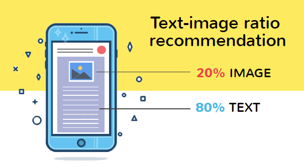
For instance, there’s a 70% chance that a reader will delete an email within 3 seconds if it is not displayed as intended. Moreover, about 66% of surveyed readers prefer emails that primarily consist of images.

Main Types of Email Design

The final design you opt for will depend on the type of email that you are targeting. Different email designs work best for various email campaigns.

For example, transactional emails should be written in a neutral tone and contain only necessary information with a minimal design philosophy. On the other hand, promotional emails should be designed to capture the reader’s attention and draw them in with visuals, colorful images, bold fonts, and other eye-catching design elements.

Here are the main types of email designs that you should know about:
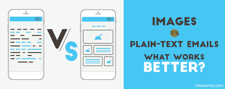
  1. Plain Text Emails

These emails are designed for short messages and contain only text-based content. Naturally, they have a straightforward format with no graphics, including logos, images, and buttons.

Use Cases For Plain Text Emails:

  • Newsletter sign-up confirmations
  • Password resets or account verification emails
  • Quick, automated notifications

Use Cases For NOT Using Plain Text Emails:

  • Promotional emails
  • Product launch announcements
  • Critical customer service messages

Learn More about Plain Text Emails here.

  1. HTML Emails

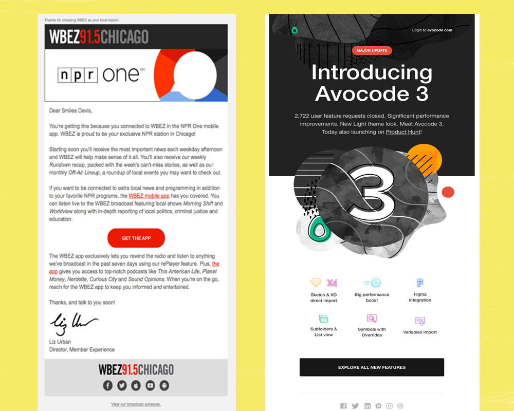
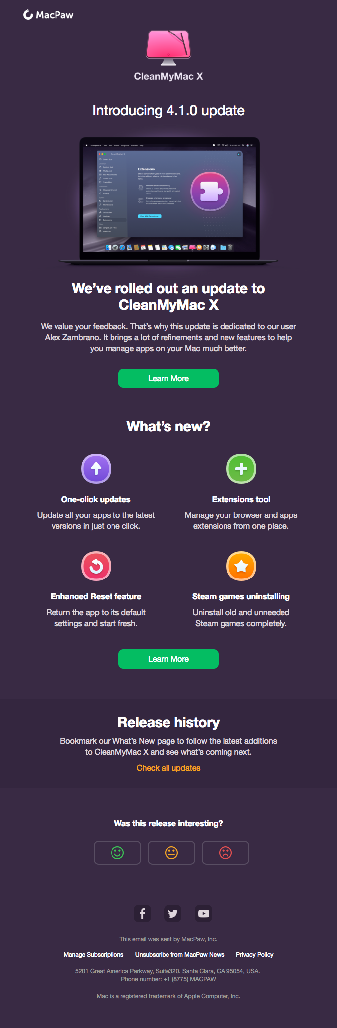
As the name suggests, these emails are designed with HTML code and contain both text-based and graphical elements. These emails have a much more attractive design than plain text emails but are comparatively time-consuming to roll out. With a unique blend of typography, images, and color, HTML emails help you create an eye-catching design that stands out in inboxes.

Use Cases For HTML Emails:

  • Newsletter Design
  • Announcements
  • Promotional campaigns
  • Event invitations
  • Product releases
  • Company updates

Use Cases For NOT Using HTML Emails:

  • Sensitive Information
  • Time-Sensitive Communications
  • Long Emails
  • Quick Replies
  1. Interactive Emails

Also known as dynamic emails, these emails are designed using HTML and include interactive elements that are JavaScript-based and in the form of animations, scroll bars, carousels, and video. These elements are designed to entice the reader and make them engage with the email content as if they are a web app.

Use Cases For Interactive Emails:

  • Holiday emails
  • Event registrations
  • Product launch announcements
  • Education emails

Key Elements of Email Design

Any great email design should have the following elements:

1.Subject Line

  • The subject line of an email should be brief, catchy, and to the point. It’s designed to get the reader’s attention, so make sure it is compelling and entices the reader to open the email.

Example:

  • Certain powerful words like “Hurry!” and “Limited Time Offers” are proven to have a higher response rate.

2. Pre-header

  • This is a short line of text that appears after the subject line when an email is viewed in the inbox. It should add context to the email and provide more value to the reader.

Example:

  • You could summarize the email content in the pre-header.

3. Body Content

  • The body content should be easy to read, concise, and well-structured. Consider using visuals such as images and videos to tell your story in an engaging format, especially if you opt for HTML or interactive videos.

Example:

  • Use GIFs to explain complex concepts or introduce a product in a visually attractive way.

4. Logo/Brand Design

  • Your logo and brand name must be prominent and indispensable elements of the design throughout all emails you send. Using it at the start and end of the email can help create a cohesive design and make it easier for readers to recognize your brand.

Example:

  • Add a logo to the top of the email and at the bottom in your signature.

5. Images

  • Adding images in emails helps to engage the reader and makes the content more comprehensible. Depending on your goal, use images to promote your products, services, or ideas.

Example:

  • If you are sending out emails for an event promotion, consider adding photos from past events to appeal to readers and make them more likely to attend.

6. Call to Action (CTA)

  • The purpose of any email design should be to drive an action or response from the reader. To achieve this, you ensure that your Call to action in emails is prominently placed and clearly visible.

Example:

  • Keep your CTA brief, concise, and easy to spot with the right color and positioning

7. Footer

  • The footer should contain information about the sender and provide links to other contact points, such as your website and social media profiles. This helps to create a connection between emails and other channels and builds your brand.

Example:

  • Use a footer to include links to frequently asked questions, contact information, and policy details.

8. Links

  • Depending on the conversion goal, you can also include links to your website, products, or services in your emails. This helps to direct the reader and provide more information about the topic or product.

Example:

  • If you are promoting a product, include links to its product page or demo video.

These are some key elements to include in an email design that will help make it effective and engaging for readers.

Email Design Trends For Evergreen Campaigns

In the rapidly changing digital landscape, keeping up with the latest trends is essential to ensure your emails stand out. Here are some of the trends that help ensure that your emails remain evergreen and relevant:

1. Minimal Elegance Through White Spaces

  • Clutter is always a turn-off for readers. Keeping your design clean and elegant by incorporating white spaces can help emphasize certain email elements when used effectively. And it makes sense why.
  •  More than half the readers today access emails through hand-held devices. Cluttered or visual-heavy designs are challenging to navigate on small screens, making the message lose its impact in the noise.

Reasons That Make White Spaces An Excellent Email Marketing Design Trend Include:

  • Visual Simplicity –  White spaces help to keep the email design simple and easy-to-read
  • Enhanced Focus –  Focus on the critical elements of an email is increased.
  • Increased Engagement –  White spaces create a pleasant visual experience, which helps to reduce drop-offs.

2. Responsive Design

Email design is not just about desktops anymore. Handheld devices are now the primary platform for emails. Understanding the importance of mobile-friendly design and ensuring your emails are responsive and look great across all devices is essential.

Responsive design helps achieve a good user experience as it caters to different screen sizes. It also ensures your email content remains consistent even when opened on different platforms, which is vital for brand identity and recognition.

Types of Responsive Email Designs Include:

  • Single-Column – This design offers a clean, simple look that works well on any device.
  • Multi-Column – This type of design uses fluid grids to optimize content for different sizes.
  • Hybrid – This is a mix of single-column and multi-column designs that use media queries to adjust the layout.
  • Adaptive – This design is more complex and uses more pre-defined breakpoints, which are set up for specific devices.

3. Neon Colors

Adding a bit of a lively flair to emails, neon colors are a great way to grab attention and entice readers. Neon can highlight important information or CTA and draw attention to some aspects of an email.

Using neon colors with caution is essential, as they can also be overwhelming if misused.

Some Precautions To Consider While Using Neon Colors In Email Design Include:

  • Incorporating neutral colors to create a balance
  • Keeping the background simple
  • Using neon colors sparingly and strategically
  • Using neon as an accent color rather than a background color

4. Animated Portable Network Graphics (APNGs)

Animated Portable Network Graphics (APNGs) are a great way to add movement and life to emails without relying on GIFs. These images consist of several frames that can be played in a loop.

It is a great way to show off product features, explain a process or highlight different aspects of the email. APNGs have better quality and resolution than GIFs and support 8-bit alpha transparency along with 24-bit colors.

Currently, the only disadvantage with APNGs is that Outlook and Gmail do not support them.

5. Animated CTAs

A head turner for email marketing in 2023, animated CTAs go the length to entice readers to take action on your emails. Marrying the CTA with a GIF or a CSS animation can help to add more impact and make it stand out from the rest of the content.

Animated CTAs work best with single-column email designs, as they can cause clutter in multi-column layouts. Additionally, it is crucial to monitor the file size of these animated CTAs, as large files can impact loading time.

6. Gamification

Gamification elements in emails can help to engage readers and build a stronger relationship with ingredients such as leaderboards, progress bars, quizzes, surveys, and more. These elements can be used to spark curiosity and encourage users to interact with the email.

It is important to remember that gamification should add value and not be intrusive and distracting. Additionally, these elements must work on all platforms, including mobile devices, as more than 60% of emails are now opened on mobile devices.

Here Are Some Gamification Ideas For Your Next Email:

  • Spin the wheel to unlock exciting giveaways or discounts
  • Scratch cards that reveal hidden rewards
  • Trivia quizzes with amazing prizes or discounts
  • Progress bars that show users their loyalty points and rewards

7. Duotone

Often used in retro-styled emails, duotone is an excellent design trend that can help to set the tone for your message. This technique uses two colors, usually shades of the same hue, to create an eye-catching and aesthetically pleasing look. Duotone images are also trendy in in-app designs and marketing campaigns.

When Selecting Colors For Duotone Images, It Is Essential To:

  • Create a contrast that works well together
  • Avoid pairing bold colors so as not to make it overwhelming
  • Opting for lighter shades that don’t overpower the message
  • Using these visuals sparingly and strategically to avoid making emails look cluttered

8. Tangible Products Photography

Tangible product photography is a great way to showcase product features in emails. This technique uses high-resolution images and close-up shots of products to showcase details that customers usually miss out on.

This trend works best with brand-centric emails, such as launch campaigns and product announcements.

The key Here Is To Ensure That:

  • Product images are high-quality
  • There is enough white space to create a visually appealing layout
  • The file size is small enough not to slow down loading times.

9. Long Scroll Email Designs

Long scroll designs are becoming increasingly popular as more users prefer to access emails on their smartphones. This trend involves creating emails containing all the necessary information without breaking them into multiple segments.

When Using A Long Scroll Design, It Is Important To:

  • Organize content in a logical sequence
  • Include visuals and different elements like graphics, illustrations, and videos
  • Have call-to-action buttons visible at all times
  • Ensure that the email looks good on all devices.

10. Bold Typography

Using bold and big fonts can help draw readers’ attention to important email messages. However, this trend works best with minimal designs, as it allows the text to stand out from the rest of the content, encouraging readers to stop scrolling and actually read the email.

When Using Bold Typography, It Is Vital To Ensure That:

  • The font size used is legible and easy to read on all devices
  • The font is appropriately aligned so as not to look cluttered
  • The font is used sparingly and strategically to make sure that the message stands out

Email Design Best Practices

Email design trends may come and go, but certain best practices should always be followed when designing emails. Well-crafted emails can be a great way to reach out to your target audience and build relationships with them. Keep these email design best practices in mind for creating emails that will grab your reader’s attention and convince them to take action.

1.First Impressions And Subject Lines:

The subject line and the preheader are the first things readers notice even before they open an email. They should be short, catchy, and convey what the email is about. Consider this your chance to grab attention in a sea of emails.

As per ReturnPath, an ideal email subject line must be under 55 characters and preferably 30 characters (as per the limit on some mobile devices). However, in case you go overboard, using power words at the start of the subject line to grab attention can help.

Moreover, as per a report by Experian, including an emoji in the subject line of emails results in a 56% higher open rate. Thus, consider using them to make your subject lines catchy and stand out in the inbox.

To know more about Subject lines Read our blog on 200+ Welcome Email Subject Lines That Actually Convert

2. Concise Communication:

Every email should be concise and to-the-point, as emails that are too long often get ignored. Use bullet points, images, or graphics to break up text and make it easier to read.

Hubspot analyzed more than 40 million emails in 2018 and found that emails between 50 and 125 words had the best response rate (more than 50%). Moreover, emails that were around 200 words long had the best Click-Through-Rate (CTR).

This indicates that your communication strategy must focus on your readers’ needs and deliver value to them. Therefore, keep it simple and focus on one main message at a time.

3. Maintaining Brand Consistency:

Ensure all your emails reflect the same design and style to ensure consistency. Your customer should be able to identify an email as yours in a single glance.

Ensure that the colors, logos, and fonts used in your emails are consistent with those used in all other communication channels. Create templates for all your emails and ensure that the email templates remains the same, no matter how often you send out emails.

4. Personalization Options:

Personalizing an email for the intended recipient makes it feel more thoughtful and professional, increasing the chances that your recipient will open it.

Email Personalization can include anything from adding their name to the email’s subject line or body, to using their purchase history or location to create a more personalized message. Use the available data to craft emails matching the recipient’s needs and interests.

Also, make sure that the personalization is not too obvious or intrusive. For example, ‘Karl, we noticed that you were looking at this product…’ could be seen as intrusive and creepy, especially in certain demographics.

5. Backgrounds:

Backgrounds can be used to draw attention to an email’s main content or headline. A bright background color, pattern, or image can help make your message stand out from other emails in the inbox.

However, use backgrounds sparingly and make sure that the text is clear and legible on all devices. Background images should also not be too large as they can slow down the loading time and make it difficult for readers to view the email.

6. CTA Alignment And Optimization:

CTAs are the holy grail of email marketing design as they convert leads and drive sales. Ensure that the CTA is placed in a prominent area of the email to be easily visible.

Moreover, ensure that the size and color of the CTA stand out from the rest of the email. In some cases, using words such as ‘FREE’ or ‘NOW’ in the CTA can help increase the conversion rate. You can also consider testing your CTA placement and design to see which variation works best for your audience.

7. Templates:

Email template designs are precomposed and easily customized for different campaigns and messages. They help reduce the time spent creating emails and ensure that they are consistent with your brand guidelines.

Email template designs can also optimize the user experience across different devices, as they automatically adjust their size according to the device being used. In addition, they can be both free or paid, depending on their complexity. Check our latest email marketing templates samples here

By following these design tips, you can create visually appealing emails and help drive conversions. Keep in mind that the key is to focus on providing value to your audience and ensuring that their needs are met.

8. Unsubscribe Buttons:

Make sure to include an unsubscribe button in all your emails. This helps ensure you comply with the CAN-SPAM Act and avoid legal issues. Moreover, it allows users to easily opt-out of receiving future emails if they are no longer interested or have lost interest in your content.

By including an unsubscribe button, you also show your readers that you respect their privacy and understand their needs. Make sure to make the unsubscribe process as simple and straightforward as possible.

9. A/B Testing:

A/B testing is a great way to improve the performance of your emails. It allows you to test variables such as subject line, content, CTA button, etc., and see which works best for your audience.

By running multiple A/B tests, you can gain valuable insights into what resonates with your target audience and create more effective and engaging emails in the future. In addition, it gives you a detailed overview of how each variable affects your conversion rate.

For example, variables you can test for your subject lines include Length, Topic, Tone, Emojis, Personalization, and more.

10. Dark mode:

With the increasing popularity of mobile devices, many users are now opting for the dark mode feature instead of light mode. Dark mode helps save battery life and makes reading text in low-light conditions easier.

Ensure that your emails support both dark and light modes so they can be viewed clearly on any device.

11. Design optimal footer:

The footer is the last thing readers see in an email and is often overlooked. However, it provides a great way to include additional content such as contact information, unsubscribe options, social share button, privacy policy, brand address, etc.

Therefore, ensure to design the footer section carefully, as it plays a vital role in setting user expectations regarding easy navigation.

12. Optimize Email Design To Be Responsive:

Responsive design ensures that emails look great and render appropriately on any device. Make sure to use HTML and media queries so that your emails automatically adjust to the size of the user’s screen.

You should also consider using responsive email frameworks such as MJML or Foundation for Emails to create high-quality responsive designs quickly.

13. Email Copy:

The email copy should be concise and to the point. Think about what you want to communicate and ensure that your message is clear and easy to understand. Avoid using too much jargon or complex language, as it can be challenging for readers to comprehend.

This is especially important if you are targeting multiple demographic groups. Readers can easily understand a simple and engaging copy from different backgrounds.

These are some of the most essential tips for designing effective emails to help you engage with your audience more effectively and drive better results. Consider using these tips to create emails that look great, deliver value, and convert. With the right strategy, you can create emails tailored to your audience and help boost conversions.

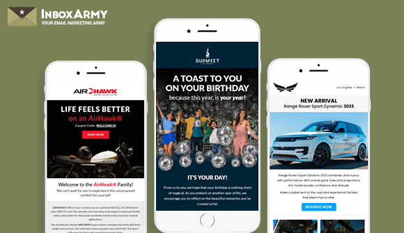
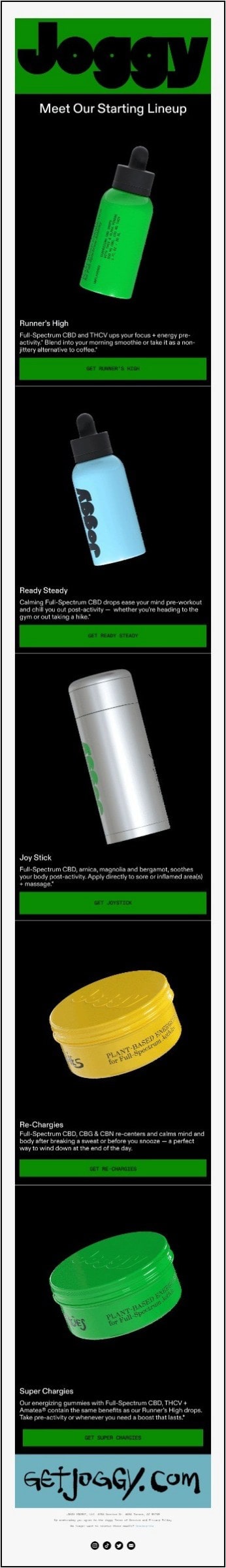
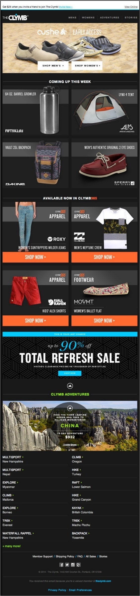
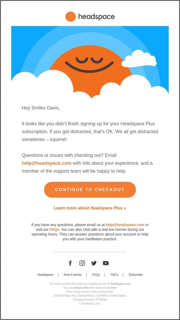
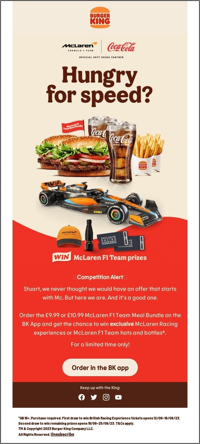
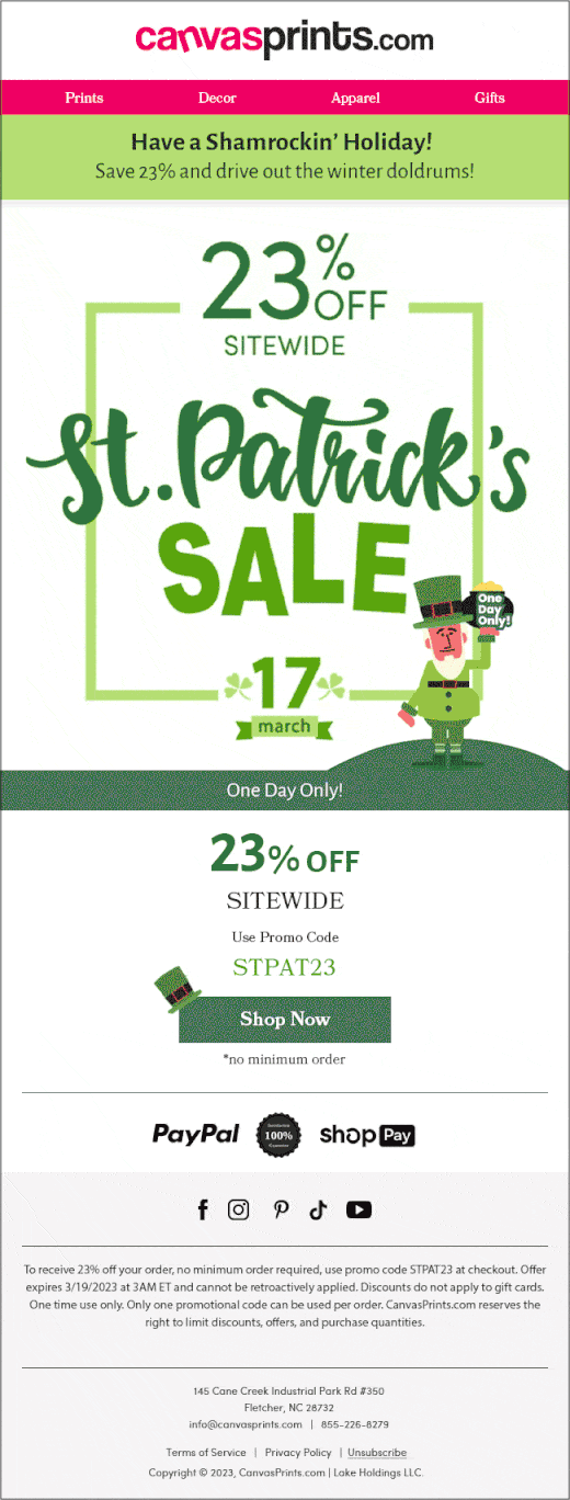
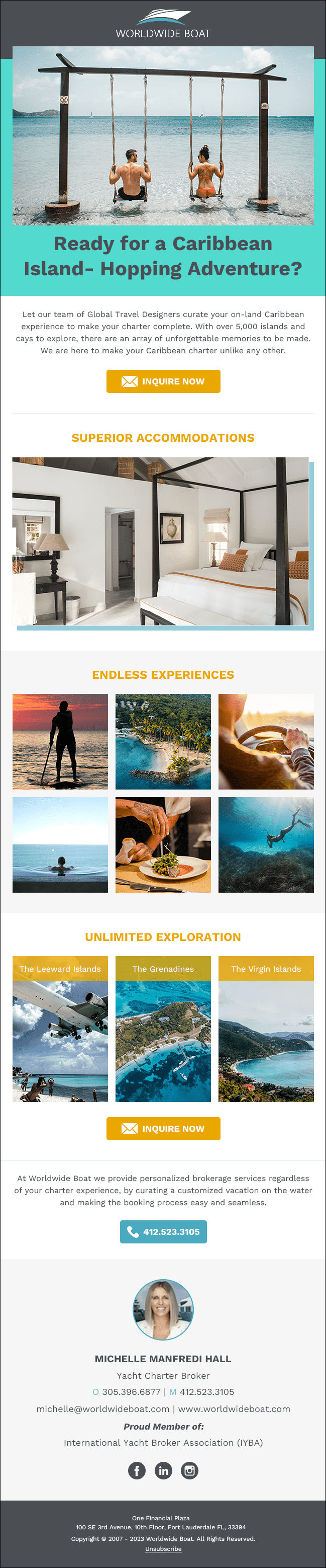
18 Best Email Design Examples

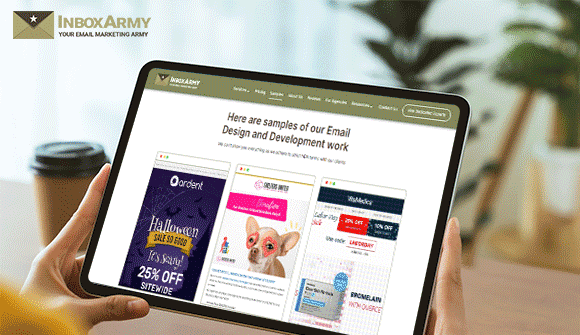
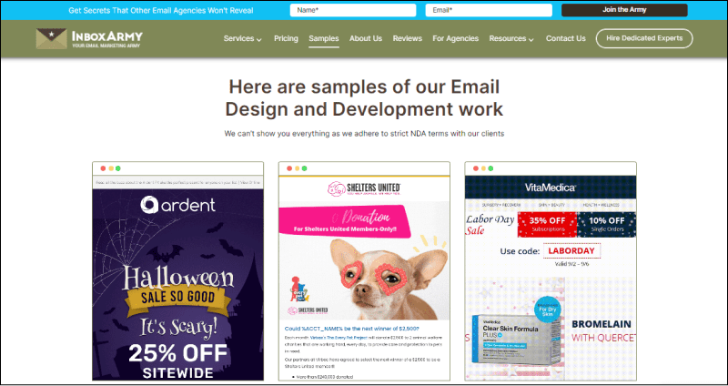
Let’s take a look at some of the best email design examples that have been created with the above tips in mind. Also, If you need help in creating stunning designs then check our custom email design services.
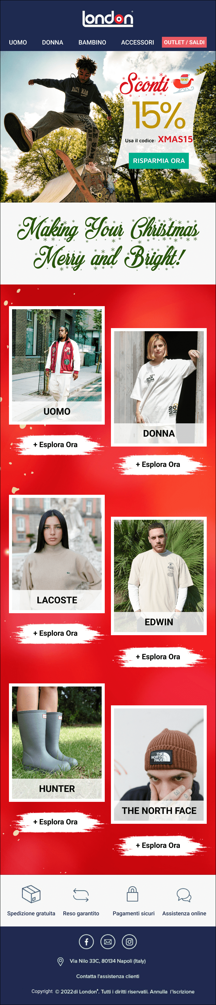
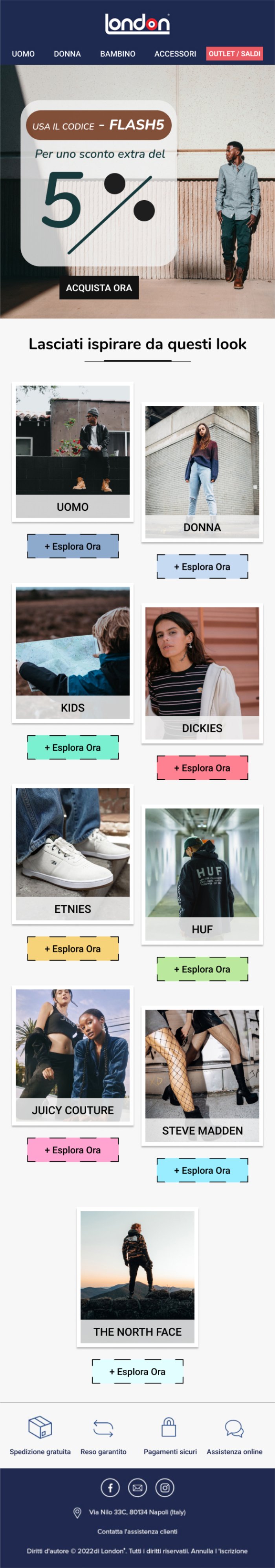
1. London Store

⭐ This brand email is a perfect example of having a solid opening. With key details about the flash sale included in the first fold itself, it helps readers quickly understand what the email is about.

The visuals also help break down complex information into an easy-to-understand format, showcasing product categories with upbeat images that reflect the brand’s personality.
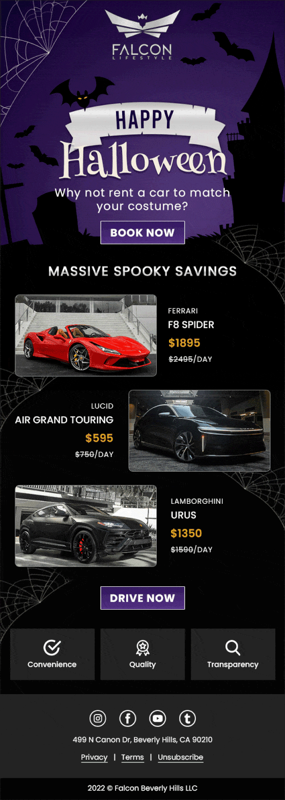
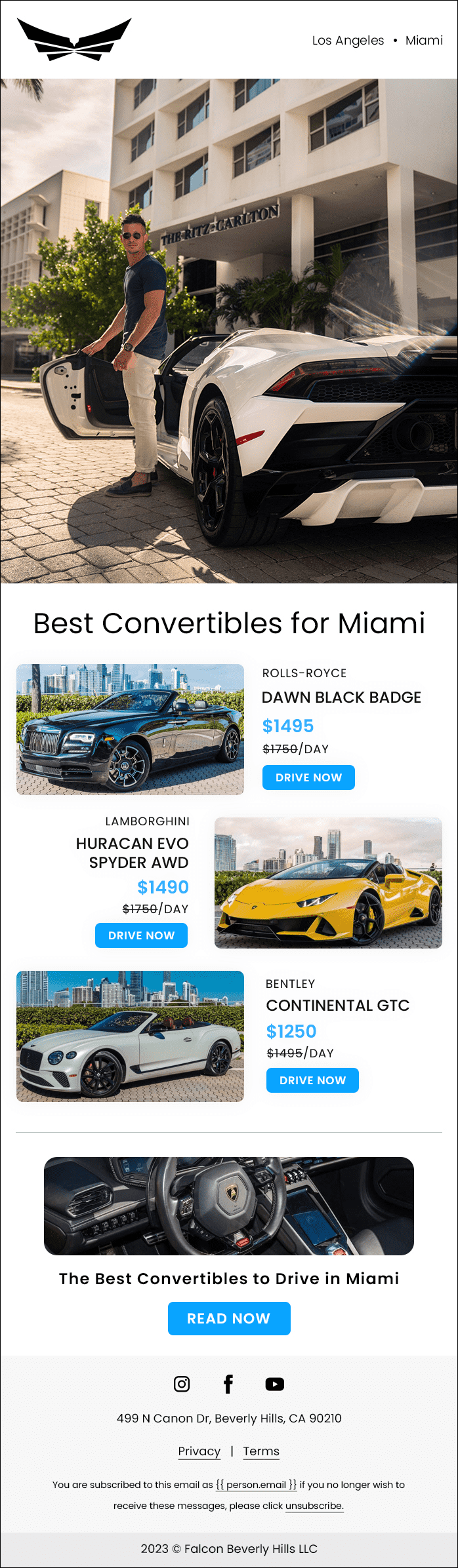
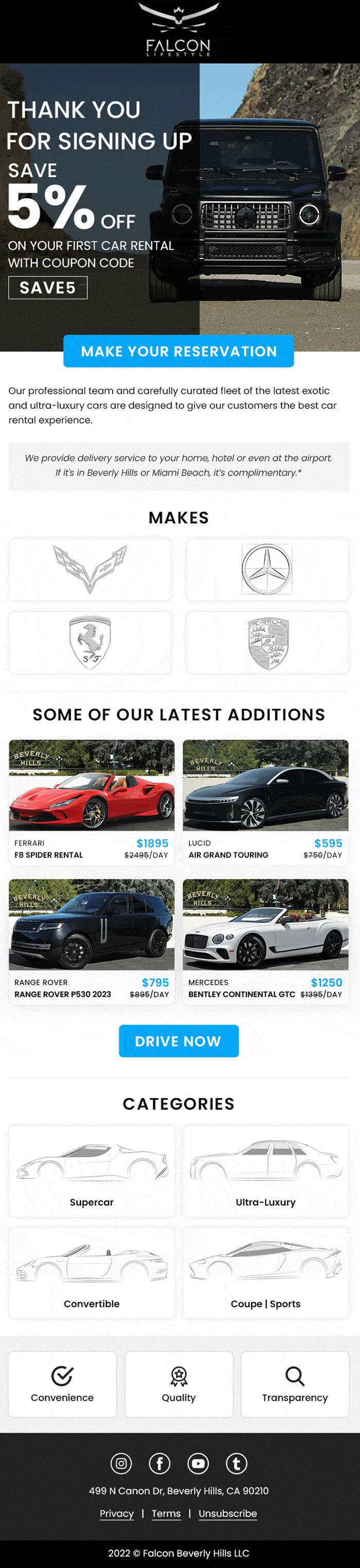
London Store Email Design Examples

2.Falcon Lifestyle

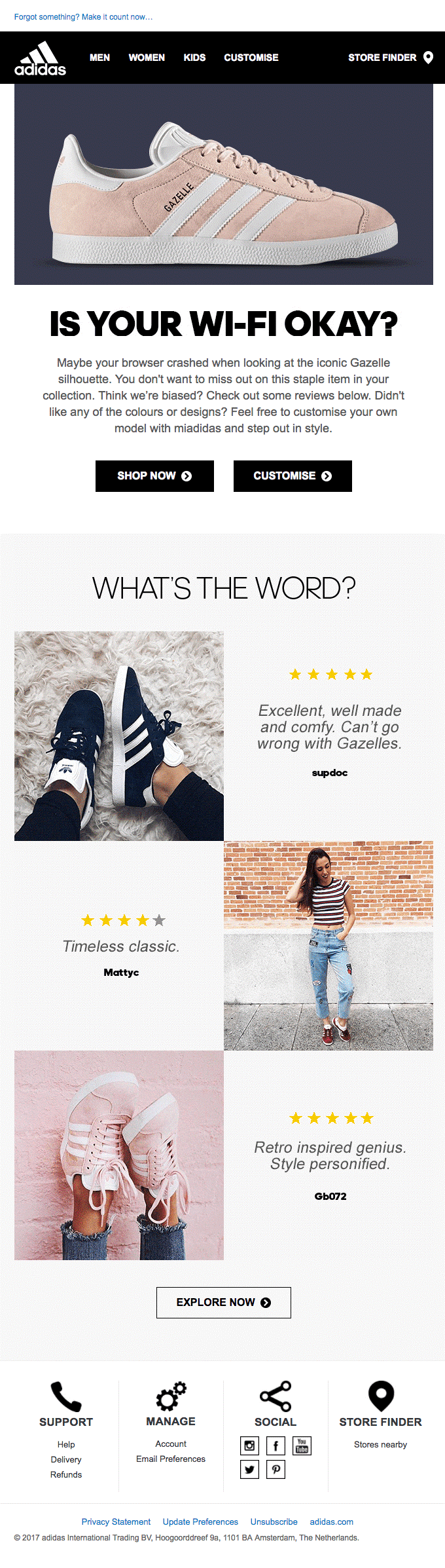
⭐ Again an example that opens strong with the campaign details, this design falls back on ample white spaces to draw attention to the visuals.

⭐ The use of simple illustrations helps break down complex information into easily digestible chunks, and the strong CTA in the middle that pops out and encourages readers to explore more.

Falcon Lifestyle Email Design Example

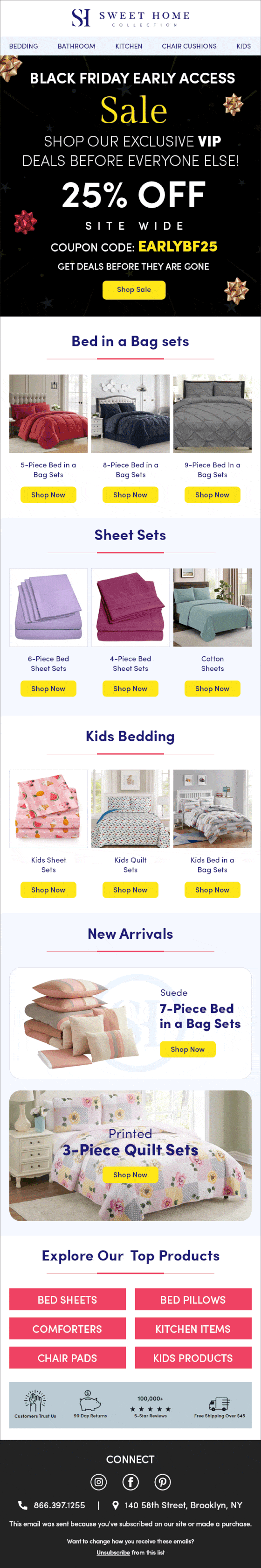
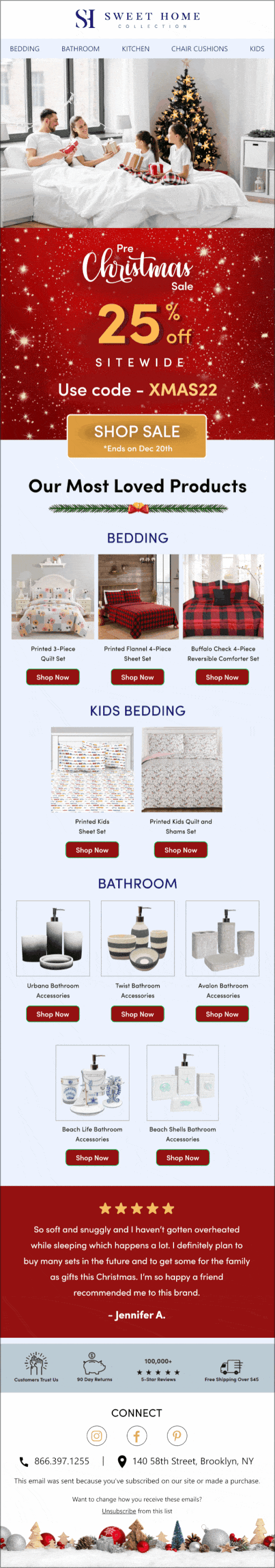
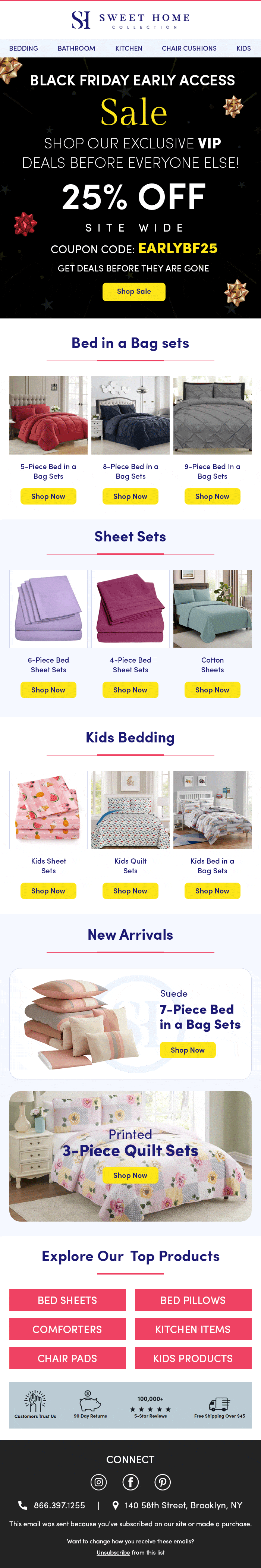
3. Sweet Home Collection

⭐ The email from this brand is a great example of CTA alignment, having a segmented email for every product category.

⭐ A clean, minimalistic design in the second half of the email and vibrant product images, along with the product categories section, helps readers quickly identify their desired products and take specific actions instead of a generic CTA. Also, signing off with key USPs of the brand at the end helps build trust among readers.
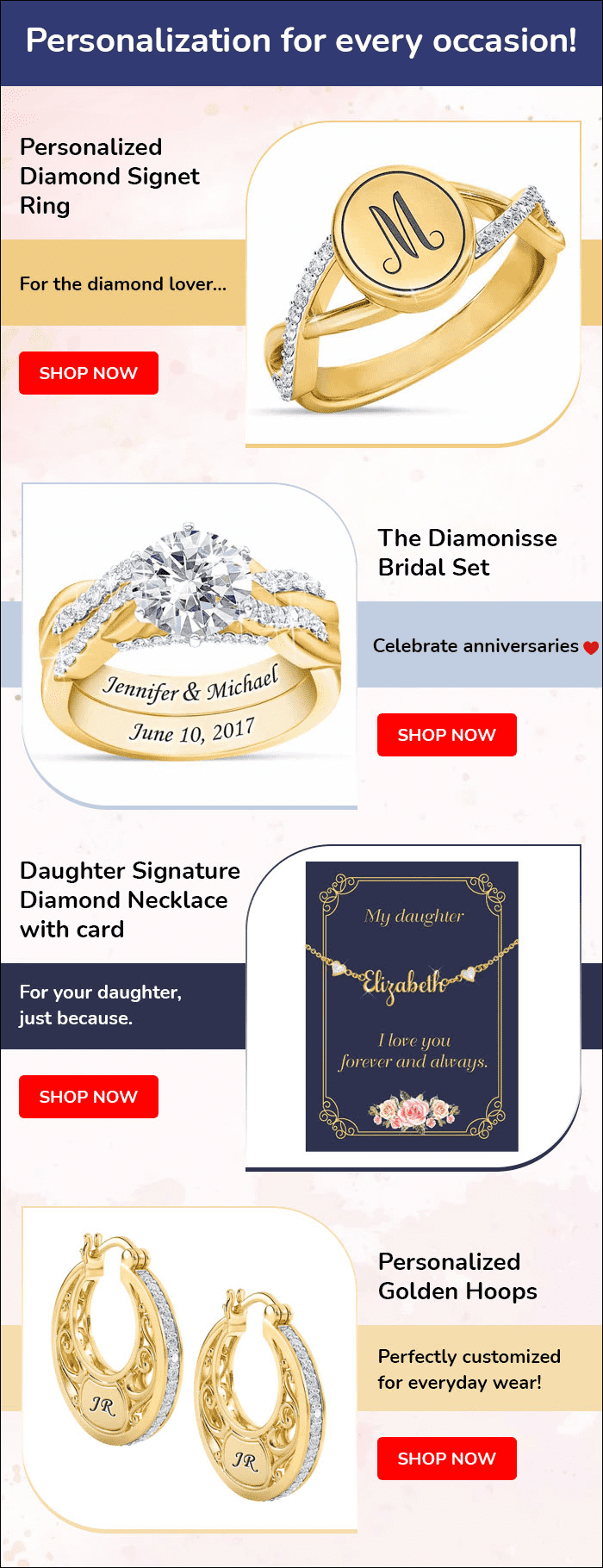
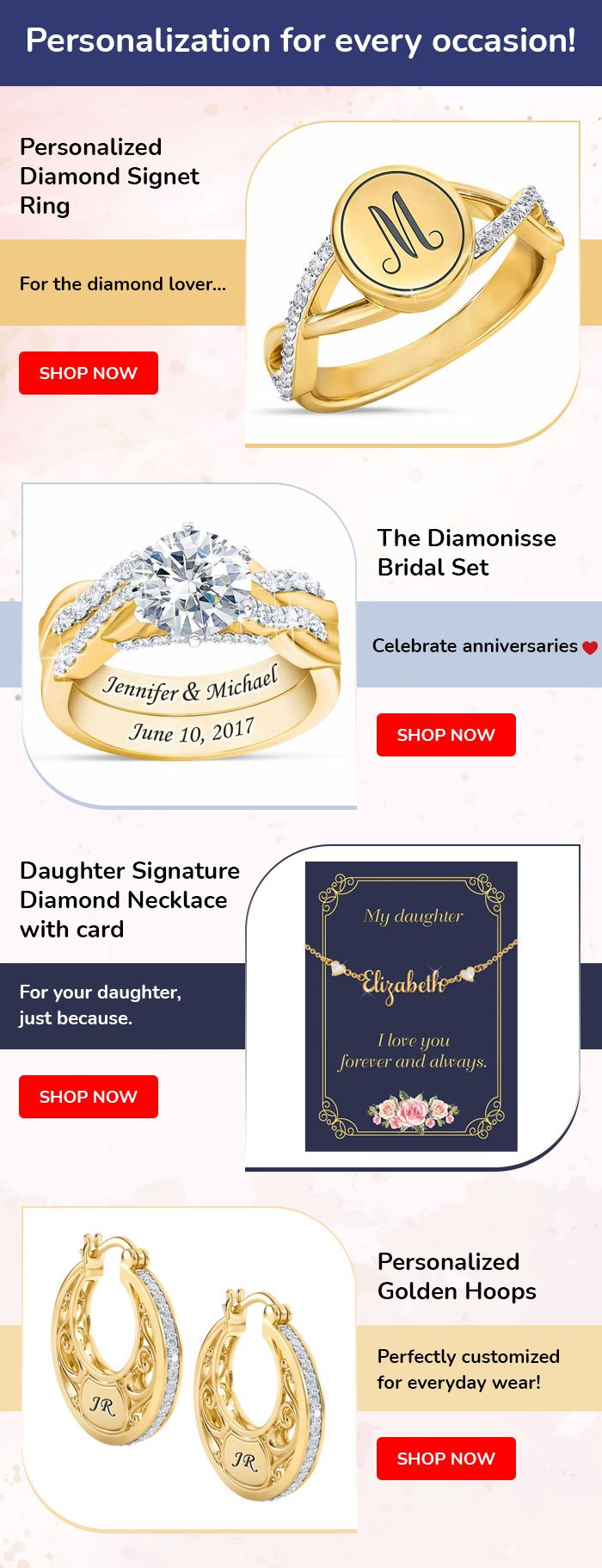
Sweet-Home-Collection-Email-Design-Examples-1-min


4. Jewellery Brand

⭐ By using a color scheme that pops out the gold, this design does a great job of drawing attention to its central message.

⭐ It also uses simple yet effective visuals to showcase the jewellery range and communicate the message with a concise communication strategy.

⭐ The red CTAs create a sense of urgency, aiming for a higher CTR.
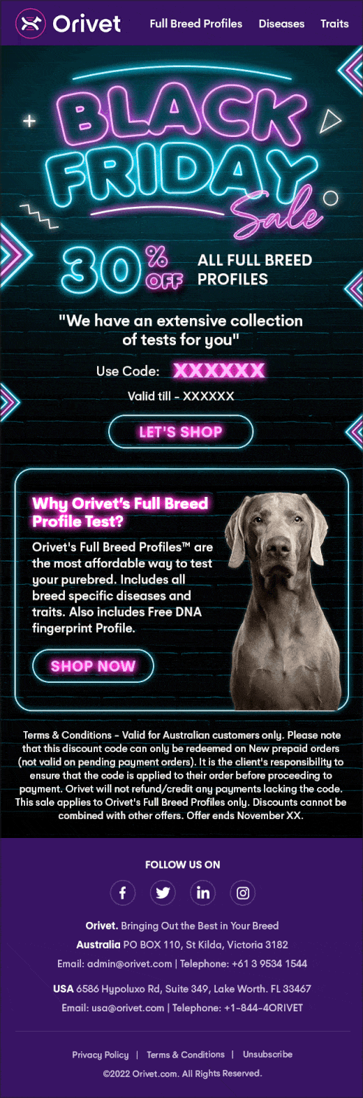
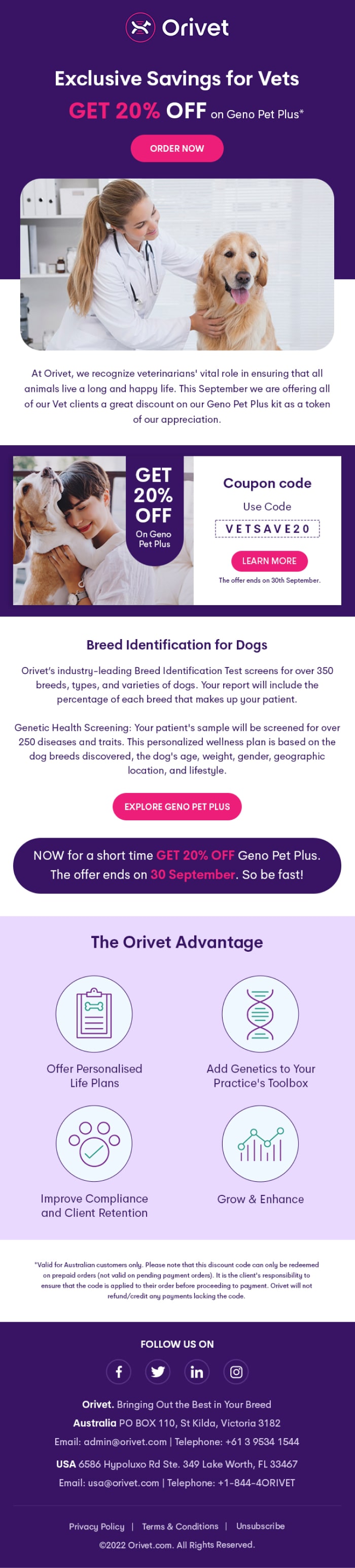
Jewellery Brand Email Design Examples


4. Orivet

A duotone color scheme used in the background of this email gives it a modern look while ensuring that the visuals stand out.

⭐ A hero image of the veterinary service in action and simple storytelling, along with multiple CTAs in the email body.

⭐ It helps readers quickly understand what’s being offered and make an informed decision.

Orivet-Email-Design-Examples-2


6. Selenbio Dental

⭐ What makes this email stand out is the self-changing carousel of images  leading to the CTA, which was smartly designed for desktop and mobile devices.

⭐ Next, a concise paragraph explains what the clinic offers, and the CTA directs readers to the page where they can find additional details.

⭐ And lastly, the unsubscribe link in the footer helps ensure compliance and gives the readers an option to opt-out if they wish.
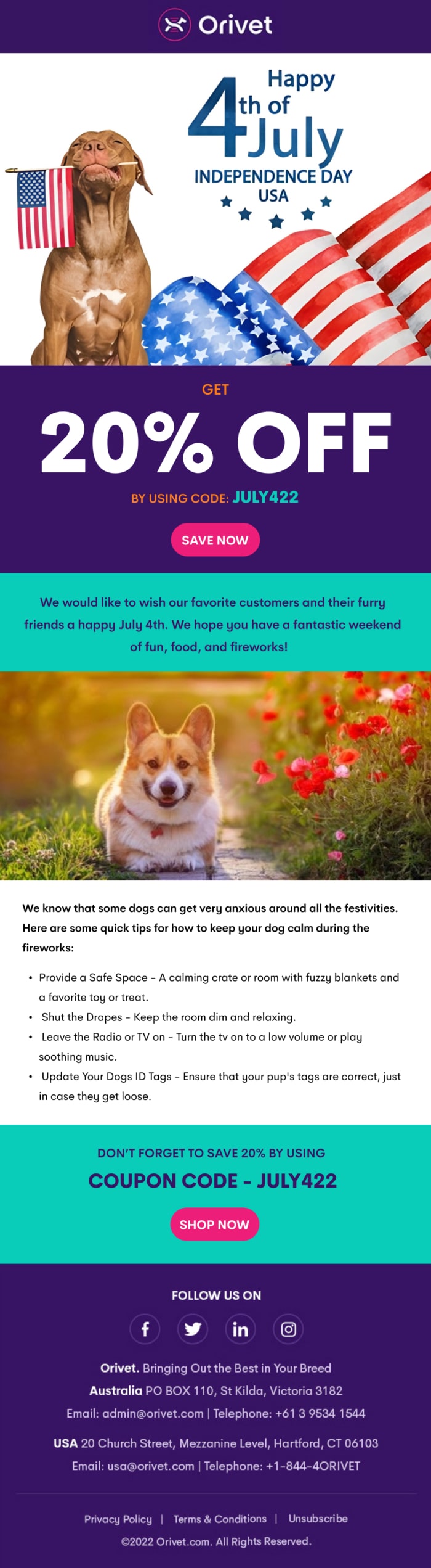
Selenbio Dental Email Design Examples


7. Orivet

⭐ Sometimes, a strong and creative hero image is all you need to capture your reader’s attention.

This email by Orivet does just that with a creative image of their actual, furry target audience in action.

⭐ The CTA at the end is simple and visually appealing enough to draw readers in with a coupon code, leading to increased sales.
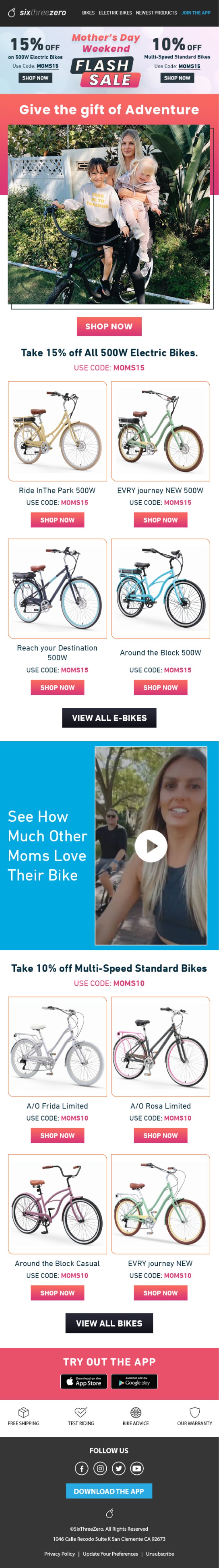
Orivet-4th-July-Email-Design-Examples


8. SixThreeZero

⭐ Opening with a strong banner image and a compelling Holiday headline, this email by SixThreeZero drives readers to its specific CTA right away.

⭐ The copywriting is relatable for the target audience, and the product photography pops out the vibrant colors of the bike, making it hard to ignore.

⭐ Lastly, the cross-platform marketing at the end by urging users to download the app helps build a more substantial brand presence.
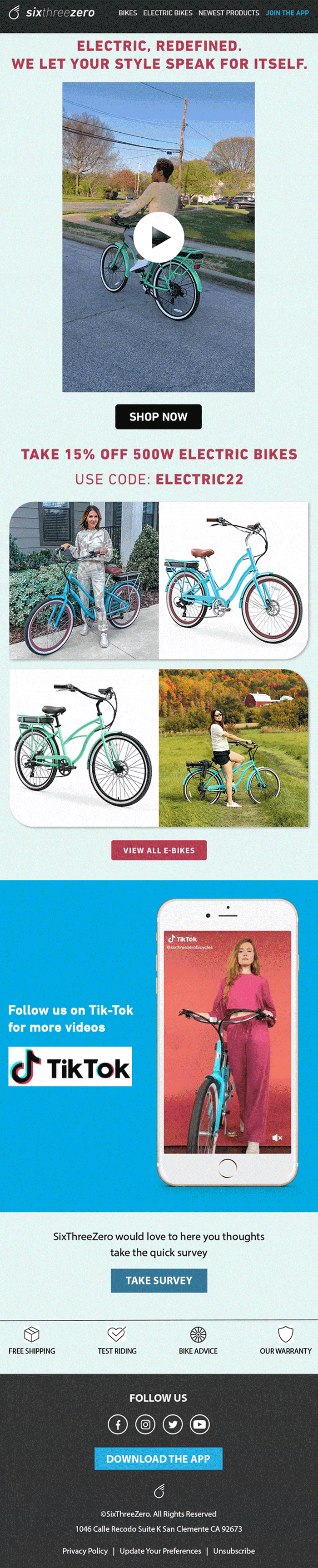
SixThreeZero Email Design Examples


9. SixThreeZero

⭐ Another example from SixThreeZero is that this email design leverages storytelling in the form of a short video showcasing the product in action.

⭐  Also, by including a follow link to their Tiktok channel in the email itself,  they’re expanding their reach across multiple networks. Finally.

⭐ The targeted copy and the CTA to check out their entire bike range makes this email template design one to be admired.
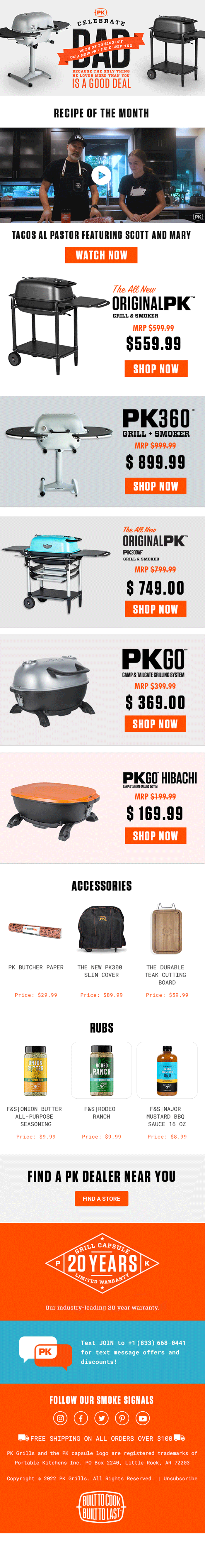
SixThreeZero Storytelling Email Design Examples-min


10. PK Grills

⭐ An almost monotone email design example, this email by PK nails the first impression with amazing, emotion-driven copywriting.

⭐ Including a ‘Recipe of the Month’ section acts as a great engagement tactic for readers who want to see the product in action before they buy it.

⭐ A minimalistic catalog of the product that follows further convinces the readers, and the ‘Accessories’ and ‘Rubs’ sections work well for cross-selling.
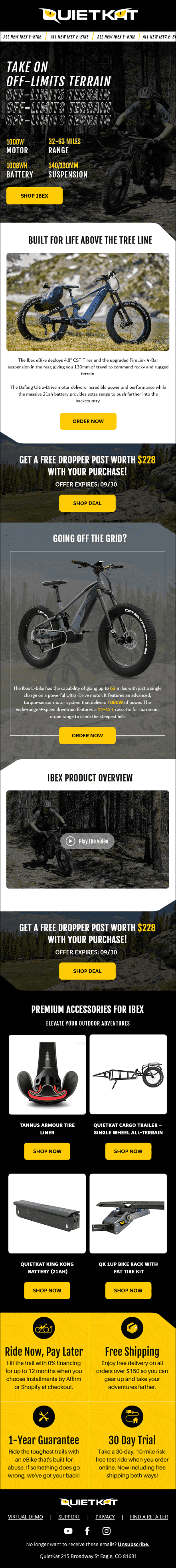
PK Grills Email Design Examples


11. QuietKat

⭐ The brand is true to the design philosophy of its brand with this email design.

From the bold color scheme to multiple, segregated CTAs, this email leaves no stone unturned.

⭐ A hero image that showcases an action shot of its electric bikes helps readers experience the thrill of the bike even before they buy it.

⭐ The additional links in the footer for social links and demo calls make this an effective email design.

QuietKat-Email-Design-Examples


12. QuietKat

⭐ An great example from QuietKat, this email design goes big on copywriting to engage the readers.

⭐ A bright, eye-catching hero image with multiple category sections helps create a story around the bike and how it compares to other products on the market.

⭐ Again, the unsubscribe link at the end keeps the readers in charge.
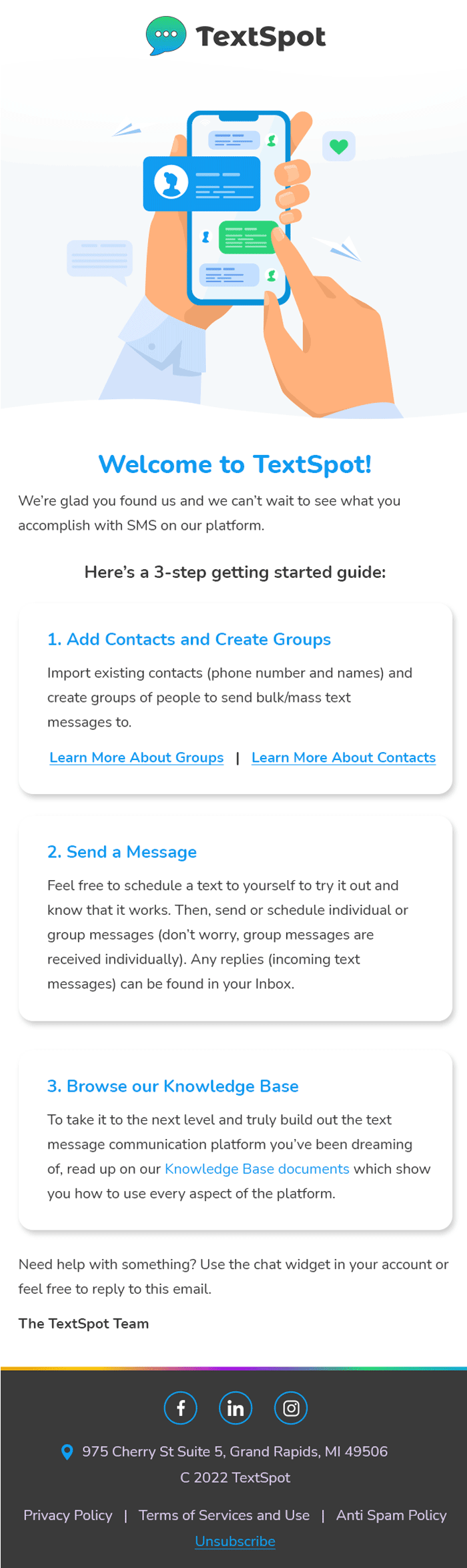
QuietKat-Bigger-Email-Design-Examples-min-min


13. TextSpot

⭐ This email template example epitomizes minimalistic design with significant white spaces and a simple, elegant read.

⭐ The hero image is both simple and instantly makes it clear what this email design tool is all about.

The copywriting is spot on and drives readers to learn how to get started with the tool.
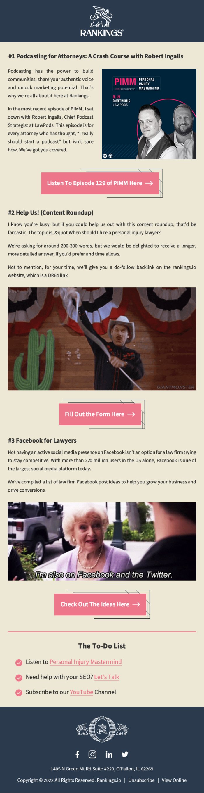
TextSpot Email Design Examples


14. Rankings.io

⭐ A great duotone design with compelling CTAs that get readers to take action.

⭐ This email design by Rankings is a great example of how copywriting and visuals can be combined to create an effective design.

⭐ Being a bit text-heavy,  the design is broken up by adding relevant images that capture the readers’ attention without being too overwhelming.
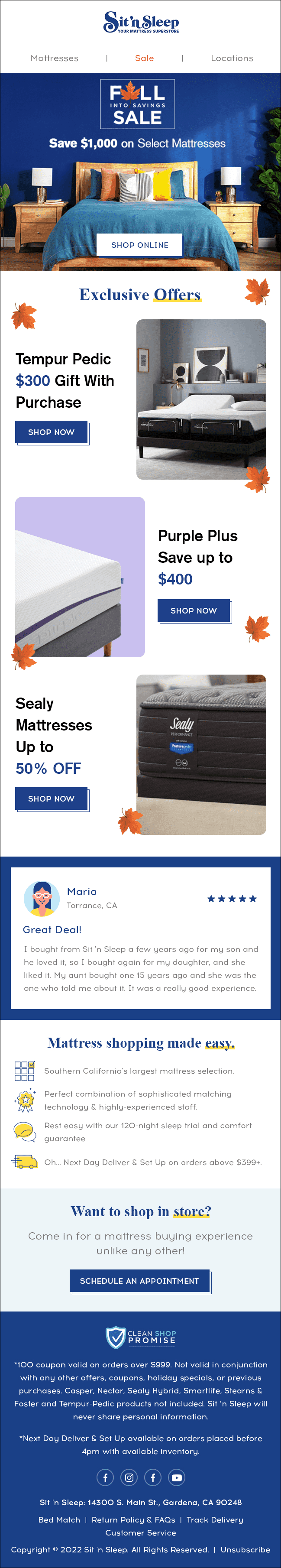
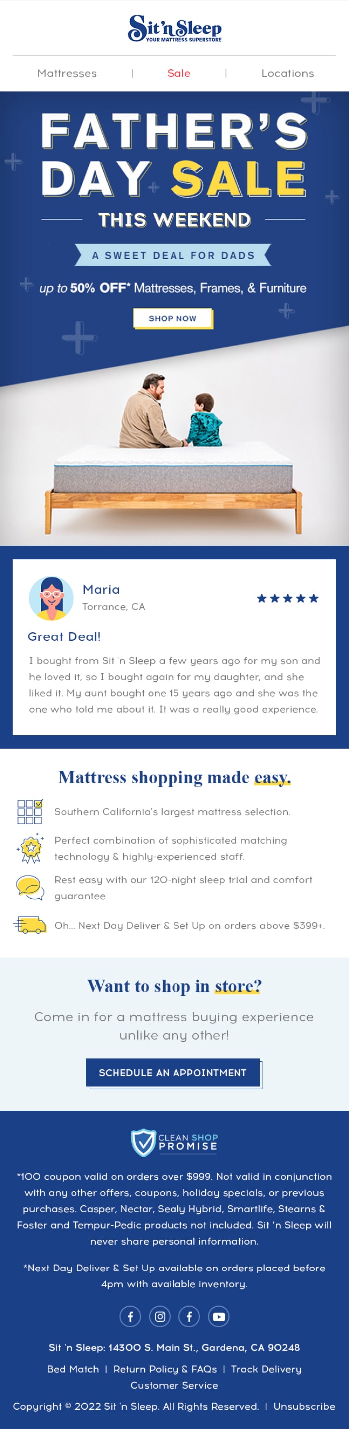
Rankings.io Email Design Examples


15. Sit n Sleep

⭐ Another duotone holiday design that relies on an emotional visual appeal,

⭐ This email design by Sit n Sleep focuses on getting readers to take advantage of the holiday deals quickly on their range of products.

⭐ Footer is specially called out here for including almost every relevant detail that can help the reader make a decision.
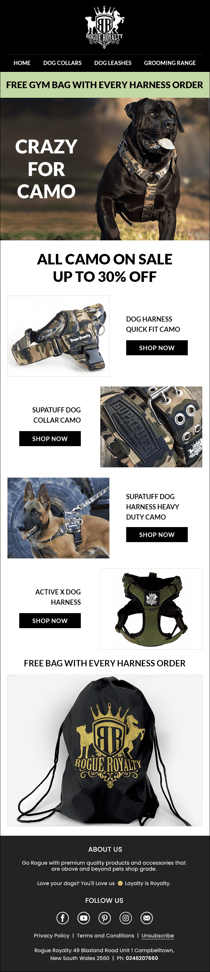
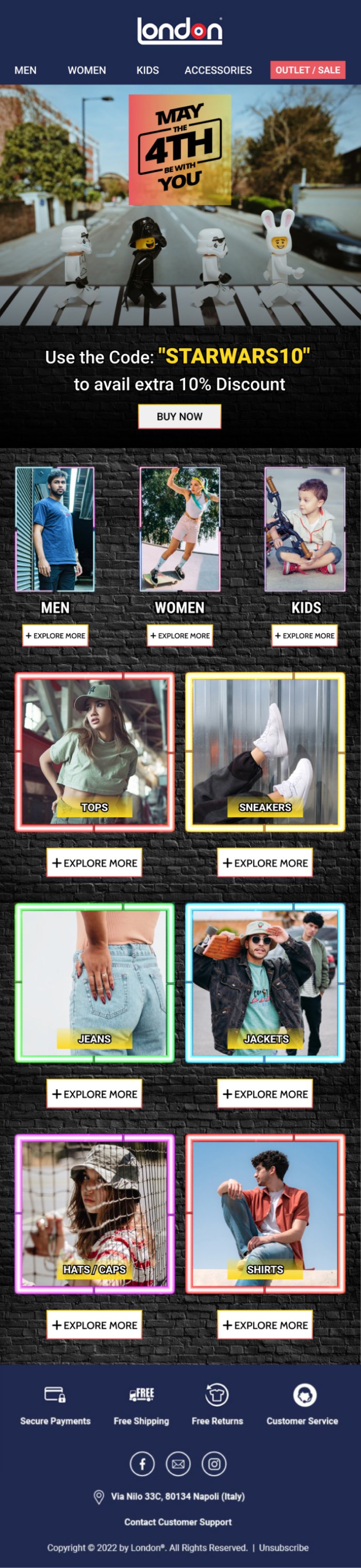
Sit-n-Sleep-Email-Design-Examples


16. London Store

⭐ It has a Quirky design philosophy with a range of products to showcase. 

⭐ This email design by London grabs the reader’s attention with its bold look & feel.

⭐ Keeping it subtle, the mix of product images & copywriting helps create an effective design that gathers attention at every step.
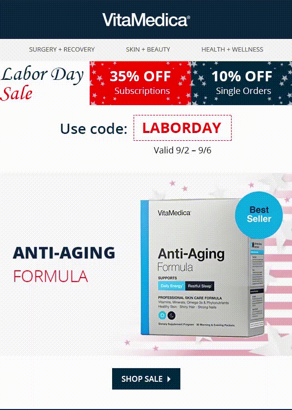
London Store Bold Look Email Design Examples


17. Vitamedica

⭐ The Vibrant design with usage of attention-grabbing visuals for the holiday sale. 

⭐ This email design by Vitamedica keeps things interesting with its bright & professional look.

⭐ Here the layout is carefully designed to share every critical information without being too complex.
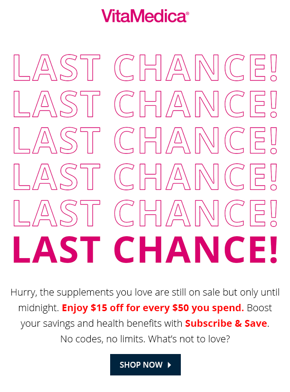
Vitamedica Email esign Examples


18. Vitamedica

⭐ Another great example from the brand, this design does well at creating urgency while still being subtle with its visuals & copywriting.

⭐  The gradient color scheme calls out offers on the product range, while the short email copy helps get the message across quickly & reduces drop-offs

Vitamedica 2 Email Design Examples

The above examples show how effective email design can be when it is tailored to the brand’s personality, its target audience, & its needs. With the correct design elements, you can create emails that will engage your readers and drive conversions.

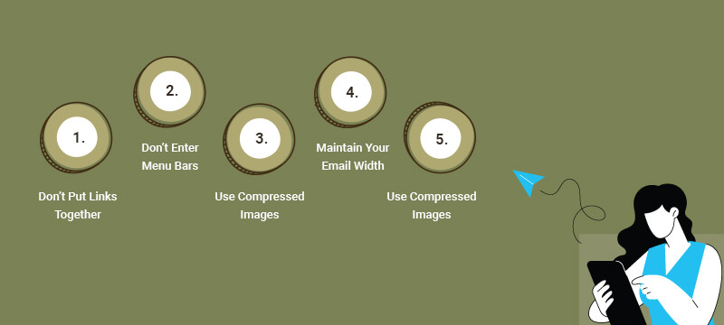
10 Email Design Mistakes to Avoid

When designing emails, it’s vital to keep in mind the mistakes that will ruin your design & render your emails ineffective.

Some of the most common email design mistakes to avoid include:

1. Not Optimizing For Mobile

The best email designs should be optimized for desktop and mobile devices so they can be easily viewed across different platforms. Not doing this can lead to a poor user experience and lower engagement rates. Learn more about mobile optimized emails here

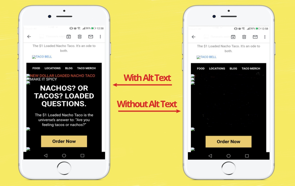
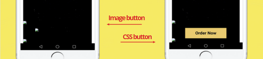
2. Ignoring Accessibility

Make sure to include images with alternative text and ensure your design is accessible to all users. Otherwise, you could be excluding an essential part of your audience.

3. Not Using The Right Colors

Be mindful of the colors you use in your emails, as they can significantly impact how readers perceive your emails. Complex color schemes can be overwhelming and may not look good on all devices.

4. Cluttering The Layout

It’s important to ensure that the email layout design is simple and easy to understand. Ensure enough white spaces between your design elements and include relevant visual cues to guide the reader throughout the email.

5. Using Too Much Text OR Too Little

Too much text can lead to reader fatigue, while not enough text can make your message unclear. Aim to strike a balance between the two and focus on using concise and compelling copy.

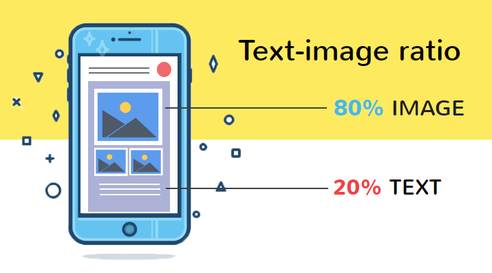
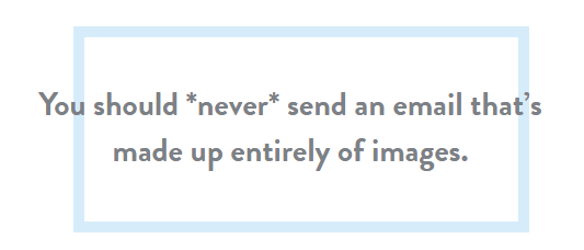
6. Relying Solely On Images 

While images are great for conveying messages quickly and effectively, they should be used in conjunction with text. The ideal approach is to use visuals that complement the copy, so your message can be easily understood.

7. Not Testing Before Sending

Testing your email design is an essential part of the process. Make sure to test the design on different devices & browsers and review the email for any mistakes.

8. Not Considering Readability

Font selection, font size, and line length are all important factors to consider when designing emails. Make sure the text is legible and not too small; otherwise it can be difficult for readers to comprehend the message. Learn more about web fonts in email here.

9. Ignoring Personalization

Personalizing your emails is a great way to show that you care about the reader and make the experience more engaging. Using dynamic content and personalization tokens can help create emails tailored to each individual.

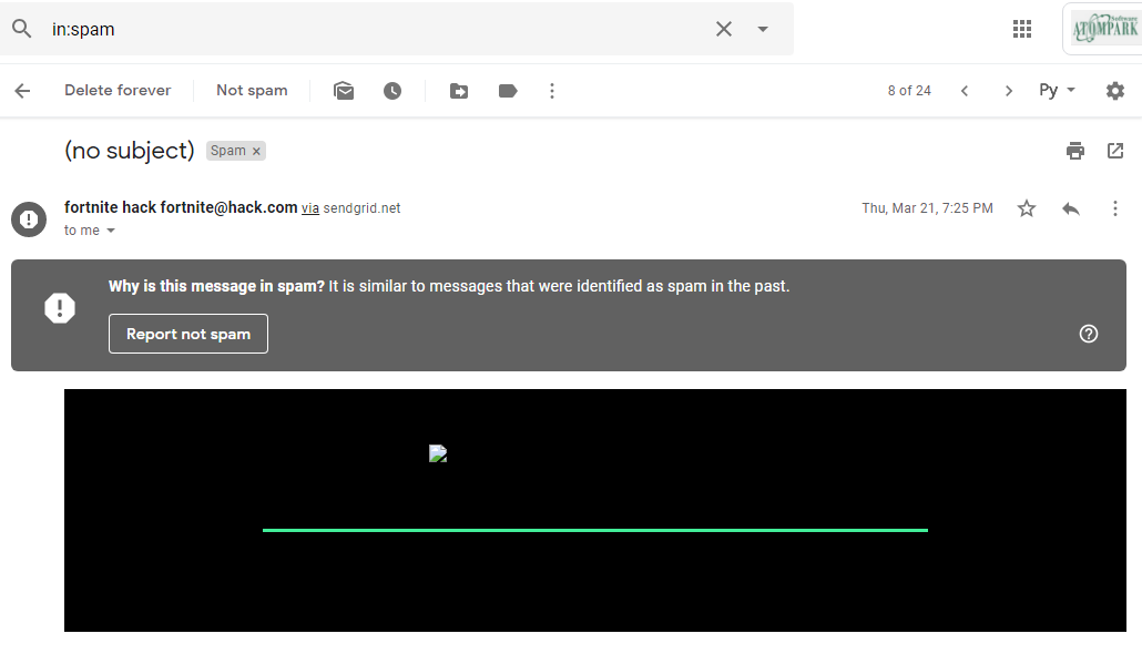
10. Not Optimizing For Deliverability

Email design mistakes can affect your email deliverability rate and lead to emails ending in the spam folder. Use a reputable email service provider, avoid triggering words, and test the design before sending.

By avoiding these common email design mistakes, you can create engaging and effective emails conveying your message. When used in conjunction with the right copy & visuals, you can ensure that emails are successful at driving conversions.

Conclusion

Now what makes a great email design, start experimenting with different elements to create compelling emails. Include visuals, Play with different font styles and sizes, Use whitespaces to break up large chunks of information & Add a clear CTA to help readers take action.

Take a look at these e-newsletters, which of them do you like more?

These are email marketing image from the ReallyGoodEmails website “Apps&Services” category

There are two types of email marketers: those who prefer to follow the MailChimp recommendation about the 20% to 80% text-image ratio as a standard, and those who don’t.

Does it mean that the latter makes a mistake?

But don’t judge too soon.

In this article, we will analyze all the pros and cons of the image-based emails and tell how to avoid problems using this newsletter type.

What is image-based newsletter?

Image-only email is a message with almost purely visual content and little percent of the text.

Approximately it is the opposite of the recommendation above:

You may say it’s a crazy idea to send such messages, however, I’m not alone in my sympathy to these email campaigns type.

After three years of careful analysis of the best email marketing company image practices for the AtomPark Software clients and blog readers, I’ve noticed that email subscribers really love bright emails.

And I have a list of coherent arguments on this:

  • People prefer to click on image based emails, so eye-catching newsletters have a 42% higher click-through rate compared to text-only one.
  • Visual elements help to underline the main idea of the message.
  • Use of illustrations improves brand awareness.

There are no limits for a designer’s imagination here. Moreover, when email subscriber opens this newsletter she/he sees that it was done with love, and the brand really cares.

Anyway, there is a reason why email marketing expert avoid using it.

Why image-only emails are risky?

Litmus says:

And it is right because there is a danger to repeat the next failure:

Actually, here is how it looks when it isn’t blocked:

Let’s talk about the reasons that could lead to this situation:

  • Earlier this newsletter type was associated with spammers because spam filters can’t read images, and spammers use this trick to send unwanted, forbidden offers. Now, image only emails are still under suspicion, so email clients quite often block such messages by default and send it to the junk folder.
  • Subscribers disable images on their end to the traffic economy, thus they won’t see the major part of your offer.
  • Screen readers for the blind aren’t able to read text on the illustrations.
  • It is a real challenge for email subscribers with a 2g – 3g mobile connection to open image-heavy newsletters.
  • Such emails are hard to find in the mailbox when you need them because the search operator uses text – the limited element in the newsletters we are talking about.

Nonetheless, brands like J.Crew, REI, Taco Bell, etc. successfully use it and have their campaigns reach the inbox. Do their marketers have the knowledge, inaccessible to simple muggles?

Maybe, but I’ve analyzed their email tactics and found this secret.

How to avoid problems with the image-based mass mailing campaigns

  • If you don’t want to use text in the main body of the email, add it to the footer part as the MOO, online print and design company did:
  • Use background images with HTML text and buttons over it. This would help your subscribers to understand the main idea of the offer in a case when images won’t display.

Here is a part of the Coffee Trade newsletter:

  • Use the power of Alt Text for email images to describe the main idea of your offer. For example, the Taco Bell newsletter with the disabled images on the phone:

  • Don’t make your CTA as button image because it could be hidden from the subscriber along with the rest of the images from your message. It is better to use bulletproof buttons: they are made with the help of HTML and CSS code, so they don’t disappear from your email when the images are off.

Have a look at your email now. Make sure that people understand your message even when pictures are turned off.

That’s all, but before testing your campaigns be sure you don’t forget about the basic tips of the newsletter content:

  • Add Unsubscribe link
  • Avoid spam words
  • Think twice over the subheading and pre-header of your campaign
  • Use lightweight visuals (no more than 5 Mb)
  • Add a link to the newsletter web version.

So the answer to our main question today is yes, image-based emails are cool. However, you must be very careful with the design of such a campaign to keep it visible for subscribers.

Now you know the secret knowledge and can impress your clients with the bright newsletter design in their inbox folder!

Emails happen to be the most effective medium of communication with your customers. Whether you want them to know about your new venture or, want to update them with your new services, sending an email always works.

Imagine receiving an email from your favourite e-commerce store, declaring a Winter sale. Wouldn’t that make you want to click and check out the products? The emails give away a whole load of details on the sale, the type of products you will get to buy and even the discounts you can enjoy during that period. It is short yet complete in its own way.

However, the tough task is to design aesthetic email that grab the attention and win conversions. Here we will take you through the various things that you need to keep in mind when planning visually appealing emails.

Go responsive with your designs

Your audience could open the email anywhere at any point in time. For instance, they could be using their mobile phones and responding to the email. Better still, they could be on their tablets, working on an important presentation.

You need to factor in the various devices the audience uses for the email, and design your emails accordingly. The email should look similar across the devices, and the audience should get a one-brand feeling after seeing these emails.

Make sure you use different font sizes when designing for the different screen sizes. You should also consider sending HTML and text-only versions to the audience, so that they can open the text-only, in case their device prevents them from opening the HTML emails.

Determine the email layout

The layout plays a vital role in making the email aesthetic. Before you begin the design itself, start placing the things on a piece of paper or using the prototype designing tool. You need to define the placements of the content, the images and other materials that will go into the design of your email. Realize the distractions in the emails, and how to get rid of them when planning the layout.

You ought to be clear about the goals to come up with a promising layout. The size of the fonts, the image sizes and even the colour choices are dependent on the design. Make sure you go through several marketing campaigns before coming up with the ideal layout for your email campaign management.

Draft legible content

The content plays a vital role in making your email aesthetic and readable. The material should meet the layout defined earlier. You don’t need to venture into elaborate content to make a point.

Aesthetically Attractive Email - GOBY

You need to remember that not everyone will open the HTML emails. That means you need to work on the content for the text-only emails as well. Make sure you drop in a line break after every 60 words so that the content is readable. Make sure you don’t use long paragraphs or sentences. Short sentences or a two-lined paragraph should be enough to communicate.

Include the essential white space

White space is the best friend for every email that you design. It makes the email design look appealing to the eyes. The whitespace allows the readers to skim through the email, grasp the material in it and even interpret it correctly. Basically, the white space gives enough space to the brain to break down the material and digest the facts.

It also gives your design some room to breathe and conquer the world of email marketing. The use of white space is essential if you want to get some click rates and don’t want your email campaign to be a waste.

Too much or too little of the white space can ruin the design of the emails. You need to use white space wherever you want to emphasize the content & make your email aesthetic.

Determine the visual strategy

The flow of the elements in the email is important from skimming perspective. At a glance, you should be able to communicate the vital message that your email wants to send out. This is why visual strategy is essential.

The shape, size, colours and contrast of the various elements along with their placement is determined in this strategy. You will also specify the colours and the fonts you will use when defining the visual plan.

Use of headers, pre-headers and footers

An email remains incomplete without the proper placement of headers and footers. You should ideally have the space defined for headers and footers. The headers help you grab attention, as they give out as much detail as they can about the email without using too many words.

Apart from the header, the pre-header also plays an important role. It helps give an insight into what the email is about, especially when you open in Gmail, Outlook or the iOS app. It is a 100 character version of the email, which allows you to decide whether you want to open the email or not. This sneak preview plus an identifiable header gets you better chances at achieving your email campaign goals.

Footers help the users know more about you, as that is where you will place all your social channel icons.

Use of proper colors and fonts

The colors are important when you are designing and want to make your email aesthetic for your audience. It should be a direct translation of the theme of your campaign and should let out the mood you have set for the campaign. The messages should relate to the color choices you have made. For instance, black is all about luxury while, blue is tranquillity and integrity.

Apart from colors, you need to pay particular attention to the fonts that you will be using in the email design. The fonts also communicate whether the email is formal, informal, funny, serious etc. The emotion and the gravity of the message are best known for the use of the fonts. You should ideally use 22 pixels for the headline and 14 pixels when working on the body content.

Add impressive images

The design of your emails is incomplete if you have not added some impressive and incredible images, which relate to the message you are communicating. If you want to talk about a product that you have just launched, make sure the picture of the product takes centre stage. You should ideally use approximately 30% of the space available on the email for your images. When adding images to the emails, you should ideally add alt text to help explain the text version of the image, in case the email service provider fails to display images.

Incorporate an actionable CTA

To make the design more compelling, you should add a call-to-action, which helps with your goals and makes the user take action. The content, the font, as well as the size of the button, should be such that it makes the user want to click on it. Align your CTA to the email content to make your email aesthetic & relevant too.

Final Thoughts

Email marketing is not just useful, but also one of the best mediums of communication for your business. The plus side of email marketing is that you are in complete control of all aspects of marketing. Proper research, comprehensive understanding of your audience, and designing the email keeping in mind all these points will help you get a good conversion rate for the emails. Make sure you don’t let your users down and send them relevant and informative content only! Any click baits and you are sure to lose your brand image forever.


More emails are read on mobile devices and therefore, it has become imperative to optimize your emails for smaller screens. According to Adestra’s report of “Top 10 email clients”, 59% of email opens took place on mobile, 15% on desktop, and 28% in a webmail client. Moreover, 3 in 5 consumers check their emails on the go (mobile) and 75% of them say that they use their smartphones to check emails.

That’s quite a good number of statistics and you certainly cannot overlook them. If you want to optimize your emails for mobile devices, here are some ideas to help you out.

1. Have smaller file size of the images

Content with images work better than content without images. However, when it comes to designing emails for mobile, select high-resolution light-weight images way that they do not hamper the loading speed of the emails. Resize the images by the proportion of the screen by using the code below:

<img style=”max-width: 75%; max-height: auto;” class=”ia_Center shadow” src=”imagesource.jpg”/>

The width property should be modified according to the screen size. You can use tools like FastStone Photo Resizer and JPEGmini to reduce the file size by 80% without spoiling the image quality. The key is to design simple emails without any unnecessary elements that would take forever to load on slow Internet connections.

2. Avoid writing long paragraphs

Make sure your email copy is succinct and relevant and does not have too many links put together. Include the most important information in the beginning of the email. As your subscribers are accessing the emails on the mobile phone, do not beat around the bush to prevent any distractions.

3. Make the links and CTA buttons easily visible

Precision becomes a task for subscribers using devices with small screens. Therefore, you should add taller and wider text links and CTA buttons. Also, add enough spacing to your links so that your subscriber does not end up clicking on any other link accidentally.

4. Write short subject lines with related pre-header text

It is an email marketing best practice to craft short and sweet subject lines that are informative and interesting enough to get more open-rates even on mobile phones. Your pre-header text should provide value to the subject line so that the recipients get curious to open your email. Preheader text should be short and easy to consume because the pre-header text displayed for every device would be different.

5. Responsive layouts are a must

Many marketers use predesigned templates from their email service provider. They should use responsive templates that automatically fit the screen on which the subscribers view the emails. When using a responsive template, you do not have to bother about any rendering issue or broken email layout.

Final Thoughts

Besides mobile-friendly emails, it is of utmost importance to have a mobile-friendly landing page too. Nothing can turn off your mobile subscribers more than the fact that the information they are seeking is not correctly visible on their phone. If you don’t have enough knowledge and skills to optimize your landing or website for mobile users, you might consider referring to a mobile development agency.

These tips would surely help you create emails that will appeal to all your subscribers regardless of the device they are using.

Email marketers are constantly looking for ways to boost their email metrics—in particular, open rates and click-through rates. They do this by testing variables like subject lines, From Name, and calls to action, among others.

Learn more about how image based emails can be a good idea for email marketing.

One test you may not have thought of is testing the effectiveness of a plain-text email vs. a normal HTML message with images. Can plain-text be more effective than images? Absolutely!

Let’s look at some reasons why:

1. Plain-text emails imply “intentionality.”

Plain-text emails can have the look of being a direct, purposeful email from an individual. This look can work well in driving engagement.

2. “Ugly sells.”

A boss of mine in a previous life used to say this to me all the time. Plain-text emails can be considered ugly, and draw the eye because it stands out from the “beautiful” emails that fill our inbox on any given day.

3. Plain-text emails are readable by all your subscribers.

Plain-text emails look the same for all subscribers. Therefore, you don’t generally have to stress over the formatting issues based on device.

4. Plain-text emails generally have better deliverability rates.

HTML, image-heavy emails require more bandwidth to load. Less load means fewer places that can raise red flags for spam filters.

NOTE: Well-coded HTML emails that abide by CAN-SPAM guidelines generally do not hamper your deliverability rate.

5. User preferences vary.

While some users would love the visual appeal created by HTML-based image emails, some subscribers strongly favor text emails. Studies how that plain-text emails are just as effective as HTML emails. This can be particularly true for onboarding or welcome emails that are sent to new subscribers who have just signed up.

6. Wearables are getting more popular.

Nowadays, more and more people are using wearables such as Apple watches. Plain-text emails work better than HTML emails on these devices, largely due to the limitations that wearables present in terms of rendering.

Before you jump into turning all of your emails into plain text (something I do NOT recommend), here are some best practices for your plain-text email marketing test campaigns.

  • Plain-Text and Text Version are NOT synonymous.

    Just because you’re going with a plain-text look doesn’t mean you skip formatting altogether. You can still incorporate simple HTML elements into your campaign. Use bold, underline, italics and other simple formatting options to make certain portions of your message pop off the screen—most notably your main call to action. (As an alternative, square brackets or double angle brackets can also serve this function.)

  • Use clear headings for every section.

    Break up different sections of content by using clear headings. Asterisks and dashed line can also separate each email section for easy readability.

  • Embed links or use shorter links. Also, don’t stack links together.

    Consider embedding your links much like you would in-line text links in a normal HTML message. Otherwise, if you want your links to look like a text version of a message, make sure your links are shorter.

    Make sure your links are not placed together (either next to or stacked on each other). Otherwise, you run the risk of encountering “Fat Thumb Syndrome” or having your links run together as one. These issues can ultimately damage the customer experience.

  • Space your email content evenly.

    Every section of your email needs to be easily defined. Scannability and readability are key to success for plain-text emails.

Conclusion

Leonardo da Vinci once said, “Simplicity is the ultimate sophistication.” Test simple, plain-text emails and see for yourself if you drive more opens, clicks, and conversions.


It’s been more than 40 years since the first email message was sent, and the look and feel of an email have come a long way since then. These days, design and fonts play a critical role in getting your email marketing message front and center with your subscribers. And web safe fonts, in particular, are a tricky beast to personalize to your brands.

Learn, how to make emails look pretty & boost your sales and revenue.

Fonts are an essential way to reflect your brand personality. Yet, in the digital space, specialized fonts require that recipients of your message “own” the same font on their device. But with the advent of “web fonts” and “web safe” fonts, that’s not the case anymore.

Web Fonts vs. Web Safe Fonts – What’s the Difference?

Like, you are using web safe fonts in your emails (particularly your personal emails). Fonts like Arial, Verdana, Georgia, Times New Roman, and Courier are deemed “web safe fonts” or “email-safe” because they are installed by default on just about every computer, device, and operating system there is.

Web Safe fonts should not be confused with Web fonts. Web fonts are not installed on every operating system and device. That said, oftentimes, you’ll find Web fonts are embedded into web browsers and downloaded into a user’s browser through rendering and applied to text.

The advantage of web fonts is the increased flexibility and versatility to make your text more attractive and provide more of a brand experience.

Where Can I Find Web Fonts?

Google Fonts is one of the easiest sources to find web fonts. You’re able to download the fonts for free and use them how you like—in Adobe Photoshop, Sketch, etc.

You can also choose from web fonts from paid services like the following:

MyFonts
Commercial
FontSpring
Typotheque
Process Type Foundry
Production Type
YouWorkForThem
Village
FontShop

You can also use a proprietary font by hosting it on an online hosting platform and linking to it. However, often when including a custom web font, you’ll need to license it. Generally, the costs for licensing web fonts depend on the number of monthly opens.

Adding Web Fonts to Your Email

An important note: Downloading a web font to your computer does not mean it will render properly in your subscribers’ inboxes. You’ll need to add the web font into the code of your email in some form.

There are three primary methods to do so:

1. Use @import

@import may be the easiest method to import web fonts into your email. Just add the below-mentioned code within the head tag of your email, preferably at the top of <style>.

@import url(‘https://fonts.googleapis.com/css?family=<fontname>’); If using Google fonts

Or

@import url(‘custom url where  the font is hosted’);

You can get the URL from your web font service. For companies hosting the font themselves, the link has to be directed to the address of web font file.

2. Use <link> tag

Similar to @import method, the href value is either determined by the web font service or the address of the hosted server of the font.

<link href=”https://fonts.googleapis.com/css?family=fontname” rel=”stylesheet” type=”text/css”>

  • <link> tag versus @import

There are two things to consider when choosing between the <link> method and the @import method: Support and Load Time.

The <link> method is supported by AOL Mail, Native Android mail App (not Gmail app), Apple Mail, iOS Mail, Outlook 2000 and Outlook.com App.

The @import method delays the loading of the web font that’s being imported until the HTML in which it’s embedded gets fully loaded. The <link> method loads the resource inline. If your web font file is particularly large, the @import method may be a better bet given that the email gets loaded even if the web font is “on its way.” If the web font is smaller, then the <link> method may be sufficient.

3. @font-face Method

Five file formats are mainly available in the online web font services.

  1. .eot
  2. .woff
  3. .woff2
  4. .svg
  5. .ttf

Emails work the best with .woff format. Using the @font-face method enables you to choose the file format you wish to import.

@font-face{
font-family:'Gill Sans MT';
font-style:normal;
font-weight:400;
src:local('Gill Sans MT-Regular'), url(link) format('woff');
}

Example of Web Fonts in Email

Fortnum & Mason uses at least one web font in their email text:


Fortnum & Mason
Courtesy: Really Good Emails


Email Web Font Compatibility

Web fonts are compatible in the following email clients:

  1. AOL Mail
  2. Native Android mail App (not Gmail app)
  3. Apple Mail
  4. iOS Mail
  5. Outlook 2000
  6. Outlook.com App

While Outlook 2000 and AOL Mail may not be a big portion of your list, the other 4 email clients are among the top 10 in terms of use according to Litmus.

As you can see, many email clients (and notably some of the bigger one, like Gmail) don’t support web fonts. This is why it’s important to provide a fallback or “default” font for your subscribers who won’t get to enjoy the unique experience.

Choosing the Right Fallback Font

Your fallback font should match as closely as possible to your email design and the web font you chose. For example: If your web font is a serif font, your fallback font should also be a serif font.

To be safe, you should also choose a fallback font that has roughly the same vertical height (or x-height) of your chosen web font. This way, your overall design doesn’t suffer too much from lack of web font support.

To get a clearer idea on web fonts and their fallback fonts, check out CSS Font Stack.

Outlook Issue with Web Fonts

To put it kindly, Outlook is the one email client that does everything… “differently.”

Outlook won’t fallback to a font you choose out of the box. Instead, it will fall back to Times New Roman.

There is a workaround for this problem.

You only need to embed the code given below.

<!--[if mso]>
<style type=”text/css”>
.fallback-text {
font-family: Arial, sans-serif;
}
</style>
<![endif]-->

Use the class fallback-text if you have your web font family as below:

<td class=”fallback-text” style=”font-family: ‘Open Sans’, Arial, sans-serif;”>Open sans font for all!</td>

Remember to TEST

As an email agency we recommend when it comes to your email marketing, test your web fonts and fallback fonts. Every email client renders web fonts differently—so test to ensure your creativity doesn’t go unnoticed.

Are Web Fonts Worth It?

Look at your mailing list and see how many subscribers view your emails in an email client supporting web fonts. For example, if your subscriber list is heavy on iPhone use, then using web fonts may be worth the effort. If a predominant portion of your list is on Gmail (which doesn’t support web fonts), then perhaps it isn’t worth the effort.

An Alternative to Web Fonts in Email

Is there a font you REALLY want to use? Put it in an image and provide suitable alt tags and inline styling to format it. Remember this: Make sure you maintain the 80/20 text-to-image ratio while doing so. Images-only emails can create their own issues.

Closing Thoughts

If you find it’s worth exploring, using unique web fonts in emails can be innovative and a great way for your messages to stand out from the crowd. If you need help moving forward with web fonts in your email campaign management, InboxArmy would be more than happy to assist you.

Check our email portfolio HERE.

Multi-ESP Support

We support 50+ ESP vendors. Be it enterprise platforms such as SalesForce and Oracle Marketing Cloud or small and medium sized business platforms such as Mailchimp, Klaviyo, Aweber, and ActiveCampaign, we’ve got you covered.

Top